When looking at the market, moving averages are often used to help define trends and locate levels of possible support and resistance. Momentum indicators are also used to evaluate the ‘health’ of market trends and determine whether they are sustainable.
And both of these stock market indicators bear importance for active investors, especially in this current environment that is marked by selling pressure. Let’s take a look at a couple of these indicators in greater depth.
The MACD momentum indicator is popular among traders and simply measures the space between two moving averages. The thought being that in an up trend the short-term moving average should rise at a faster or even pace as the long-term moving average.
But we can also use the MACD to see how far price itself gets from a moving average, which is what the chart below shows. The chart below shows the weekly price movement of the S&P 500 Index going back 18 years. I’ve also included the 50-week Moving Average which I believe has done a good job at defining market trends and acting as support and resistance on longer-term charts for the equity market.
S&P 500 Chart – MACD & 50-Week Moving Average stock market indicators
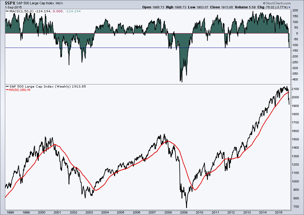
Over the last several weeks price has declined in almost a ‘waterfall’ like fashion. Many levels of price and indicator support have been broken, including the 50-week Moving Average. What I find interesting is how far price has gotten below its 50-week MA. Currently we are matching the drop in distance between the two to 2011, and before that – early 2008. While the market has dropped previously between 2011 and now, we’ve not seen price get that far below its long-term moving average. In fact, outside of the Financial Crisis, investors would have to go to the Dot Com bubble during the early 2000s to find a time where price got this far away!
I don’t show this chart as a predictor of what’s to come for stocks but to show the type of environment we may be in. In 2011 stocks bounced higher from this point based on the distance between price and the 50-week MA. But the only prior occurrences in the last 18 years took place during very tough times for equities. I say this to make the point that if price were to fall further, the current selling environment we are in has not been normal for a bull market up trend in recent history.
Thanks for reading.
The information contained in this article should not be construed as investment advice, research, or an offer to buy or sell securities. Everything written here is meant for educational and entertainment purposes only. I or my affiliates may hold positions in securities mentioned.
Twitter: @AndrewThrasher
Any opinions expressed herein are solely those of the author, and do not in any way represent the views or opinions of any other person or entity.
: Creating Bullish Divergence?")


 and Semiconductors (SMH): Concerning Price Pattern?")


