On the night of the U.S. Presidential election, many investment assets went from a state of sheer panic at the prospect of Donald Trump winning the election, to manic euphoria as the glorious narrative of Reagan-esque economic revival was born with Trump’s victory. Euphoric markets are not generally built on durable substance, and they eventually reconcile with reality as investors come to their senses.
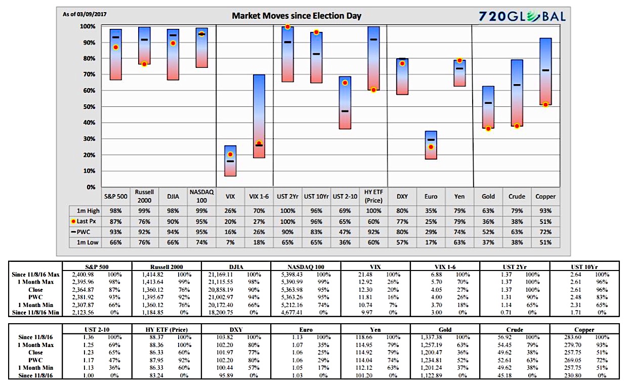
Trump Range Chart
In today’s case, the enthusiasm of pro-growth fiscal initiatives are destined to collide with decades worth of ill-advised economic policies and political obstacles. As such, we created the Trump Range Chart to track the performance of various key indexes and tradeable instruments since Election Day. This tool serves as a gauge of market sentiment and the market’s faith in Donald Trump’s ability to effect real economic change.
We suspect that when economic proposals meet political and economic reality, some markets will begin to diverge from their post-election trends. As is typically the case, it is likely that this will occur in some markets before others. Markets showing early signs of divergence may provide tradable signals. We plan on releasing this data regularly to help our clients track these changes. Based on feedback, we may produce new range charts to include different markets, various time frames, and economic data.
In the chart below you will find the range bars showing various market and index moves since the election. Below the chart is a user’s guide on how to read and process the information it offers.
How to read the charts
The data in the Trump range chart above is shown in a format that is quite different from what is commonly used to illustrate market changes. This format provides an easy way to view relative performance across a broad number of indexes and securities. It is intended to be a meaningful supplement and not a replacement to the traditional charts most investors review on a routine basis.
The base time frame captured by the graph reflects the market move for each index or security since Election Day, November 8, 2016. This change is represented by the 0% to 100% on the left hand axis. The 0% level reflects the intra-day low of the security since November 8 and the 100% level the intra-day high. For more clarity on the prices associated with the range, see the table below the chart for each respective index.
The (red/blue) bar reflects the price range of the past month relative to the base time frame. The black “dash” within the 1-month bar reflects the previous week’s closing level (PWC) and the red dot highlights the closing level on the “as-of” date in the top left corner.
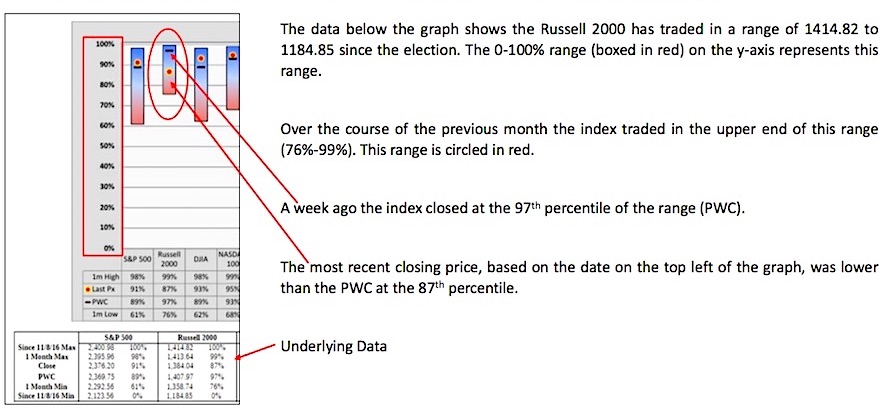
The diagram below isolates the chart and data for the Russell 2000 to further illustrate these concepts.
Thanks for reading.
Twitter: @michaellebowitz
Any opinions expressed herein are solely those of the author, and do not in any way represent the views or opinions of any other person or entity.


