Well, it’s already 2H now, and what a year it’s been so far for investors!
Following on from the original “10 Charts to Watch in 2019” and the Q1 update, here’s a half-time update on the 10 global macro charts to watch in 2019.
The key purpose of this article is to update the charts and see what’s changed, where I’ve been wrong, and what to watch for in the second half of the year and beyond.
In the original article, I shared what I thought would be the 10 most important charts to watch for multi-asset investors in the year ahead.
My original overarching thoughts/themes on the outlook were:
“Overall, the theme of “transitions” I think captures a lot of the major moving parts: a transition for central banks from suppressors to sources of volatility, rotation across assets and markets, and a transition stage in the business/market cycle. Risk is clearly elevated, but as the charts show; so too is opportunity.”
As for what’s changed at a high level on the outlook from here, the big thing is globally central banks are clearly trying to pivot back towards being suppressors of volatility. We’re certainly seeing signs of rotation across assets and markets and so far a lot of ranging. And with the global economic slowdown we are most certainly in a transition stage, but it is unclear whether this is a transition to a major global recession or that it ends up being a passing growth scare and subsequent re-acceleration. I remain in the latter camp… for now.
With that all said, let’s get into the charts!
[Note: I have included the original comments from back at the start of the year, so you can quickly compare what I’m thinking now vs what I said back then]
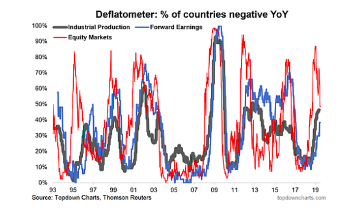
1. Deflation Risk: Following a fairly decent run of performance in H1 (MSCI ACWI Ex-US up over 11%, S&P500 up about 20%), the proportion of world equity markets in “deflation” has dropped from over 80% to now less than 50%. Basically stocks are pricing in more benign economic conditions now. So far there is some hope that the current global slowdown follows the 1995, 1999, or 2011 playbook. But the fact that over a third of countries we track are seeing contracting industrial production and forward earnings growth goes to show that there is, or at least has been, a genuine slowdown.
“Deflation Risk: as I write, over 80% of world equity markets are in “deflation” (price negative YoY%), the risk here is that we see the black and blue lines turn up (proportion of countries seeing forward earnings and industrial production contracting on an annual basis), and if they do it will probably leave us all feeling a little black and blue, because when it comes to economic deflation, what we’re really talking about is the risk of a global economic recession. Keep this chart front of mind and top of your radar this year.”
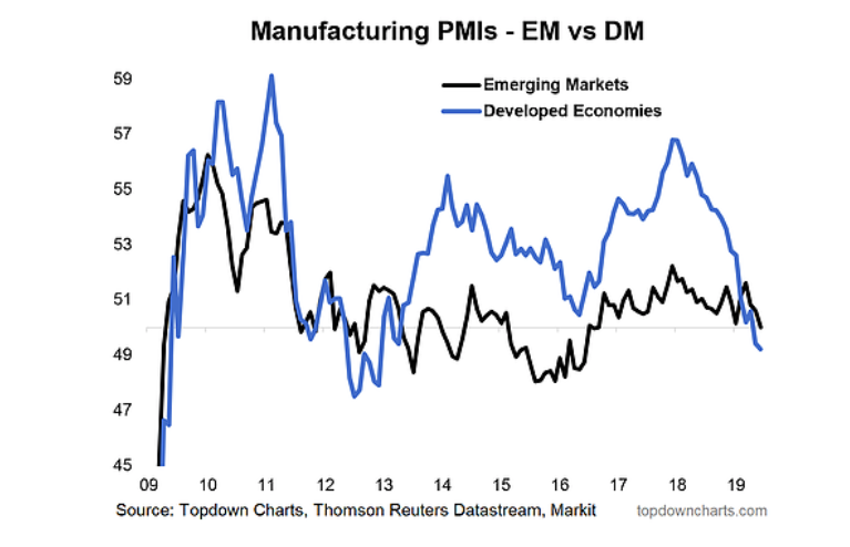
2. Manufacturing PMIs – EM vs DM: The manufacturing PMIs also reflect this, but I find this chart really interesting in that EM [Emerging Markets] has really just been plodding along, chopping in a tight range, while DM [Developed Markets] has basically fallen from grace (fallen from hype?). At present we are in a rare condition where the EM PMIs are higher than the DM PMIs. It’s worth keeping this economic divergence front of mind.
“Manufacturing PMIs: down with DM, up with EM? It’s early days, but we’ve been seeing some stabilization in EM economic data (and softening across DM). Given the growing size and influence of EM economies this could be a key chart in determining how the previous chart plays out.”
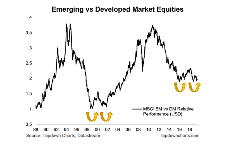
3. EM vs DM Equities Relative Performance: One key reason to keep that economic divergence between EM & DM front of mind, is this chart. EM vs DM relative performance has at least for the last few decades followed a long cycle of under/out-performance. Along with cheap valuations and some economic divergence (and perhaps most importantly, a very tired looking US$), I think we could be on the cusp of a potentially decade long period of outperformance by EM.
“EM vs DM – Equities: this one also ties in closely with the previous chart, because this emergent economic divergence is among the many factors (including valuation) which I think will help EM equities comfortably outperform vs DM in coming years.”
4. Global Cyclicals vs Defensives: On a shorter term basis, global cyclicals vs defensives have been something I’ve been intently focused on as they’ve provided a heads up on some of the major moves of the past couple of years in global equities. The standout in this chart to me, again is EM.
continue reading on the next page…


