 As those of you who follow my twitter account know, I have spent the last few years shifting the focus and strategy of my research from that of classic chart reading and technical analysis (subjective) toward a more quantitative focus. I have done this as a means of bringing better consistency to my institutional clients. Clearly, a more consistent performance in regards to my research is becoming paramount.
Since many of their concerns revolve around identifying risks within their portfolios rather than trade ideas, a key focus of mine has been to try and pinpoint MAJOR trend Commencement and ending Culmination zones with appropriate time context.
A quantitative measure that I have found extremely useful has been the Hurst Exponent. In a nutshell, this is a formula that can be used to measure TREND PERSISTENCE. More on this calculation can be found here.
And in full disclosure I don’t use the formula as it is linked to in this article. I have found a more proprietary calculation of this method that looks at a series of look-backs and timeframes as a composite to estimate the over all Hurst of a given market.
The main idea being that if you can simultaneously measure the Hurst coefficient or (SLOPE) of all market participants and timeframes into 1 composite you could potentially measure the entire state of which that market is currently in. There are other facets to the ExtremeHurst® signal, (developed my friend Kris Kaufman) that also have proven useful in my research. In addition to the Hurst coefficient composite, ExtremeHurst also overlays a universal pattern that is present in all markets and in all timeframes at or very near inflection points. This is called the Log Periodic Cycle. John Hussman, PHD talks about it here in this article and Didier Sornette, Professor on the Chair of Entrepreneurial Risks at Swiss Federal Institute of Technology Zurichas has recently done a TED talk on the subject here as well.
What I wanted to present here today was a sort of case study looking at some past and present ExtremeHurst signals and comparing them. This will allow you to see how some major inflection points have played out and why current markets may be signaling something ominous to come.
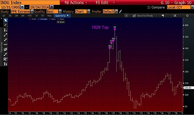
The first chart goes all the way back to 1929 and includes a quarterly chart overlay for the Dow Jones Industrial Average. This becomes a very interesting image to me. Albeit it looks simple with just a series of fucia triangles, the science behind what happened here is very foretelling. as the Stock Market Mania in the roaring 20’s came to a pinnacle. The ExtremeHurst was clearly showing that this bubble pattern had extremely strong trend persistence and also had simultaneously a very high rank (Measure of best fit) log periodic cycle.
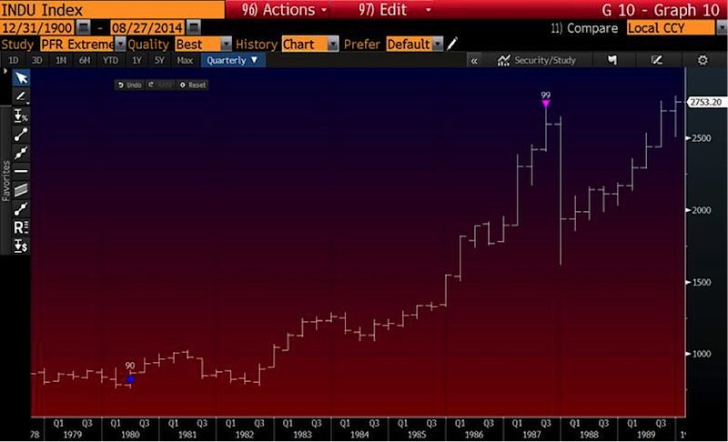
Now let’s fast-forward to 1987. Again on a quarterly scale, you can see that ExtremeHurst found again – it’s a very similar type of market state at the top of the 1987 bull market.
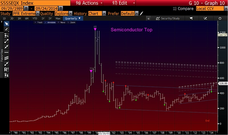
Moving on to the Nasdaq internet bubble of the 2000’s, we can see that this market was in such a mania that its set of ExtremeHurst signals were quite a bit early and found multiple instances within the same market. Below is a chart of the Semiconductor Index.
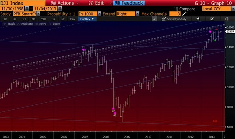
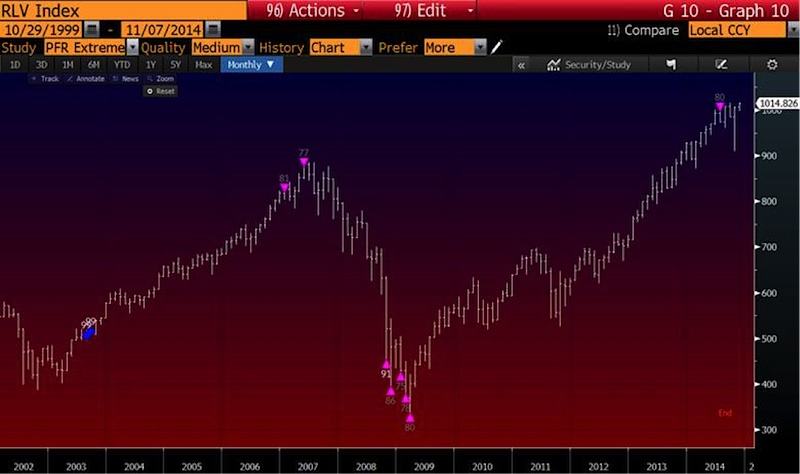
Fast-forward to 2007 and you will see that the Dow Jones Industrial Average and the Russell 1000 Index also had this extreme trend persistence and Log Periodic cycle before the 2008 crash.
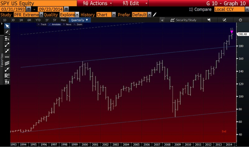
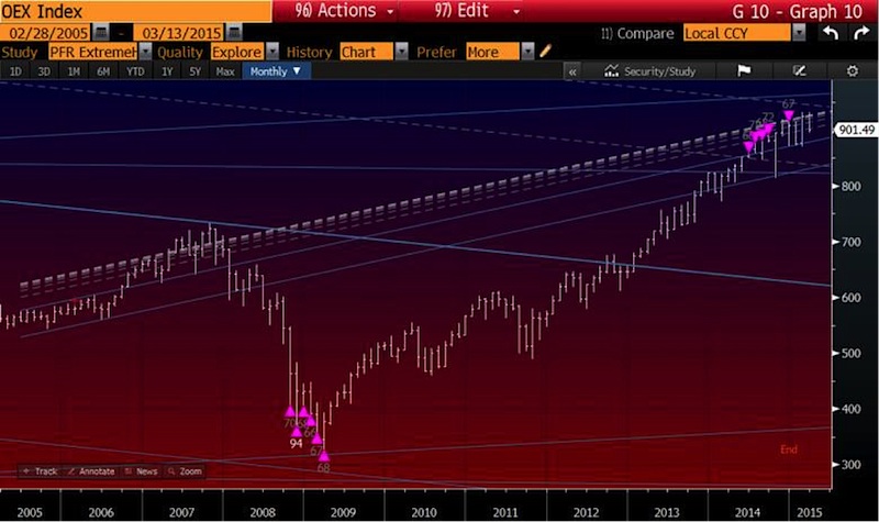
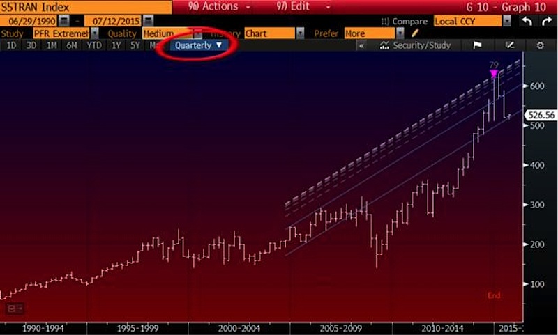
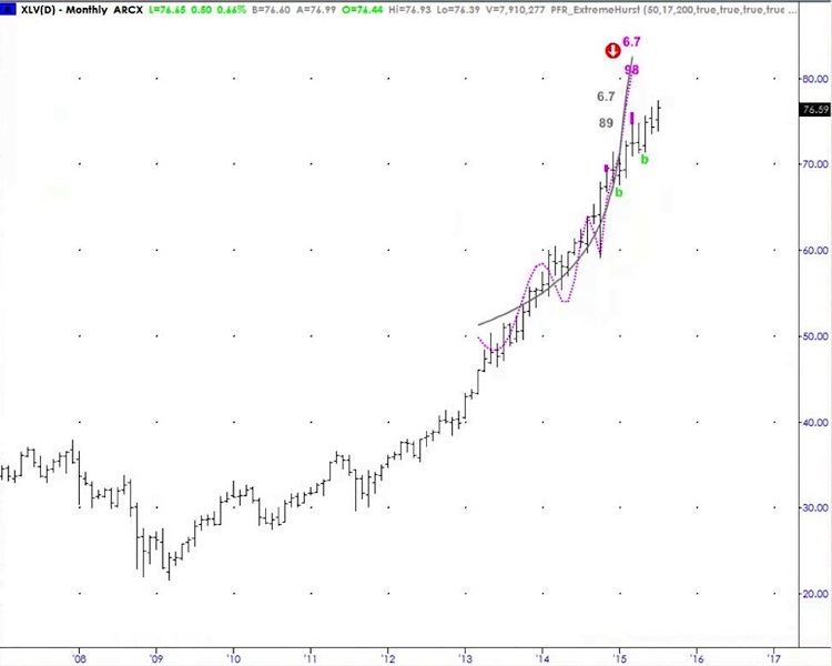
And now finally, let’s look at a few of today’s markets: The S&P 500 ETF (SPY), the S&P 100 Index, the Dow Jones Transportation Index, and the Healthcare Sector ETF (XLV).
I want to emphasize that the science behind ExtremeHurst is NOT a “crash meter” or “crash finder.” These signals show extreme market states and illuminate when in these states there exists in concert a Log Periodic cycling apex. The resolution of these signals is for the current trend to end, which does not imply crash or in some cases complete reversal. We often times see, (but did not showcase many) markets that have these signals which then experience a new state of NON-Trending or aimless log periodicity after cycling through the signal apex.
In essence a more accurate assumption or estimation that I use in my research with these measurements is to assume that a market will be flat from is prior trend with the possibility to reverse.
As we can clearly see in some of the current markets I have highlighted (SPY, OEX, TRANS, XLV) the same extreme market states have been popping up consistently across many independent data sets.
What do I think this means? In short, I think it means that the major US stock indexes are saying that this current bull market is getting long in the tooth… but as for where I think they go from here, it’s probably best to quote the expert in these signals:
“On a large scale, we have QUARTERLY scale extension tops on the S&P 500 (SPY), Transports, and the Russell 2000 Growth Index. This indicates a major “generational” top is building (the same signals were seen in 1987 and 1929), but as we’ve seen, it’s very hard to predict the exact end to the day, of these Bull Markets. But our long-term forecast based on the analytics of these signals is flat to down through early-2018.”
Thanks for reading.
Twitter: @interestratearb
Any opinions expressed herein are solely those of the author, and do not in any way represent the views or opinions of any other person or entity.


