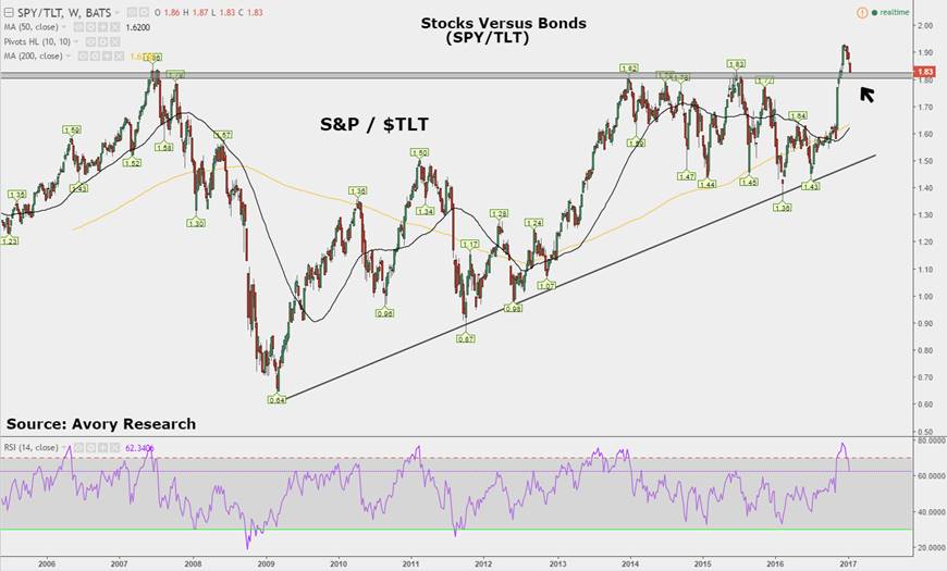
The most interesting chart in the world right now is the stocks versus bonds ratio chart.
Check out the chart below. Here we are simply measuring the ratio of the S&P 500 SPDR ETF (NYSEARCA:SPY) versus the iShares 20+ Treasury Bond ETF (NASDAQ:TLT).
The ratio is approaching the 2007 peak, and a series of resistance levels throughout 2014 and 2015. Following the Trump victory this pair shot higher, easily breaking out above the prior resistance levels. In my view the importance of this pair is the potential shift in sentiment, and how that relates to flow of funds.
Looking back to the 2007-2008 economic collapse and how it relates to this pair. The S&P 500 peaked on an intra-day basis on October 13th, 2007. The stocks versus bond ratio peaked that same year, however it did so 3 months prior. In essence money was shifting into bonds at a faster pace than into equities prior to the eventual collapse of equities.
On the technical front, if we see a breakdown of the new highs, this would be considered a false breakout, and the following move could be powerful to the downside.
From a directional standpoint the next move is anybody’s guess. However, I continue to monitor it to see if this is simply a re-test of the prior highs, or a breakdown from new highs. The next move will be a guide to how risk is being managed.
Stocks vs Bonds Ratio Chart (SPY / TLT)
Twitter: @_SeanDavid
The author currently holds a long position in TLT at the time of publication. Any opinions expressed herein are solely those of the author, and do not in any way represent the views or opinions of any other person or entity.


 Ready To Break Out?")

