 Are constructive market internals still affirming the S&P 500’s continual push above it’s secular 2000 and 2007 highs? Is S&P 500 Breadth beginning to cast legitimate doubts on a further rally without a meaningful pullback?
There are many ways to measure the question of participation and breadth: traditional indicators such as the A/D Line and On-Balance Volume, myriad variations analyzing New Highs and New Lows, and more sophisticated manipulations of raw breadth data like the McClellan Oscillator, among others. Each of these have different nuances, and except in fast, directional markets will read similarly.
One measure of participation in a move that receives a lot of (especially contrarian) attention during grinding rallies such as the one currently underway is the number or percentage of S&P 500 component stocks above key moving average X – let’s call them % MA.
In a bull market, relative strength among the 500 stocks in the S&P 500 (SPX) will vary, usually by sector and industry. General market momentum, however, will keep most of these stocks above their 200-Day Simple Moving Averages (200SMA). Many of these will trend above their 50-Day SMAs, many of those above their 20-Day SMAs, and so on depending on just how formidable the trend is.
For example, here’s a view of the percentage of SPX stocks above their 200SMAs, currently at 83.56%. As you’ll note, the strong impulse legs higher of the last 4.5 years have been predictably accompanied by a high percentage of stocks in the S&P maintaining a long-term up-trend, as defined here by trading above their 200-Day average.
S&P 500 Breadth: SPX Stocks Above Their 200-Day Simple Moving Averages
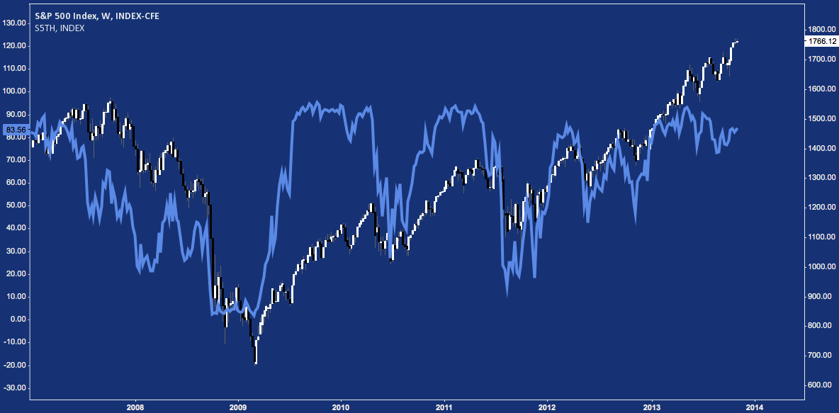
Predictably, these % MA metrics cap out around 90-95% on strong up-legs, often staying there in perhaps the best simple affirmation that the rally then underway is receiving across-the-board participation.
The chart above shows that once participation reaches its upper bound, it’s happy to stay there for a time while stocks continue to move higher – sometimes much higher. This seems like common sense – participation has to be persuaded otherwise to meaningfully decline, and broad market persuasion – in the absence of major macro events – is a process. Like the message of a momentum oscillator once in “overbought” territory, strong participation readings are trend-confirming until they’re demonstrably broken.
This “persuasion” does happen, though: always. Often it is slow; and then all at once.
The slow part is usually marked by a negative divergence: the index continues higher, but fewer stocks trade above the average. Another evident but important point: the shorter-term average metrics slip first and are thus more volatile.
Think of this as the index hollowing out from the inside. The structure of leading stocks in leading sectors is still there, but tiring; meanwhile less conspicious constituents are plateauing or even selling off. A decline doesn’t mean all stocks are declining: only that the momentum they enjoyed is leveling off, allowing these key moving averages to race up to meet them. At that point, nominal selling can breach the moving average; and thus the % MA metric takes a hit. In short, at the least we can say divergences mark a slowing market, not a reversing market. The former can be a hint to the latter, but confirmation must come from elsewhere.
Having considered that momentum trends are not price trends, slowing momentum nevertheless often presages a price reversal. It’s worth repeating that this is a process – not the stuff of short-term trading. Think of these occurrences as analytical inputs, not standalone market-timing signals.
So: do these negative divergences matter?
To gauge this, here’s a 5 panel chart showing the correlation between SPX and these % MA measures from late 2007-present. The first panel is of the S&P 500 itself; while the lower four show the correlation of the SPX to a spectrum of % MAs, looking at 1) 20-Day, 2) 50-Day, 3) 100-Day, and 4) 200-Day Simple Moving Averages.
S&P 500 Breadth: SPX and Correlation to Participation Moving Average Measures
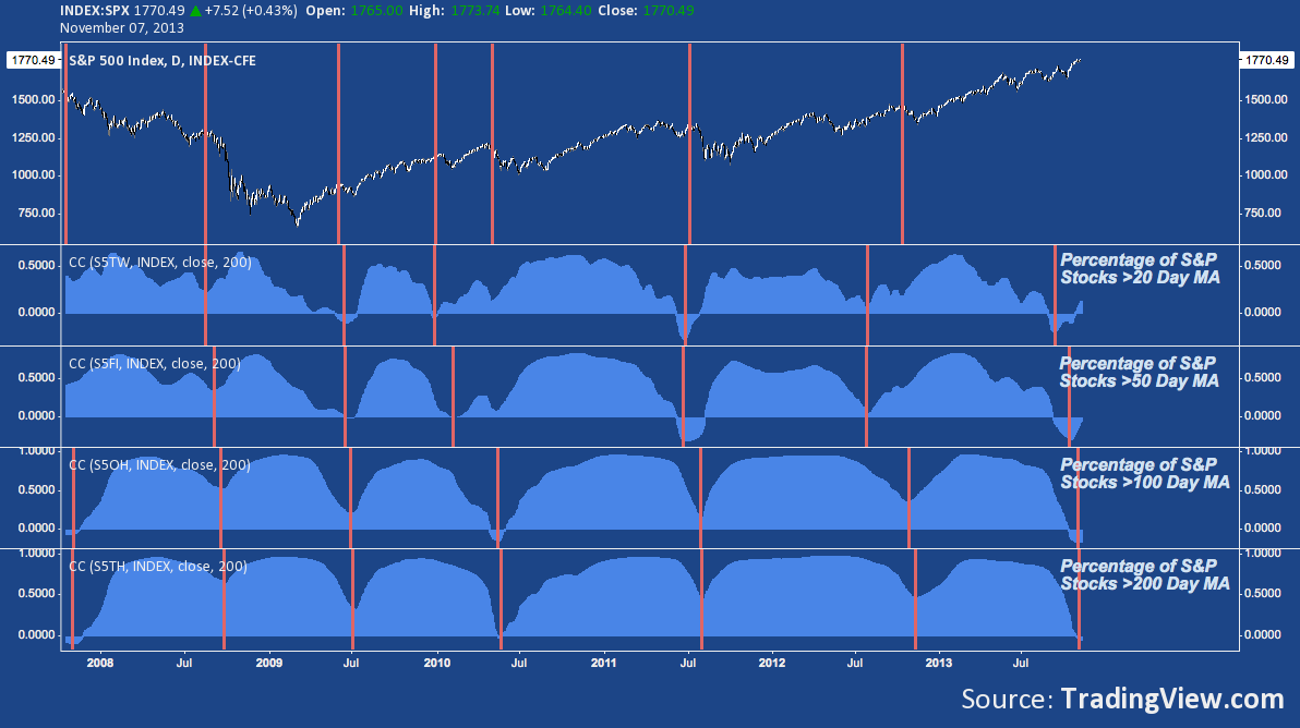
The longer-term the moving average, the less volatile the measure. Nevertheless from the more twitchy “% of stocks above their 20SMA” out to the smoothly rolling “% of stocks above their 200SMA”, major shifts in breadth register similarly across each metric.
In the chart above, the vertical orange lines on price generally denote pre-corrective tops. Not every top; but many of them, including the 3 major moves down – Fall 2008, Spring 2010, Fall 2011 – of the last 6 years. On the lower 4 panels, points where the usually positive correlation (i.e. whether SPX is moving more or less in lockstep with its component stock moving averages) breaks down heavily are noted – toward zero and the rarer instances where these measures move opposite the S&P.
The takeaway from this chart: points where the correlation between SPX and participation is lowest generally coincides with cyclical tops and providing leading (in the case of shorter-term) and/or coincident (longer-term) signals of SPX pullbacks and corrections.
As for application, one immediate point to consider: where these % MA measures dive to a random (i.e. 0) or negative correlation and an SPX pullback/correction has not yet occurred, it’s worth paying close attention. One of those times is now.
Twitter: @andrewunknown and @seeitmarket
Author holds no exposure to securities mentioned at the time of publication.
Any opinions expressed herein are solely those of the author, and do not in any way represent the views or opinions of any other person or entity.


