 Despite a renewed pullback and fears of a deeper stock market correction following the reprieve in the beginning of last week, the highly uniform rising trend in US equities that characterized all of 2013 continues as we move deeper into April. Among benchmark domestic stock indices, over the past year the regime of relative strength (RS) has been “bottom up”: the tech-heavy NASDAQ 100 (QQQ) led, followed in order of decreasing returns by Small (IWM), Mid (MDY), Large (SPY), and Mega (DIA) cap stocks. Top to bottom, QQQ still outperforms DIA almost 2:1 over a rolling 12-month period:
US Equity Indices: “Bottom Up” Relative Strength (click image to zoom)
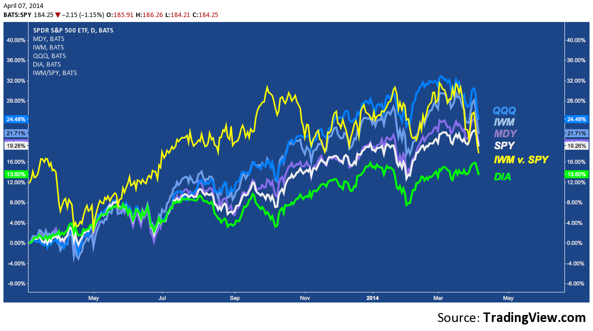
Overall, a “bottom-up” RS regime signals a healthy risk appetite still prevails: the speculative appeal that drove equity flows so strongly into Tech and small cap leveraged beta last year is unbroken.
But close observation of the chart above alludes to recent cracks in the seamless veneer that has confounded bear and bull alike with it’s indomitable symmetry and consistency. Since early March, relative strength according to market capitalization has inverted: pullback participation is muted among mega caps, becoming incrementally greater in Mid (MDY) and Small (IWM) caps while the NASDAQ 100 (QQQ) fares worst of all:
This diffusion of strength (or concentration of weakness) across market caps is something new: just look at January and now above to see a clear side-by-side contrast. The current pullback feels different and there are convincing reasons to suppose it’s symptomatic of the waning of a long era of Small cap outperformance, visible in the chart below where the rising trend denotes 15 years of the Russell 2000’s dominance over the S&P 5oo (blue line in the main panel):
Russell 2000 v. S&P 500 (RUT/SPX) – Monthly: The Long History of Small Cap Outperformance
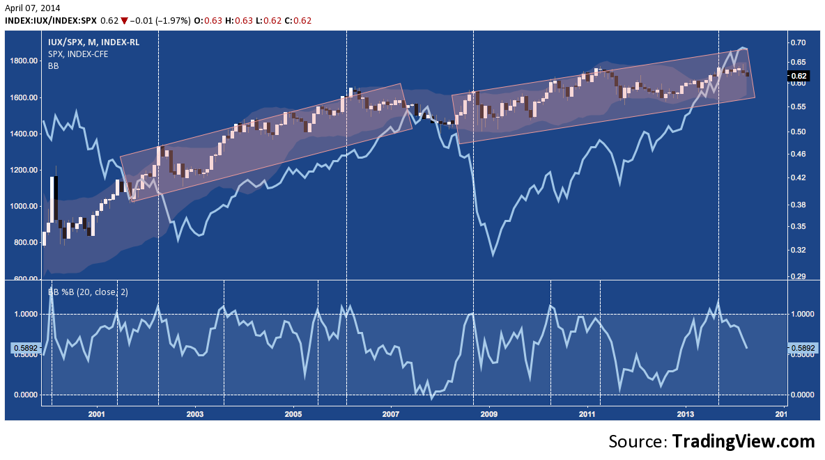
The bottom panel (Bollinger Bands %B) points out with vertical lines where the upward momentum and positive volatility favoring the Russell crests. This relationship is hardly a timing tool so it shouldn’t be overstated; but in general crests above 1 (where small caps are strongest) are indicative of 1) nominal upside remaining, 2) an exact top on the wider market; or 3) a decline already in progress. A sequence incorporating each of these during the slow plod higher on RUT/SPY between 2002-2007 (red horizontal rectangle on left) has repeated itself over 2009-2014. If Mega and Large caps continue to assert leadership here, the medium-term outlook for equities becomes a much more challenging one.
Whether or not this shift is indicative of a speculative rot that is about to buckle under the weight of stumbling momentum, these indices all feature medium and long-term technical builds suggesting the path of least resistance is down. Here’s a selection of them across major domestic indices:
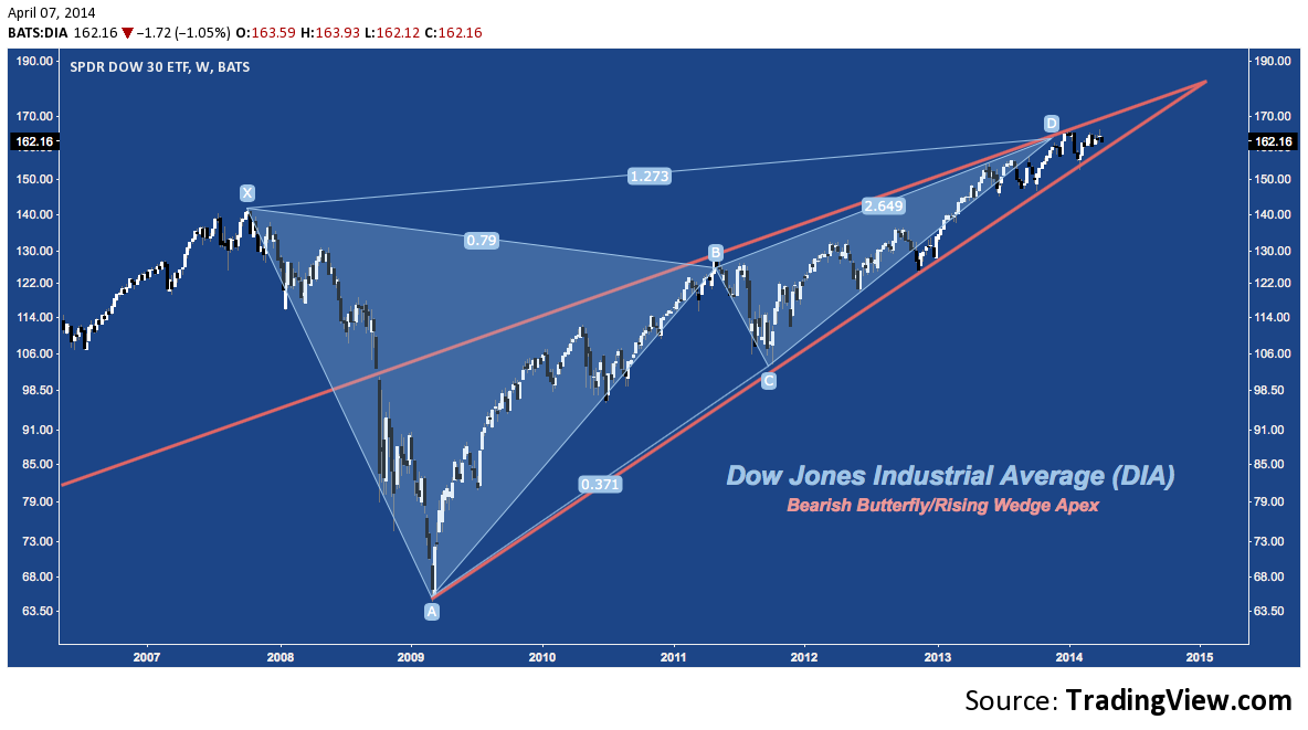
Dow Jones Industrial Average (DJIA, DIA)
The Dow exhibits a Bearish Butterfly that has been in congestion since late 2013 around it’s 127.2% fibonacci extension (at ‘D’). Coming as it does near the end of a 5-year rising wedge (orange), the question is whether the index will break higher or lower. Until proven otherwise, the pattern argues for a downward resolution.
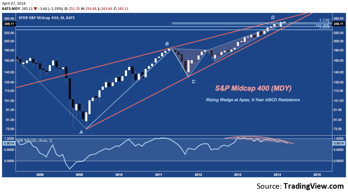
S&P Midcap 400 (MID, MDY)
Mid-caps bear the same rising wedge as the Dow, a recurrent theme we’ll see more of below suggesting a binary, broad market outcome despite whatever shifts occur in market cap RS. MDY is contended with this at ABCD and cluster resistance between 230-250. A major shelf of support near 200-210 from Q2-Q3 2013 sits at 200-2010, with the next major rung lower near 175-180 at ‘B’.
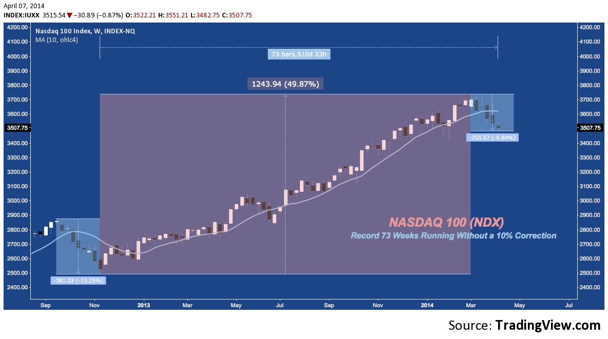
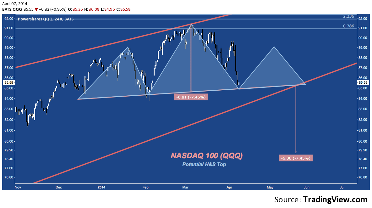
NASDAQ 100 (NDX, QQQ)
Despite the damage the NASDAQ 100 has incurred, it is now 73 weeks into it’s record (since inception in January 1985) of consecutive weeks without a -10% (or even -7.5%) correction. The current breach beneath the 10-Week (like the 50-Day) Simple Moving Average (SMA) is the longest (2 weekly closes) and deepest since June 2013 and is the best candidate since to threaten the historic run.
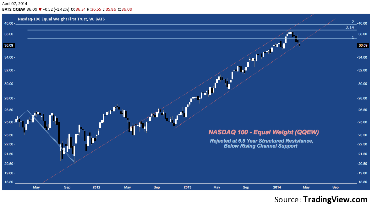
A few basic constraints aside, NDX is a capitalization-weighted index; and despite holding 101 stocks (now +1 with Google’s recent split) it’s performance can become very lop-sided. A valuable alternate view for getting the mean of any cap-weighted index is it’s equal-weighted complement, such as QQEW below. Unlike the more sinuous curve up in 2013 on NDX, QQEW’s progressed higher in tight channel: up until cluster resistance around 38. Now the index is working on it’s 6th consecutive week down (a rare occurrence you won’t elsewhere in the last 3 years, at least) and has broken lower from 2013’s rising channel.
Turning back to the cap-weighted variant of the NASDAQ 100, QQQ (just like DIA and MDY) is nearing it’s 5-year rising wedge apex. Rejected (again: see January) in March at structured resistance, the index is now testing wedge support. In an illustration of the dark side of steep momentum, there’s little in the way of a technical foothold on a break lower until the mid-70s and no real support until 70 at 2012’s horizontal resistance.
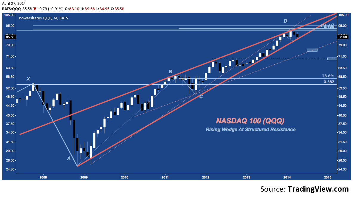
Not many short-term charts here, but this is one: QQQ is constructing a potential Head & Shoulders Top. At this point, a completion of this pattern (aside from a drop lower from here) is the leading scenario for how the NASDAQ 100 resolves it’s multi-year wedge lower.
Checking in on Small caps:
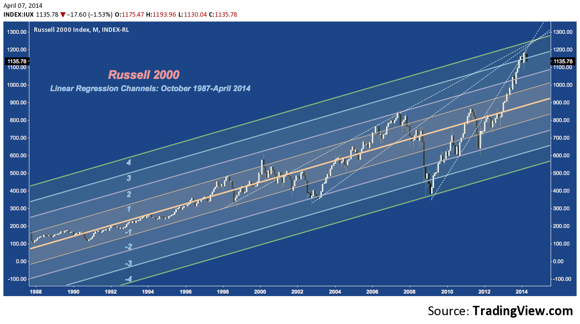
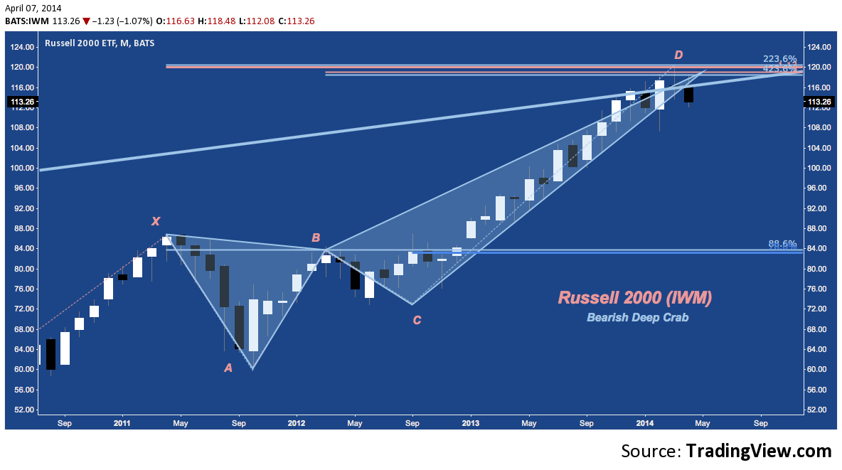
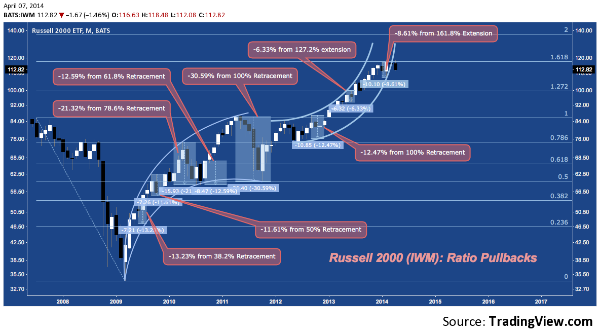
Russell 2000 (RUT, IWM)
The Russell 2000 is struggling at a major confluence of secular and cyclical trend line resistance some 3.5 standard deviations above it’s 25-year regression line. Look no further for a chart that technically depicts the index’s precarious footing at historically high Trailing 12-Month P/E and amidst a frightening prevalence of unprofitable companies.
Looking closer, the last 5 years have pushed aggressively higher through a rising channel to trend line and structured resistance. The bearish harami star in February/March are getting some early vindication this month as initial downside follow through has broke through the rising channel off IWM‘s November 2012 low.
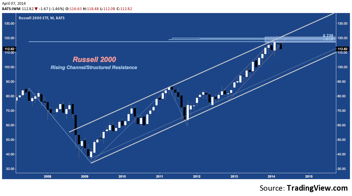
Splitting the channel in half, IWM capped at it’s Bearish Deep Crab potential reversal zone (PRZ) around 120. Lateral support around 110-112 since November; but after rejection at this confluence of resistance, the pressures pushing the index to fail there have mounted.
The Russell 2000 has pulled back or corrected (deeply: see 2010, 2011) at every major fibonacci retracement and extension of the 2007-2009 range. February’s pullback saw IWM shed -8.61%, which is the second shallowest pullback (after last Summer’s -6.33%) of the entire series. Now outside of it’s rising arc and in light of the patterns above, it appears the ground lost at the 161.8% extension may go deeper.
 Zooming out again on IWM, after a pop above (but close below) secular trend line resistance in March, the index is giving acknowledgement to its “Rule of 26”, the 10-year rubric under which every leg lower and higher is ~26 points (with a few being 13, and 2002-2007, 2011-2014 being 52). This has created (and been a function of) very symmetrical price action over the past decade. If the pattern continues, it suggest a long consolidation around this level, at best. An alternate scenario (favored here, for now) is a drop lower to retest the late 2012 break to all-time highs above 86.
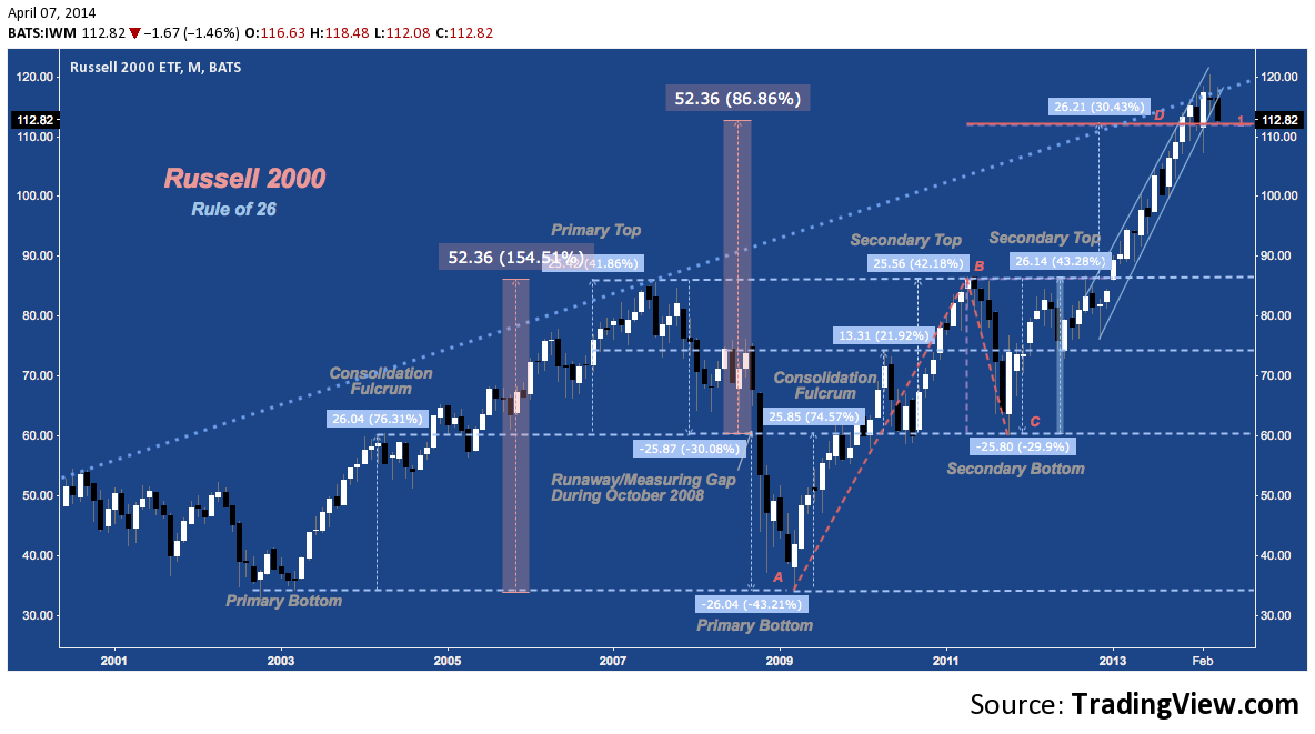
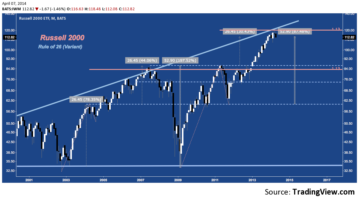
Here’s a variant of Rule of 26, comparing the symmetry of the 113% extensions on IWM‘s 2002-2007 and 2009-2014 legs:
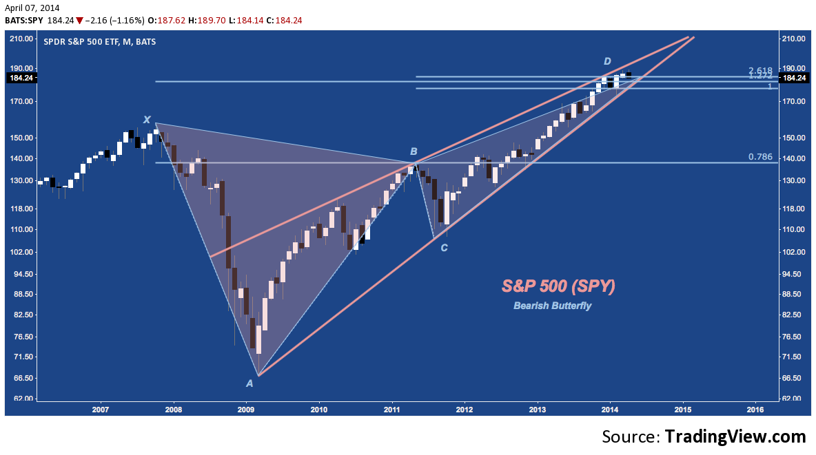
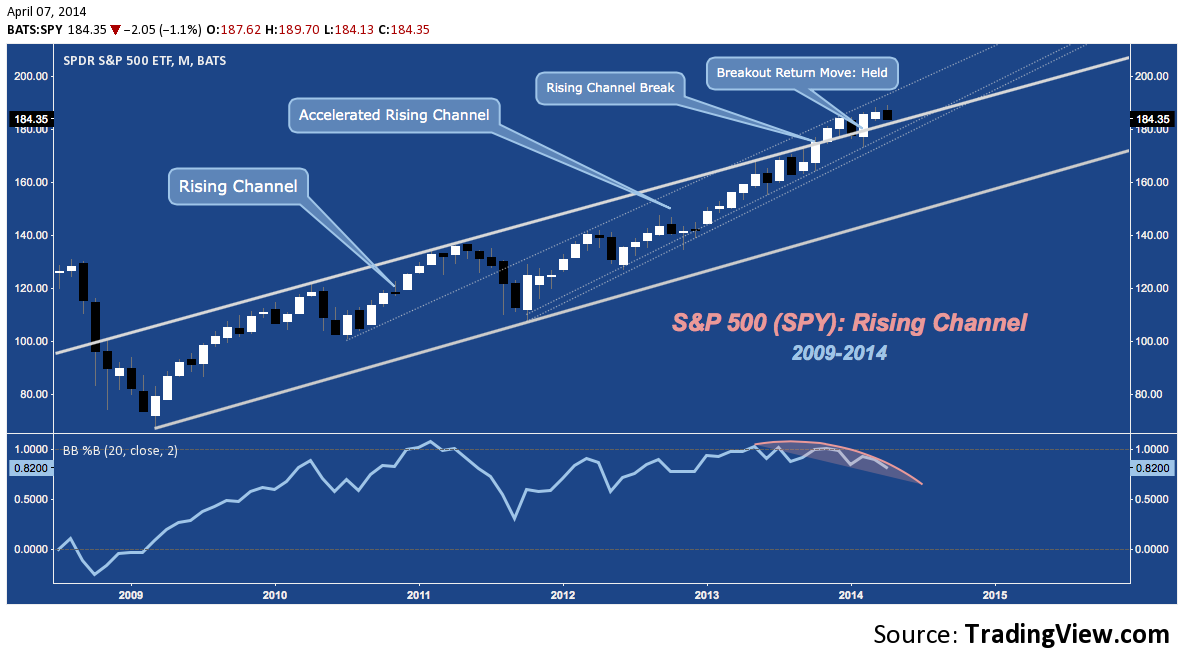
S&P 500 (SPX, SPY)
No index review would be complete without a glance at the S&P 500. No surprises here: SPY exhibits a) a Bearish Butterfly at its PRZ while b) struggling at cluster resistance; and winding out c) a 5-year rising wedge. Below the congestion of the last several months (braking 172-173 would do it), real support comes in on a retest of the 2007 high (at ‘X’) near 156 (1560-1570 on SPX).
Looking at an arithmetic chart of the last 5 years, SPY‘s wedge becomes a channel from which it has broken in an accelerated trajectory (begun Q3 2011). So far the channel break has held; but failure to press higher (a plausible scenario given its flagging momentum) means a failure back into the channel; and perhaps a long-delayed return to channel support below 160.
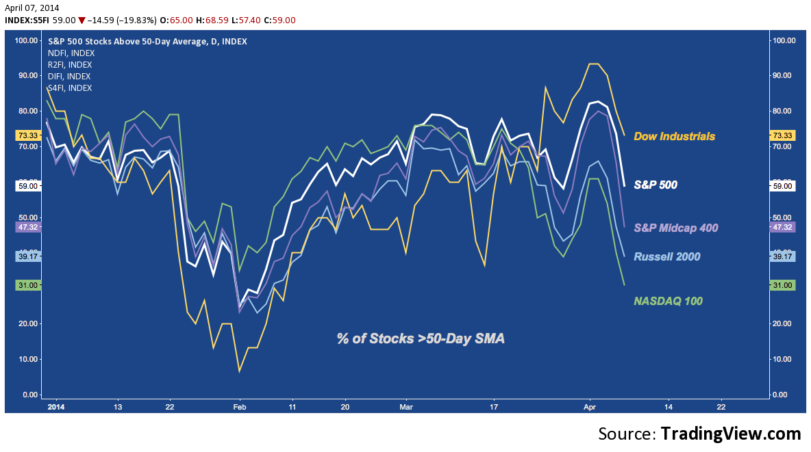
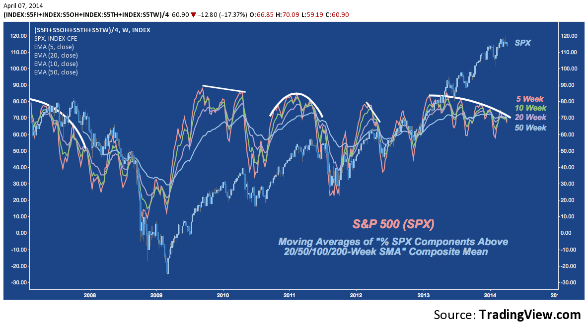
The final chart here – a composite of the percentage of SPX stocks above various moving averages – is one of my favorite expressions of longer-term broad market breadth. The deteriorating participation it suggests is slowly mounting beneath the surface may resolve higher; but as this measure turns over week-by-week (as it has over the last year), apprehension about a deep stock market correction (as timeworn and hackneyed as that phrase seems) remains alive and well.
Twitter: @andrewunknown and @seeitmarket
Author carries net short Russell 2000 exposure at time of publication. Commentary provided is for educational purposes only and in no way constitutes trading or investment advice.
Charts courtesy of tradingview.com
Any opinions expressed herein are solely those of the author, and do not in any way represent the views or opinions of any other person or entity.


