US stocks seem like they’ve been split in two by the current pullback. Or is it 4? The number depends entirely on what segment of equities you’re looking at.
However bifurcated or otherwise sliced up the price action feels lately, a single unifying theme has emerged: despite superficial appearances, reassuring commentary and unremarkable closing statistics, risk is getting punished underneath the surface.
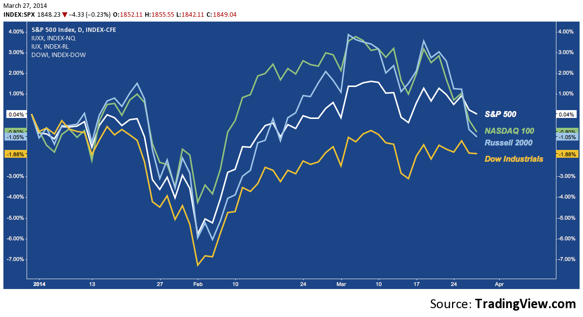
Following today’s close, the S&P 500 is once again flat for Q1 2014. Not much to look at, but the large cap benchmark is modestly outpacing the NASDAQ 100 (-0.8%), Russell 2000 (-1.05%) and Dow Industrials (-1.88%) YTD.
After the early February bottom, a broad dispersion of performance took hold across US indices as the NASDAQ 100’s (NDX) relative strength into the January pullback asserted itself on the bounce. At the same time, the S&P 500’s (SPX) initial strength flattened out, trading placed with the Russell 2000 (RUT) as it pushed aggressively higher to recouple with the NASDAQ 100 in the beginning of March.
If anything, the current pullback has compressed broad equity performance, effectively reining high beta in and dragging every other index toward the Dow’s (DJIA) lethargic baseline:
Broad US Equity Index Performance, YTD 2014: (click image to zoom)
As I’ve been hearing from various quarters, though: it doesn’t feel like that. In fact, there are many sectors (e.g. the Consumer Discretionary ETF, XLY is -4.16% YTD), industries (Biotech is the obvious choice here) and other cross sections (e.g. the current basket of favored momentum stocks) suffering material declines belied by the S&P’s trivial -1.85% dip off last week’s all-time high.
Peering underneath the surface, we see the constituent stocks of each of these indices have radically different rates of participation in the pullback. First up, check out the percentage of stocks remaining above their 20-Day Simple Moving Average (SMA) across these key market measures:
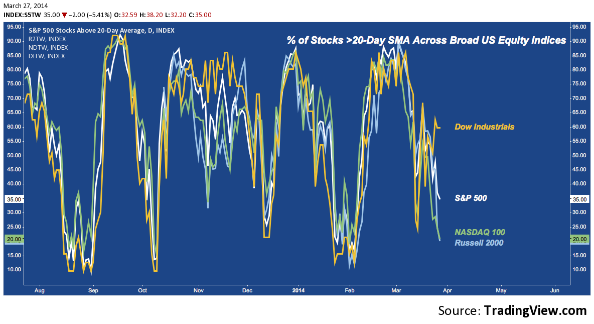
Interestingly, DJIA moved in lockstep with the other indices into the March high on rally participation, even though it’s aggregate performance lagged. This means it’s individual stock participation was just as broad as, say, the Russell 2000’s; but the gains generated were much less spectacular. And now – though it’s in last place on YTD performance – it’s the relative strength leader on this pullback.
Here’s the same study using the 50-Day SMA. The participation rate is even more varied:
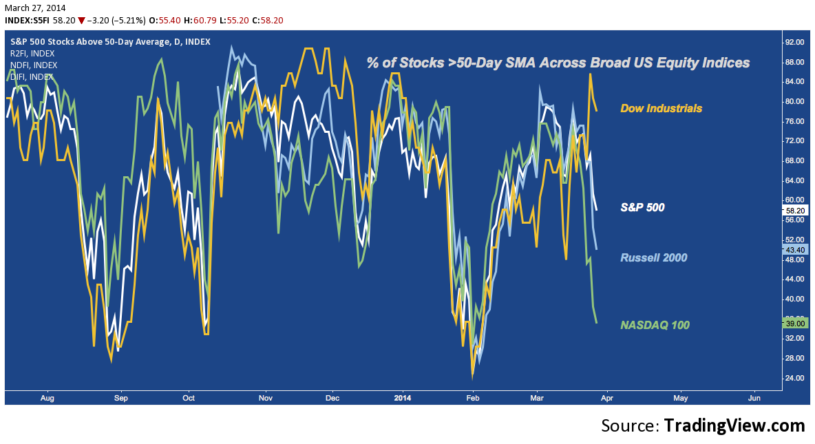
This speaks to the “feeling” the Russell 2000 and NASDAQ 100 are getting hammered while “large caps” are barely sinking. The number of Dow components above their 50-Day SMAs is consistent with recent peaks, while the NASDAQ 100’s rate is consistent with recent bottoms!
Zooming out, here’s the % of stocks in each index that remain above their 100-Day SMAs:
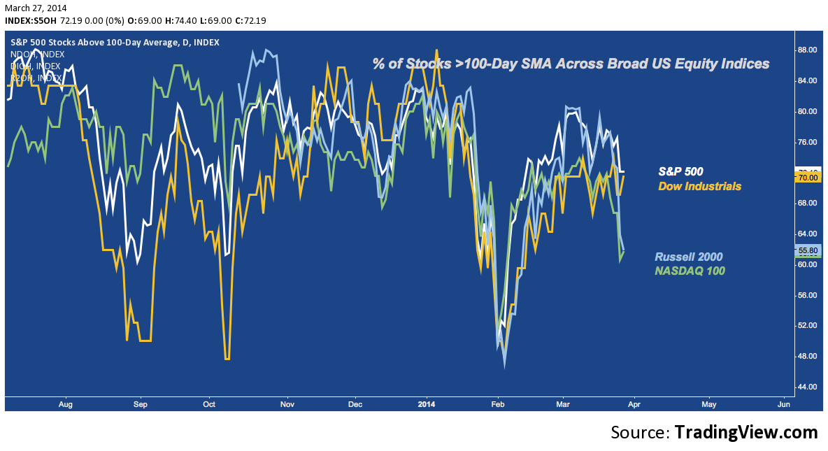
On this time frame, the NASDAQ 100 and Russell 2000 rate below the October pullback low, but still appreciably higher than the February low (i.e. there’s no uniform march of higher lows in tandem with price). Importantly, though the S&P 500 itself made a higher high, the number of SPX components over their 100-Days did not. The Dow did not make a new high with the S&P in March; and it’s % >100-Day SMA measure didn’t come anywhere close.
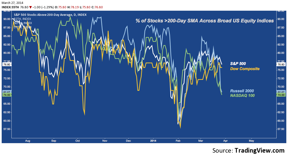
Here’s the % of stocks >200-Day SMA across the indices. A similar theme is present: beta leverage coming off hard, while large caps are suffering a comparatively muted drop. Note here, though: every index has made the same series of lower highs over the last 6 months. Additionally, more stocks are becoming susceptible to cratering beneath their 200-Day SMAs (note the Oct/Feb lower low), even while prices march higher.
Given these studies, here are a few themes to consider.
- High Beta and Small Caps are underperforming. This may be nothing; or it may be symptomatic of a huge shift.
- Market Cap and Sector Rotation is favoring defense. This is the message of the relative outperformance of the DOW and S&P; and of the strong showing seen in Utilities (XLU) and Healthcare (XLV), in contrast to the inability of Consumer Discretionary (XLY) to recover the leadership role it had before 2013’s anemic holiday retail performance scuttled it’s relative strength.
- Breadth and trend participation have been leaking lower for a year as the increasing and broad forfeiture of the 200-Day SMA across indices above demonstrates.
- RUT and NDX are looking short-term oversold, so a momo-led relief rally may be in the offing. But the defensive posture this time around is different: though it’s valuable information as longs attempt to figure out “what’s working”, the fact that large caps haven’t been sold as heavily (yet?) isn’t encouraging.
And finally, check out the following chart: it averages all of these “% Above SMA” metrics (for SPX) into a composite percentage and further smooths that out with 5, 10, 20 and 50 weeks moving averages. I realize that sounds like a logic puzzle: just think of it as an average of the average SPX component trend participation across time frames. According to this set of metrics, participation is declining – and has been for a year. Looking at how far the current pullback is above even the modest participation dips of the last year (to say nothing of 2007, 2010, 2011 or 2012’s divergences): the current decline probably isn’t over.
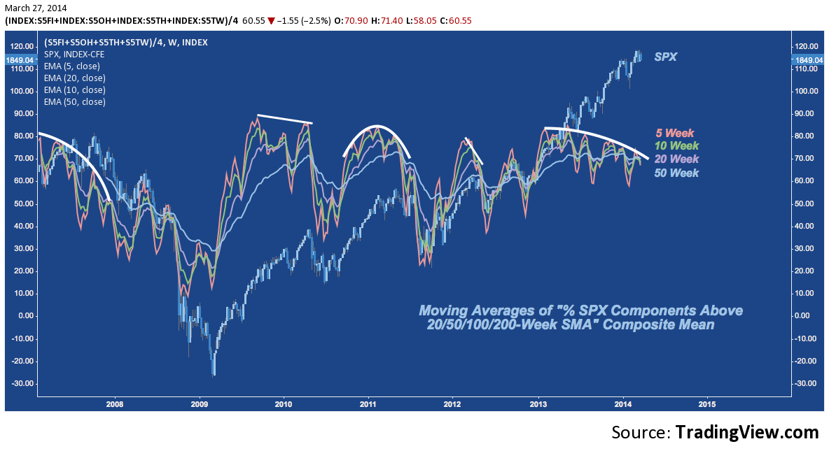
The most pressing question of all derives from this last chart: will the larger divergence underway over the last 13 months continue? Is the defensive shift in leadership actually just an occurrent symptom of a deeper deterioration that festered through the market’s best year since 1997? If so, the pullback may be just beginning.
Twitter: @andrewunknown and @seeitmarket
Author carries net short Russell 2000 exposure at time of publication. Commentary provided is for educational purposes only and in no way constitutes trading or investment advice.
Charts courtesy of tradingview.com
Any opinions expressed herein are solely those of the author, and do not in any way represent the views or opinions of any other person or entity.


