As a technical analyst I have many tools at my disposal for analyzing the markets. But in this post I’m going to highlight a type of charting that I really enjoy that isn’t referenced all that much. It is point and figure charting. I’ll provide a brief backdrop, then use point and figure to analyze the S&P 500 (SPX).
First, many market participants who use social media either aren’t using point and figure charts or just don’t share their insights on them. For that purpose I feel that I am offering something fresh and different when writing about point and figure charting. Secondly, point and figure charting addresses what is most important in the market and that is price. Although indicators may be added to point and figure charts, such as Bollinger Bands and trend lines, it is purely price that adds to a column of X’s or column of O’s which in turn, generates a buy or sell signal.
There are different parameters which can be used for point and figure charting. First is the box size which can be a percentage number (1% is most commonly used) or a numerical value and even the average true range may be used for box size. Next is the decision of reversal amount which will show a change in column direction from up to down and vice versa. Most commonly used reversals are one or three box reversals. Right here I should note that one box reversals are more short term oriented as it only takes a one box signal to reverse price as opposed to three boxes. The final data point is whether to use high/low intraday prices or the closing price. This too is a style preference and I use both. However, from my experience one has to experiment with both on different securities and indices to gain a comfort level of their knowledge and the vehicle being charted.
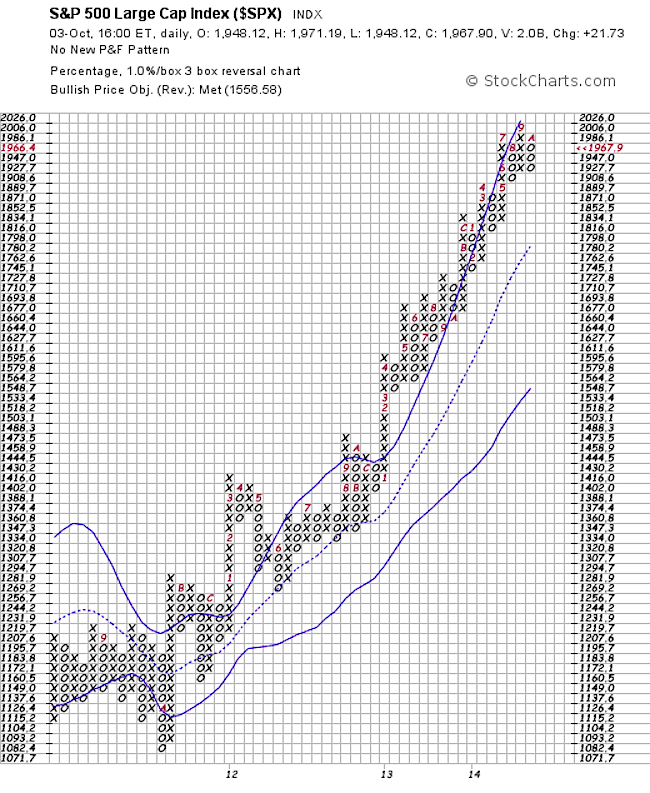
So now that we have a very brief overview of point and figure charting, let’s address the attached chart of the S&P 500 (SPX). In this analysis, we’ll look at what’s been happening for over two years and more importantly what we can extrapolate from the chart now. The parameters that I have chosen are one percent box size with a three box reversal using high/low price data. Since the double top buy signal in June of 2012, the market has been in an uptrend and hasn’t issued a sell signal for the duration of this move. If this was all that was used for deciding whether to be long, short or out of the market, one would have been handsomely rewarded. Impressive, right? What is also important to note is the strength of the trend. Price has ridden the top Bollinger Band up for almost the whole move and the moving column average (middle Bollinger Band) that acted as support early in the trend clearly has an upward bias. Most recently, another double top buy signal was given in September with the 2006 print.
S&P 500 Point and Figure Chart
This type of charting is not a “Holy Grail” but a different way of looking at price which ultimately is the bottom line. Some may argue point and figure charting is more objective rather than subjective and perhaps there is some truth to that as buy and sell signals are explicit. There is a great deal more to point and figure charting and I look forward to posting more educational pieces on the subject. In the meantime I think this is a good introduction and also sheds some light on the S&P 500 over the past two years.
One can reference Jeremy Du Plessis who has a great book out “The Definitive Guide to Point and Figure” which I highly recommend if you wish to really grasp the intricacies of point and figure charting. Thanks for reading.
Follow Karl on Twitter: @Snyder_Karl
No position in any of the mentioned securities at the time of publication. Any opinions expressed herein are solely those of the author, and do not in any way represent the views or opinions of any other person or entity.


