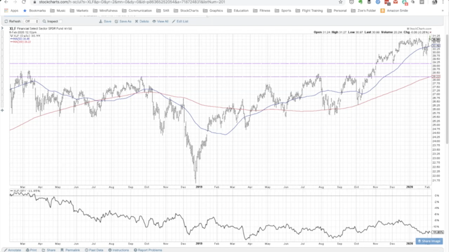
For this week’s One Chart, I’m sharing with you the chart of the Financial Sector ETF – ticker symbol XLF.
When you look at the SPDR Financial Sector ETF (XLF) over the last two years you can see this broad basing pattern.
There is a low from the end of December 2018 surrounded by a series of higher lows earlier in 2018 and then to the right in 2019 we have these sort of short-term pull-backs.
It appears what we would call an inverse complex head and shoulders which means it is a low, surrounded by a series of lows on both sides.
What is interesting about this pattern is if you look at the neckline, which is around the 28-25 level on the XLF you can see we finally broke above that in October 2019. The Financial Sector broke above 29, which is pretty impressive. We pulled back to test that 29 level in December 2019 and then broke onto new highs.
Most recently at this point, the XLF has been trending higher, higher highs to higher lows above to upward sloping moving averages, the 50 and the 200-day. An interesting thing happened though at the end of 2019 and the beginning of 2020. From the end of December to the beginning of January, you can see that the uptrend stalled a bit. So it rallied in mid-December then plateaued, not really pushing to higher highs, not really moving to lower lows – just sort of hit an equilibrium.
For chart-speak, when you hit an equilibrium that essentially means that we have decided on a proper price. Collective market participants have decided that it is worth about $30.75 per share for the XLF.
Then if you look at the second half of January, it broke below the 50-day which many times is a warning sign that things may not be as strong as they seem. If you look over the 4 weeks before that you can see the relative strength started to turn lower. While things like the Technology Sector ETF (XLK), were moving onto new highs, the broad S&P 500 Index moving to new highs, the XLF was stagnant which is what caused this little bout of underperformance.
I believe right now is a key time for the Financial Sector ETF (XLF).
At this point, one of two things will happen. Either it is able to push through above resistance (above 31-31.50) suggesting enough buying pressure to push the sector much higher and participate in the overall market uptrend. The alternative scenario is that it fails among these levels and gets back below the 50-day (below 30) and starts to go down into this range. Either it backs and fills into this range and starts to break to new lows, for example, if it breaks below 29, that would be a fairly significant breakdown. That would break the low from early December. Even a break from 29.75 (the low from January) would certainly suggest a lower a lower low and potentially break this pattern of lower lows, and higher highs that has continued up through this point.
Here’s a video discussing these scenarios in depth:
To conclude, the XLF is an interesting one because the market can rally without financials however, as a bullish investor, I would feel better if the XLF financials were participating.
Twitter: @DKellerCMT
The author does not have a position in mentioned securities at the time of publication. Any opinions expressed herein are solely those of the author, and do not in any way represent the views or opinions of any other person or entity.


