This week’s One Chart is a chart of the SPDR Utilities Sector ETF (XLU).
On Thursday, February 13, the stock market started fairly strong, then pulled back a little bit into the red even though small and mid-caps were up a little bit.
But on a day when the stock market was holding up just fine, instead of it being led by offense, it was instead led by the defensive sectors (such as utilities and real estate).
When consumer staples are numbers 1, 2, and 3, it feels like a little bit more of a rotation to the defensive side of the ledger. But if you look at a chart of the XLP it has actually held up beautifully.
This is one of those times when just looking at the price itself doesn’t give you the whole picture.
If you look at the price of the Utilities Sector ETF (XLU) over the last year, it has been making a consistent pattern of higher-highs and higher-lows.
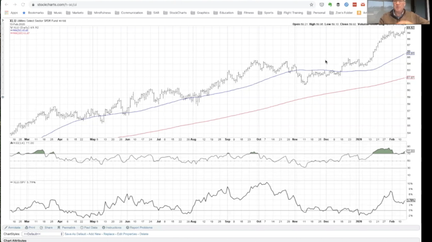
We have a basing pattern in the 4th quarter of 2019, a consistent resistance level just around 64.50 for the XLU and finally breaking above that in the first few weeks of 2020.
Since then it once again has had a shallow pullback in the last couple weeks and one again, new price and closing highs for utilities.
So overall, that seems very constructive. If you just looked at the price itself you would probably feel pretty good about the chart looking that constructive.
Two things to think about:
If you look at the momentum it may not be as potentially attractive. The RSI has become extremely overbought (back at the end of January) meaning the upside-momentum was so significant. When something becomes overbought with an RSI above 80 that usually means a bit of a pullback and then a resumption of the uptrend at least 1 more leg higher. This is where I feel we are at right now with the XLU going to new highs once again.
Currently, the RSI on the daily chart now is at 77, which means it is really close once again to that extremely overbought level. So if the RSI gets above 80 that means that the upside momentum is so strong that we may see a pullback, followed by a resumption of the up-trend.
What is interesting is the relative performance at the bottom, or the relative strength. What you see is that it is sort of range bound because things like technology, semi-conductors, bio-tech, consumer discretionary, etc., have all sort of outperformed. Even though they have also been an uptrend, they have been accelerating much more than utilities, so overall their strength is much more constructive.
However, you have seen the relative strength breakout in January, pull back a little bit, and just now start to turn higher. So overall, relative strength seems pretty constructive right here.
So overall, you have price making new highs, it is above two upward-sloping moving averages, the RSI was recently extremely overbought, and the relative strength profile is starting to turn more constructive. Overall it seems like a pretty attractive chart.
What concerns me is that this is in a very defensive part of the equity space in utilities. You have a good (or constructive) price chart and you have a healthy dividend component (stocks that tend to pay a pretty good dividend). So the question is, is this sustainable?
Here’s the companion video where I discuss the Utilities Sector (XLU) in depth:
Twitter: @DKellerCMT
The author does not have a position in mentioned securities at the time of publication. Any opinions expressed herein are solely those of the author, and do not in any way represent the views or opinions of any other person or entity.

: Showing Some Signs of Emerging Strength")
