We read early in our careers that markets go up and markets go down. Well they sure as hell didn’t go up this week.
The Dow Jones Industrials dropped over 800 points on Wednesday and 500 on Thursday (S&P 500 dropped 95 and 57) before bouncing on Friday.
These are some of the biggest one day declines since the stock market correction back in February. The weakness spread to overseas markets and has now come back to North America to see if the markets that lead the declines can lead the bounce.
While there is never just one factor that causes markets to go up or down, there is often a leading contributor.
And in this case it once again appears to be rising bond yields.
In Chart 1 we plotted the Canadian TSX and S&P 500 over the past year in the top panel and the 10-year U.S. Treasury yield in the bottom panel. Bond yields remained rangebound between 2.0 to 2.5% for pretty much all of 2017, which enabled markets to enjoy a great year driven by strong economic growth and earnings. When bond yields moved higher in early 2018, moving from the 2.0-2.5% range to the 2.8-3.0% range, markets tumbled.
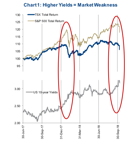
Then the market became accustomed to the new range, enabling first a recovery then a move onto new highs. All the while bond yields remained within this new range. In late September bond yields broke out again to the upside and as the market realized the breakout to higher yields appeared sustainable, whammo!!! We get sudden market weakness.
We continue to believe, and have repeatedly written about at nausiam, that the markets have become more sensitive to changes in yields than previous cycles. This is one of the unintended consequences of so much quantitative easing and low central bank interest rates over the past decade. Higher yields will trigger bouts of market weakness. We believe this pattern will repeat at various yield levels for however long the current bull market continues.
Soft Patch or Correction or Start of Something Worse?
As of midday Thursday, the TSX is down 7.3% from its high in July. The S&P 500 is down 5.8% from its high a couple weeks ago. Given a “correction” is viewed as a 10% decline, clearly too early to call this a correction in North America. However, once you look outside North America, corrections are plentiful. Europe, Asia and emerging markets are down more than 10% from their highs reached as far back as January or late 2017. These markets never fully recovered from the sell-off in January / February.
Given the abrupt decline yesterday, we would be surprised if the S&P and TSX simply shrugged it off and started moving higher. These adjustments rarely occur in a one day and done time frame. There have been 10 periods of market weakness during this bull market run that has seen the S&P 500 drop 5% or more. The days from peak to trough vary widely from a low of only 8 in 2015 to a high of 73 in 2011. The average is around 30 days and we are now on day 20 since the high for the S&P. This has us in the camp that there is more weakness to come in the very short term.
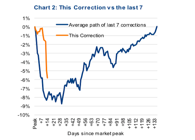
In Chart 2 below we provided the average path of the past seven corrections from the peak. Now the average line hides a very high degree of variance, but does provide a rough timeline for corrective phases in the market.
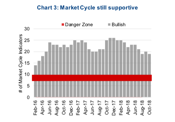
The good news is, this does appear to be a normal corrective process and not anything more nefarious. And we are not basing that on what the U.S. President or Kudlow have said on TV. We updated our Market Cycle indicators and of the 30 signals, 19 remain bullish, roughly where the signals have been sitting over the past few months. Our Market Cycle framework is designed to provide some early warning ahead of full on bear markets / recession. Based on our research, the likelihood of this occurring when 10 or fewer signals are bullish is high. So at 19, we remain in the camp that this is a correction, not the start of a bear.
What to do from here?
While we do believe there is a greater probability of more weakness ahead, we have started to do some buying. In the Purpose Core Income Equity Fund, which we manage, we have been holding about 9-10% in cash. This higher cash level is based on our view that we are late in the market cycle but not yet at the end. Typically late in the cycle the market experiences heightened volatility, both the good kind in higher markets and the kind we have been experiencing this week. In this type of oscillating market, deploying cash on weakness and trimming on strength adds value. At this point we have brought cash down a few points and if we see more weakness we will likely be doing more buying.
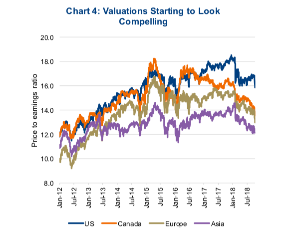
Valuations have become more appealing thanks to strong earnings growth and the recent drop in prices. The TSX is now trading at 13.5x forward consensus estimates. It has not traded at that low a valuation since July of 2013. That is a five year low valuation. Aggregate index valuations can be misleading sometimes, so we also looked at the individual company level. 76% of index members are now trading below their median valuation of the past five years. In fact, over half are trading in their bottom quartile of valuations during this period. There is value out there. And this is also very evident when looking at Europe and Asia (Chart 4).
Markets tend to be moody. Sometimes they are in a good mood, bad news comes out and the market shrugs it off with limited impact. At the moment, we would say the market is in a bad mood. Which means if we get bad news, we would expect this to translate into weakness. Next week could see the U.S. Treasury name China as a currency manipulator. This would be a negative as it would be an escalation of the ongoing global trade dispute. On the positive side we are about to start Q3 earnings season. Earnings, assuming the standard high percentage of positive susrprises, could provide a steady flow of bullish news. That would go a long way in improving the markets mood.
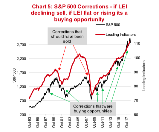
One final indicator to consider is the U.S. Leading Economic Indicator Index (LEI). This measures a basket of economic and market data that have in the past provided a forward looking signal for the overall economy. We would point out that during periods of market weakness, if this index was falling, it was best to sell and head for the hills. However during periods of market weakness that coincided with a rising or flat LEI, these have historically provided very good entry points for the equity markets (chart 5). As the adage goes, the LEI doesn’t lie. And at the moment it is still rising providing another reason to view this weakness as an opportunity.
Twitter: @sobata416 @ConnectedWealth
Any opinions expressed herein are solely those of the authors, and do not in any way represent the views or opinions of any other person or entity.


