Tech stocks continue to lead the market to the downside, with the Nasdaq declining over 30% from its 2021 high.
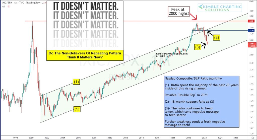
Today, we share an update to a ratio chart that we have shown several times (check out our post from February!). It’s the Nasdaq composite to S&P 500 Index performance ratio.
Needless to say, it has been a painful lesson for investors whom ignored this sell signal pattern.
As you can see, the breakdown occurred at (2) and selling accelerated (tech underperformance). This is a similar pattern to the dot-com crash. It doesn’t matter… until it matters! Stay tuned!
Nasdaq Composite to S&P 500 Index Ratio “monthly” Chart
Note that KimbleCharting is offering a 2 week Free trial to See It Market readers. Just send me an email to services@kimblechartingsolutions.com for details to get set up.
Twitter: @KimbleCharting
Any opinions expressed herein are solely those of the author, and do not in any way represent the views or opinions of any other person or entity.


 and Semiconductors (SMH): Concerning Price Pattern?")


