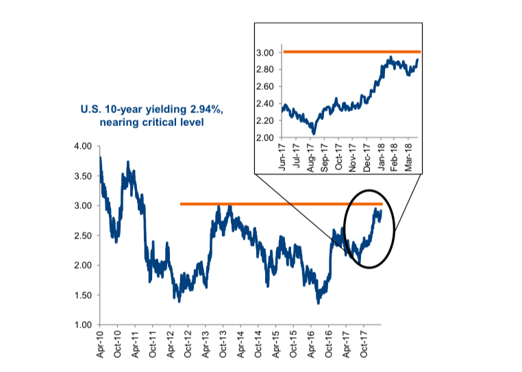
The U.S. 10-year Treasury yield appears to be rising into the 3.0% level.
Now a number of market chatters have pointed to 3% as a critical threshold, from a resistance level and for a potential negative feedback loop onto the equity markets.
Looking at the chart below, it is easy to identify 3% as a level bond yields rose up to multiple times and then failed to go any higher. This could be the rally that makes it through this critical level given inflationary pressures appear to be gaining momentum. The bigger question is will a Treasury yield of 3.0% cause the market to sell-off? No clue.
We do believe the equity markets are extra sensitive to bond yields, and higher yields will cause weakness. But trying to guess what level of bond yields will trigger these equity pain points is impossible.
In this report we share our views on inflationary pressures, bond yields and how markets may react.
Inflationary Pressures Building
There are a number of long-term secular trends that put downward pressure on inflation. Demographics is certainly one, as currently the dollar volume of savers is greater than borrowers. This will likely persist for some time, although may begin to turn in the 2020s. Technology, whether on the productivity enhancement or better utilization of fixed assets, is another suppressor of inflation. Global trade is another. Over much of the past few decades, global trade has increased and become easier. This enables the prices of many goods to fall as production was moved to lower cost jurisdiction. Yet, even if you believe these long-term secular trends will continue, there are periods when the shorter-term economic cycle bucks this trend. We believe this is the environment of today.
In early 2017, U.S. unemployment dropped below NAIRU (non-accelerating inflation rate of unemployment). Which means employment has been below NAIRU for almost a year and a half. Now that has been slow to translate into rising wage pressures, but this is starting to show up. There are still some pockets of slack in the employment picture but the number of bottlenecks (aka labour shortages) in certain industries or qualifications has been rising. At some point this will begin to translate into higher wages, which is inflationary.
The pressures go much beyond just employment. The U.S. economic output gap has largely been closed, meaning more growth can easily translate into inflation and higher prices. Most economics student would likely agree this is not the time to be adding fiscal stimulus, tax cuts and reducing regulation. Yet, that is exactly what has been happening in the U.S. If any policy makers are reading this, we would suggest add stimulus during weak economic times, remove when things are going well. These initiatives could actually speed the end of the current cycle by stoking the inflationary embers.
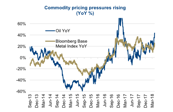
The U.S. dollar has declined by 10% on a trade-weighted basis over the past year. As a significant net importer of goods and services, a weaker dollar is a cause of upward inflationary pressure. Plus, we have commodity prices rising significantly with oil now up 43% over the past year and base metals up 25%. These higher input costs, will make their way through the production process into higher end prices. As will the recent implementation of some tariffs.
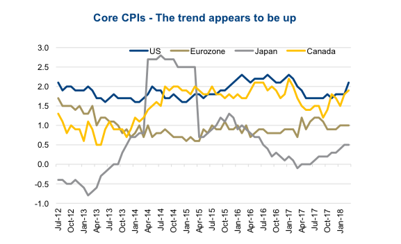
Rising inflationary pressures is not just a theory anymore. The U.S., Europe, Japan and Canada have all seen their respective core CPIs (that excludes food and energy) rise during the past few months (2nd chart). Our concern is with all the aforementioned factors, could we see CPI actually rise faster than the market expects? The Federal Reserve Bank of New York conducts an inflation expectation survey and the March data calls for a 2.75% inflation rate in a year’s time. We would contest at this point expectations and the Fed’s rate hike path are at risk of falling behind the data.
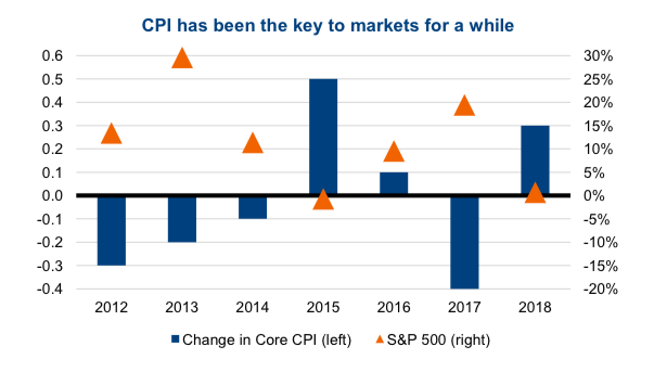
Rising inflation leads to higher bond yields which hurts market valuations
If you doubt this is connected, just look at the next chart. Basically, in years when CPI declined (blue bars flat or negative) the equity markets performed rather well (orange triangles). In years when CPI rose, as in rising inflationary pressures, the equity markets did not do so well. The market has also become more interest rate sensitive given how long bond yields were so low.
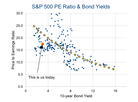
There is a strong relationship between bond yields and the market earnings multiple. As yields rise, the multiple tends to contract. The last chart shows all quarter instances for the S&P 500 going back to the early 1960s. Higher yields increase the discount rate on future cashflows and also make a competing asset class (bonds) more attractive.
Investment Implications – We are in the camp that inflationary pressures are building and will continue to do so for some time… perhaps for the duration of this cycle. When this translates into higher bond yields, the equity market will face a big headwind and likely decline. These will be buying opportunities in the near term as the market cycle continues to have enough momentum, with limited risk of a near term end of cycle. Should economic data slow, and inflationary data soften, markets should be able to move higher. This dance will likely continue for several quarters, creating bigger market swings in both directions.
Charts are sourced to Bloomberg unless otherwise noted.
Twitter: @sobata416 @ConnectedWealth
Any opinions expressed herein are solely those of the authors, and do not in any way represent the views or opinions of any other person or entity.


: Showing Some Signs of Emerging Strength")
