With US equity indexes decidedly range-bound over the past six weeks, it’s a difficult environment for all but the most nimble swing trader. Until the indexes break out (or down) from their established ranges, we’re left to look for other signs of possible directional movement.
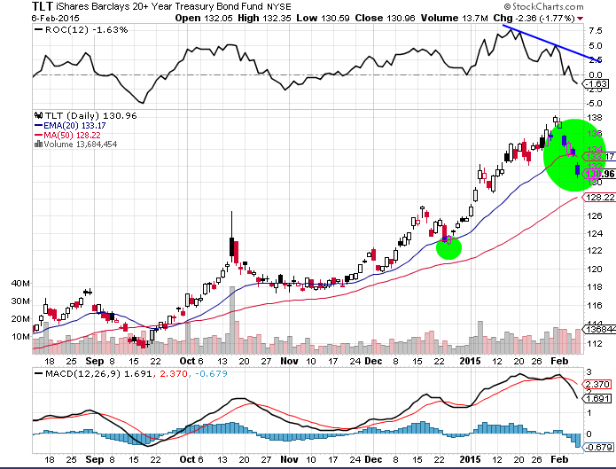
The recent price action in 20+ year Treasuries (TLT) has been far more revealing than the indexes. Friday’s opening gap beneath the 20 day EMA, coming on the heels of the MACD crossover, suggests that the path of least resistance for TLT is to the downside. Even more telling was the declining rate of change (ROC), which peaked over 2 weeks before the top in long dated treasuries arrived.
20 Year+ Treasuries Bond (TLT) Chart
To put the TLT behavior into context, it’s helpful to look at the ratio of the TLT to the SPDR S&P 500 (SPY). As you can see from the chart below, the ratio made a series of three successive highs, beginning in early January. But the successive highs were driven more by TLT outperformance than SPY weakness. At each new peak in the ratio, the S&P 500 (SPX) revisited and held the 2000 level.
TLT:SPY Ratio Chart
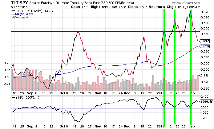
With the ratio now dropping below the lowest of those three highs, the possibility of a SPX retest of the December highs is certainly something to monitor in the coming weeks. Thanks for reading
No position in any of the mentioned securities at the time of publication. Any opinions expressed herein are solely those of the author, and do not in any way represent the views or opinions of any other person or entity.


