Earlier this week, I shared some stock market seasonality charts on my research blog and Twitter feed. I’d like to highlight a couple of those right here on See It Market.
The charts below look back over the past 27 years (1990-2017) and put together a composite yearly seasonality chart.
There are two charts covering three indexes… The S&P 500, The 10 Year Treasury Bond Yield, and the VIX Volatility Index.
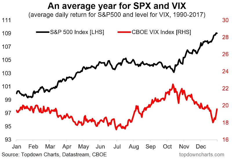
S&P 500 Seasonality
First up is the S&P 500 vs the VIX Volatility Index. From my post:
The stronger parts of the year for the S&P 500 are the Feb-May period and the Oct-Dec period. The weaker part of the year is Jul-Oct. Looking at the VIX, there is an interesting pattern where it tends to mirror the seasonality in the S&P500 (as you might expect). The VIX tends to be higher on average during the weaker part of the year and usually trends down from Mar-Jul.
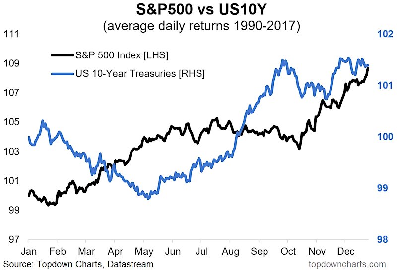
Treasury Bond Yields Seasonality
The second chart looks at the S&P 500 vs the 10 Year US Treasury Bond Yield. From my post:
Looking at the price index of the US 10-Year treasuries there is a tendency for bond prices to fall in the first quarter of the year and again perhaps unsurprisingly bonds do better at the time of the year when stocks do worst. This is particularly interesting given the action we are currently seeing in the bond market – basically seasonality adds to the case we talked about.
ALSO READ: 10 Charts For Investors To Watch In 2018
Twitter: @Callum_Thomas
Any opinions expressed herein are solely those of the author, and do not in any way represent the views or opinions of any other person or entity.


