 By Derek Hernquist The Dow Jones Industrials are up 1% and you make an average of 2% each across your 10 longs. A week later, another +1% day and your longs are flat on average. Have your stockpicking skills eroded? Of course not. Are you unluckier than on that day last week? Perhaps. Is the Dow Jones average showing a misleading picture of the market’s true strength? Most definitely.
“Market moves start inward and spread outward.” – Justin Mamis
Before ever looking at an advance-decline line or list of new highs and lows, a trader knows whether the “troops” are marching with the generals or have drifted off on their own course. The new trader will look at this lag and hope for a better performance tomorrow. The experienced trader looks deeper to see if his/her flattening equity curve is sending a signal about the market’s lack of deeper support.
This is market breadth analysis at the most micro level, and something uniquely available to equity investors. In most trading vehicles, we have one big index to dissect in search of opportunity. In equities, we have an entire market of stocks that offers not only limitless opportunities, but unparalleled chances to look under the hood in search of insight.
Is it better for a small group of highly watched stocks to carry the load, or would we prefer to see an expanding list of healthy stocks? Well, if you own the right highly watched stocks, then I suppose it doesn’t matter. But our odds of success are much greater if the risk appetite for stocks is expanding, not contracting. How do we stay in sync with the prevailing winds? By studying breadth.
I take the market’s vital signs across every time frame, and from a few different angles. There is no magic bullet, but a “weight of the evidence” approach will easily identify periods of both extreme danger and opportunity. The following image shows a few different ways to consider the intermediate-term state of market breadth. Click on chart to enlarge.
Position Breadth Chart – Market Breadth
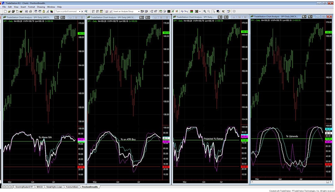
What are we tracking in this picture? We have the following 4 indicators:
1) % of Stocks > Moving Average- your stock being above/below its X period moving average can be a decent piece of information. Whether a growing or shrinking number are above/below theirs is a great piece of information.
2) % of Stocks on ATR Buy Signal- bond trader deBrink shares how he applies a simple ATR-based reversal system to his $ZB_F trading. Why not track how many stocks are in their own bull and bear runs?
3) Median Projected % Range- to make money long, at some point we need our stock to move to the upper end of its range and (hopefully) extend the upper end(vice versa for shorts). I like to add a little momentum piece to this and see how many “high huggers” the market contains.
4) % of Stocks in Uptrend- when on the fence about whether, let’s say, $QQQ is holding its uptrend, it’s nice to know whether 75%(good) or 50%(not so good) are holding theirs.
How do we evaluate these? I take a universe of active operating companies(no utilities, REITs, etc.) and study them from the following 4 angles:
1) Acceleration- fast(purple) vs. mid(white) vs. slow(blue). The shortest lookback will adjust fastest; coming out of a) peaks and troughs and b) trading ranges we want purple(fast) showing us the way.
2) Momentum- current reading vs. prior. It is incomplete analysis to say 70% of stocks are above their X Day moving average. That’s where we are; we also need to know where we were. The message of 70% is far different if the prior number was 60%(expanding from lower) vs. a prior number of 80%(contracting from higher).
3) Absolute- looking for stable and persistent readings above 70%(uptrend) or below 30%(downtrend) as signs that the next timeframe is too dominant to allow a price correction in this frame.
4) Relative- snapshots vs. the index. If $SPX makes a new high or low, we’d like to see the average stock do the same. If $SPX touches the same price as it did earlier in a trading range, we might have an opportunity to spot hidden improvement(say, 60% vs. 45%) or deterioration(45% vs. 60%).
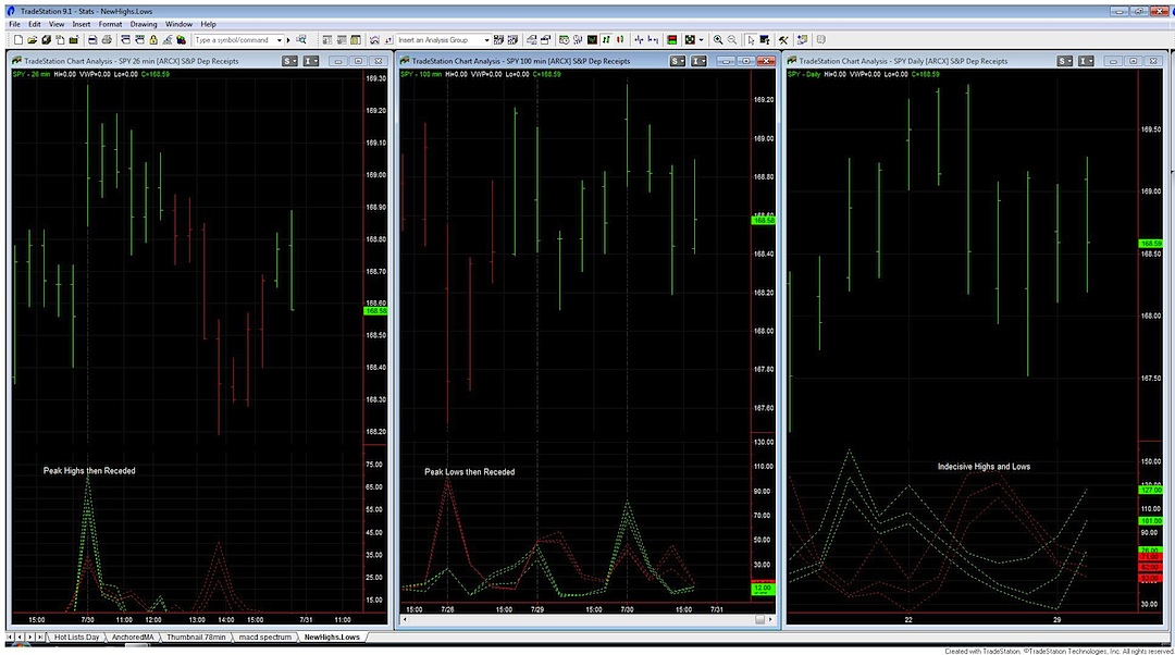
That’s a lot of analysis, especially when done across 4 timesframes; I’ve been lucky enough to find a skilled programmer to build me a dashboard of my favorites. You may choose to hone in on a favorite few that do the trick. In fact, my most closely watched measure is New Highs and New Lows. Because of the way they unfold in clusters, I prefer Excel over charts along the lines of what Chris Perruna shares here.
If I were to pick just one, New Highs vs. New Lows would be it. What other measure so cleanly indicates just how eager the buyers or sellers are, than whether they’re willing to buy at the highest price or sell at the lowest price in the last “X” hours, days, weeks, months? The easy mistake with New Highs and Lows is chasing an extended run, after all the stones have been turned. To quote my friend Zortrades, “many talk about how great breadth is but fail to realize that sometimes breadth can be so good that it’s actually bad, and vice versa.”
Yes! In fact, those “so good it’s bad” extremes represent 2 of the 4 fat pitches on the New High/New Low spectrum. When a huge(say 90%+) proportion of stocks make a high or low in a given period, our eyes should be glued to the next period or two. If the number recedes to virtually nothing, we can act on a reversal trade with the confidence that a major regret point or pivot has been made. If the % drifts lower but we still see fresh stocks pushing through, then we can treat that as a flag just pausing to refresh. Again, I prefer the numbers over the charts but the following shows the stalemate for both short-term highs(green) and lows(red) in recent weeks. Click on chart to enlarge.
New Highs-Lows Chart – Market Breadth
Breadth analysis can be the tiebreaker when price analysis is a toss-up, or in my case form the foundation for deciding: a) how much portfolio risk to take, b) how urgent the next entry should be, and c) how tight to keep stops. Just like properly dressing for the weather requires more than a quick look at the sky, properly preparing a trading plan should include the context surrounding a single price chart. Those HFT stop runs might just be a short cloudburst giving way to clearer skies; it pays to take a deeper look at the radar.
About Derek Hernquist: Derek is a Portfolio Manager at D. Scott Neal, Inc. where he focuses exclusively on implementing an ETF-based Tactical Asset Allocation program for the firm’s investment clients. He studies price action across multiple time frames in search of sectors and asset classes transitioning from one phase of sentiment to another. His philosophy was shaped by years spent observing clients, first as a stockbroker and then running a retail trading desk in the late 1990s. These experiences led him to combine behavioral finance with his math background to more objectively measure the collective psychology of the market.
Read more from Derek on his blog: musings of a tape reader.
You can also follow Derek on Twitter: @derekhernquist and StockTwits: derekhernquist
Any opinions expressed herein are solely those of the author, and do not in any way represent the views or opinions of any other person or entity.
Charts from Tradestation
: Creating Bullish Divergence?")


 and Semiconductors (SMH): Concerning Price Pattern?")


