 Ever met someone you’d call “a real numbers guy”? I’ve come across a few.
Roughed-up card counters dumped headlong into Vegas casino kitchen dumpsters. A school janitor who has effortless dalliances with intractable theoretical math problems under the influence of pine-sol fumes. An agoraphobic, thorazine-popping mathematician who pursued the ultimate pattern in the stock market while doggedly pursued by corporate hitmen and Talmudic gangsters until he had an unsettling experience with a drill. A toothpick-counting savant convinced he’s a really, really good dancer. C-3PO.
And then there’s Goichi Hosoda.
A Japanese newspaperman, Goichi’s beat was dutiful coverage of the Japan’s centuries-old rice markets, during which he charted prices and eventually formulated a unique conception of support and resistance.
Then in the late 1930s, he created his own supercomputer by gathering a small army of students to run endless computations (chained to their desks, true; but with generous rations) and scenarios in pursuit of an optimal systematic approach to evaluating markets.
So dedicated to the task before him (his wife divorced him, citing irreconcilable differences rooted in her raging jealousy of the numbers 9, 26 and 52), Goichi-san and his cadre of human calculators spent over 20 years crunching numbers. Finally in 1968, Hosoda published his findings: a system he naturally titled Ichimoku Kinko Hyo.
Yep, that’s him over there. As you can see, by the end his eyelids were disabled from overuse, he’d developed an inexplicable yet oddly endearing penchant for silk vests, loved frothy beer and was awfully pleased with what he had accomplished.
So what does the culmination of this multi-decade research project look like?
“…What is that?”
Maybe you’ve seen Ichimoku before. Even the phrase – best translated from Japanese as “equilibrium chart at a glance” – is intimidating. If you’re at all like me, some mild curiosity aside your initial inclination is to relegate Ichimoku Kinko Hyo (IKH) to that list of “exotic indicators” you shrug at and soon after forget, never to be consulted again. But if you’re a trend follower or breakout trader on any time frame, you’d be wise to reconsider.
Not just a monument to one man’s obsession, it turns out this bramble bush of indecipherable squiggly lines is a simple-yet-sophisticated and highly effective way of evaluating and trading with the trend of any asset class or instrument you wish.
Measuring Market (Dis)Equilibrium
For a news man in the first half of the 20th century (and perhaps because of it), Hosoda had a fantastically insightful perspective on what markets are – certainly compared to his journalistic and analyst counterparts working in the West at the time. To him, market prices are human: they are a social product both determining and being determined by human behavior. Like us individually and collectively, markets are a social creature caught in a dynamic pendulum swinging closer to and then further away from a state of equilibrium. On occasion we trip our limits and exhibit unusual volatility; but reversion to the mean is the rule – people, like markets, can’t flourish or even subsist for long at behavioral extremes.
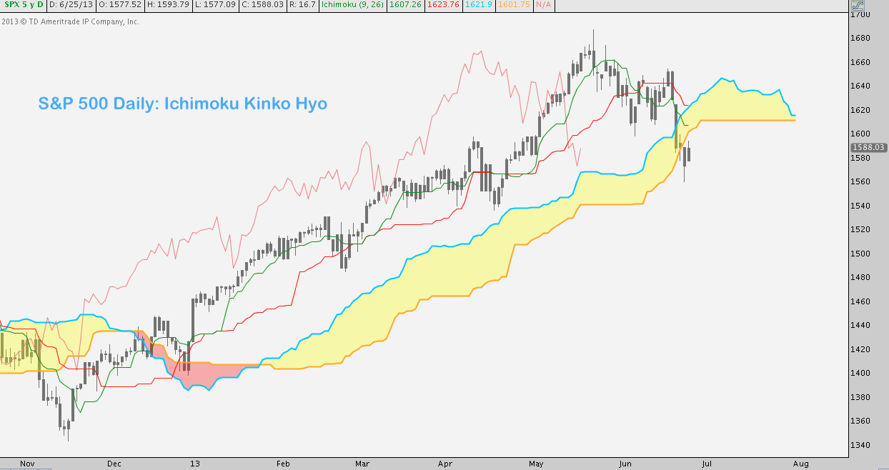
After multiple decades of vision and revision, Hosoda concluded that the (apparent mess of a) chart above was the best quantitative representation of this underlying existential market reality.
A Primer on Cloud Shapes
“Great story: but how does this thing work?”
Ichimoku looks anything but simple: most proponents of the KISS principle would dismiss it out-of-hand because of the clutter it superimposes over price. To make a fair assessment, let’s break it down into its constituent parts and then build it back – just as we would do when conducting Ichimoku analysis.
Here’s the above chart again, this time annotated with the components of IKH (yes, there’s more Japanese):
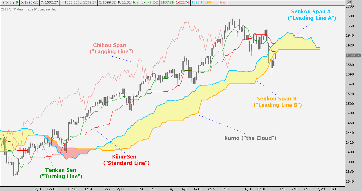
A coherent system, each of these lines has its own crucial function while complementing the others. I won’t lie: though mildly painful to work through at first, it’s beneficial to understand how each piece is calculated and something to familiarize yourself with if you incorporate IKH into your analysis repertoire (comfortable with indicators and want to know? I’ll cov Check out the details here).
But I won’t labor too much over those details here: far more important is to understand Hosoda designed IKH to give immediate information on how close or far a market is to equilibrium; and telltale signs of its return or departure from it. Whether a market is steadily trending (the middle of the S&P 500 chart above…) or rangebound (… the left and right segments above) there are more immediate (Tenkan and Kijun) and more distant (the Cloud) measures to assess both trend strength and volatility.
Let’s take each of these pieces in turn. Fair warning: this part reads like a ceiling fan manual, so if you’d rather just get to how IKH is used and don’t care about how IKH is built, skip down to the phrase THAT’S IT below.
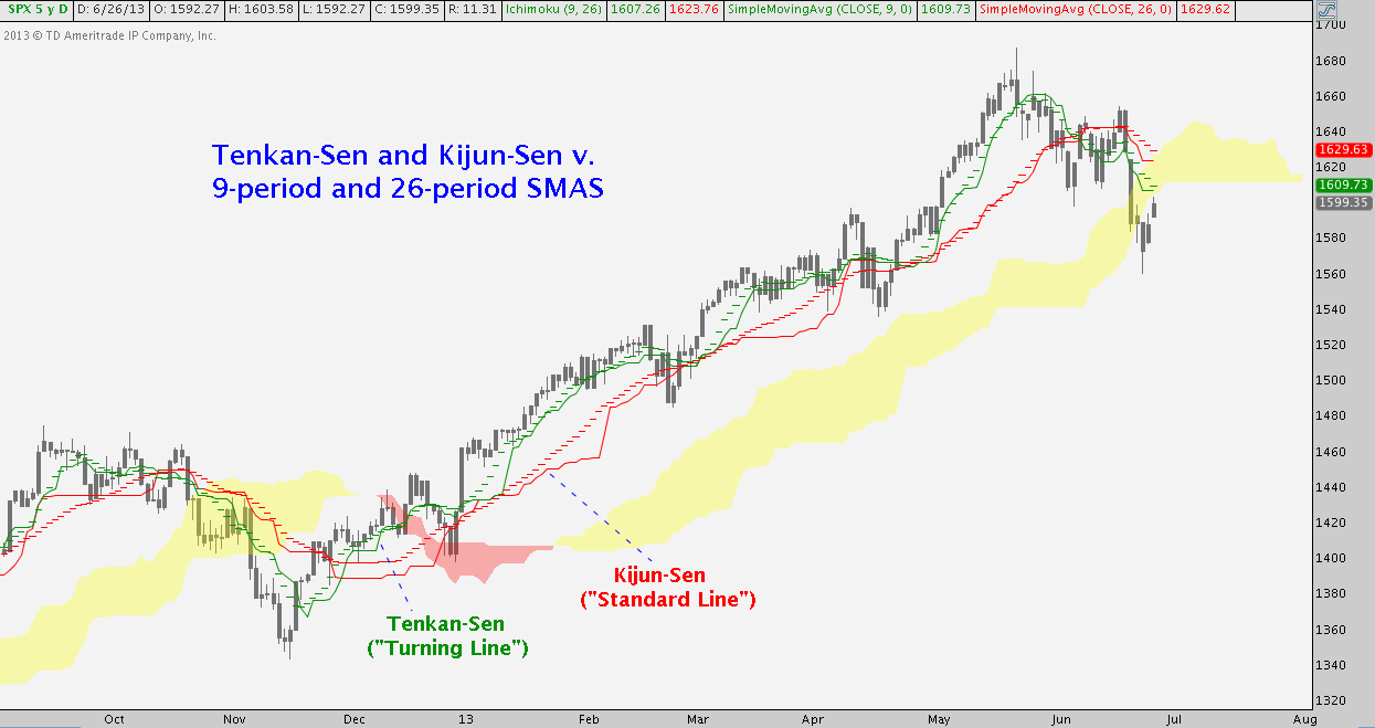
- Tenkan-Sen: derived from a 9-period moving average and as its name (“turning line”) implies, it is the aspect of IKH that is most responsive to price.
- Kijun-Sen: derived from a 26-period moving average, it is the envelope (“standard line”) across which the shorter-term Tenkan line move. Less responsive to price, it is also a more durable and consistent source of trend support/resistance.
If you’re thinking “this looks like a dressed-up moving average crossover system”, you’re not far wrong – but only so far as these go. Itt’s key to realize here that these lines are calculated by using price extremes (the highest high and lowest low) over their lookback periods (9 and 26 periods), rather than the closing prices to which most all moving averages default. This sounds like a subtle distinction; but the result is an approach that more widely encompasses support and resistance: it’s the difference between looking at a candlestick or OHLC bar chart and a line chart. The result? A much more incisive measure of a market’s range and a clearer picture of its point of equilibrium. S&P again: See if you can spot the differences here:
- Chikou Span: the “Lagging Line”, this measure can seem extraneous at first because it plots the current price 26 periods in the past Sounds useless (in the past? so intentionally lagging?); but the purpose of the Chikou Span is to assess trend direction and intensity by asking “where is price now versus where it was about a month ago?” If Chikou is above/below, you know the trend is up/down and higher highs/lower highs have been the norm. How far it deviates from above/below price 26 periods ago gauges how strong the intervening move has been.
- Senkou Span A: takes the current Tenkan and Kijun values together and throws them 26 periods into the future (“leading line”). In effect, the averages are averaged and mirrored onto the path ahead. Put another way, the local measures of equilibrium are combined to generate a longer-term, global measure. This is one component of two that make up “the Cloud”.
- Senkou Span B: like Kijun-Sen x2, with a twist, this second “leading line” looks at the highest high and highest low over the past 52 periods and then throws that data point 26 periods into the future. The result is the longest-term and most durable determinant of equilibrium in Ichimoku Kinko Hyo has to offer. This is the second Cloud component.
THAT’S IT. “That’s it?!” Yep – I include all that (hat’s off if you made it through) to show you a) Hosoda really did work through every scenario conceivable, b) the ligaments and tendons building out the system are all intertwined and c) that everything serves the greater role of creating a unified picture of what “equilibrium” means for any market at any given time. If you get A, B, and C, don’t sweat the details. There is one more component we should all look at together:
- Kumo: the Cloud is market equilibrium and all IKH analysis starts and ends with it. Made up of Senkou Span A and Senkou Span B and like them, the Kumo is plotted out front. It has forecasting applications: like a pair of shorter and longer-term moving averages, SSA and SSB periodically flip positions to suggest future trend changes). It also acts as dynamic support/resistance, eschewing too-easily-violated lines for a constantly expanding and contracting zone of equilibrium. Because of the Senkou Span calculations, the top or bottom of the Kumo may even flatline for a time in a strong demonstration of equilibrium while current price moves around.
Signals in the Sky
The basic groundwork laid, I’ll now look at 3 independent, detailed examples of how Ichimoku Kinko Hyo works in practice. Throughout I’ll allude to some entry and exit strategies, but only to show how the system functions (strategies may be the subject of a future post). It’s important to remember: IKH is about checking up on and trading in and out of confirmed trends. By definition, the system measures the market against its middle. It measures trend strength, in part, as deviation from this “middle” but is abysmally bad at ticking tops or bottoms.
Case Study 1: USD/JPY
First up, let’s take a look at Ichimoku on a Forex pair. Since it’s our first time out, we’ll do a deep play-by-play to give a feel for mechanics. As a fitting homage to its inventor and in blessed memory of the nameless and starved brain trust that helped him, here’s USD/JPY (click the image below to zoom):
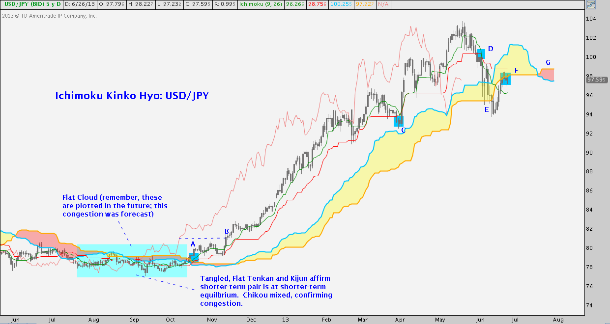
The last year of USD/JPY is divided in two very different market regimes, both of which Ichimoku Kinko Hyo deftly handles. June to December features sideways price action. We don’t need IKH to tell us this, but the Cloud (Senkou Span A + Senkou Span B projected about a month into the future) did tell observers this period would be thin/flat and choppy. When the time arrived (blue box) that’s exactly what transpired with tightly knotted Tenkan and Kijun lines confirming.
Then at A, price and the shorter-term Tenkan poked above the Cloud. Kijun quickly followed. Looking back, this hadn’t happened in over 6 months. In effect, Ichimoku set off an alarm. According to a Price Breakout strategy, buyers would step in when price broke above the Kumo. A slightly less aggressive Tenkan/Kijun Breakout strategy suggested entry once Tenkan (green) and Kijun (red) broke above the Kumo. Still, price had not broken out of its longstanding horizontal range.
Until B: comparing price to the Chikou span, price was now both 1) above where price was beneath the Chikou in October and 2) above the June-November flat Kumo range. Counterintuitively, the Chikou says things are changing here and now.
After B, Tenkan (green) orients above Kijun (red) and both range far above the a thickening Kumo. As soon as late December, it becomes apparent a trending market regime is underway. And away USD/JPY went until late April. At C, price dips below the Tenkan and Kijun lines; not also Chikou Span was neutral, adding to the uncertainty. A conservative, system-based stop loss criterion would take a long position out here. Importantly, Tenkan did not cross below Kijun. As it turns out, this was the whipsaw immediately preceding BOJ Governor Kuroda’s unveiling of Japan’s enhanced QE program. Price popped hard back above Tenkan/Kijun and didn’t look back for 1100 pips. Tenkan quickly followed suit to confirm.
At D, price again crosses below Tenkan and a flat Kijun (remember, flat is indicative of equilibrium); and Tenkan follows some 50 pips later. Similar to C, a moderately tight stop loss criterion trips here. This signal taken, any long position was protected from a 600 pip drop to 94 at E where price temporarily finds flat Kumo bottom support but then snaps. At this point a moderately loose stop loss criterion goes off: USD/JPY has just broken and closed below its most enduring indicator of equilibrium, flipping the tone to bearish. At present, the pair has recovered to F, facing flat Kumo resistance. Both of the last price points are complemented by a Chikou now below price. Looking forward a bit to G, we note the Senkou Span A (blue cloud line) and Senkou Span B (yellow cloud line) have ominously flipped orientation, suggesting a bearish turn.
Recap: IKH signaled a flat unattractive market range ahead of time. When this changed, the system offered aggressive, moderate and conservative markers at A and B around which to enter all at once or scale-in. The best money in the past 6 months was made between B and C and Ichimoku was long for nearly every pip. C may have tripped a stop on at least part of the position, but a long was promptly reentered/the remaining long went on to substantial further gains. Opportunities arose to exit a long earlier (D) or later (E). An aggressive short entry could be taken with price below the Kumo at E, but Tenkan/Kijun are in mixed territory suggesting no/modest positioning only. C, E, and F demonstrate price’s sensitivity to the Cloud as dynamic support and resistance.
Ok: Now we’re cooking with gas.
Major equity indices (Nikkei, S&P 500, etc.) bear a remarkable similarity to USD/JPY over the period just covered so I’ll skip those due to redundancy (if you want, you can go back to the SPX charts above and ply your newfound skills). Instead, let take a comparatively brief look at the the base industrial metal, Copper (Symbol: HG).
Case Study 2: Copper (HG)
Assuming you were around then and/or made it through in one piece: how’d your system do in 2008? You could be living in a complete news vacuum (“Layman? Well, I’m not clergy” “TARP to cover up what?” “Angelo Mozilo bathes in cheese-puffed-infused Evian every morning before heading to the office to undercut more quixotic woul-be homeowners with no-doc/ninja loans?”) and the chart above would tell you all you need to know: hardly anyone’s system did well.
It’s easy to say so in retrospect, but Ichimoku fared nicely; and any trend follower who diligently managed their position in Copper and kept their wits about them (i.e. chose not to panic) did the same (click the image below to zoom):
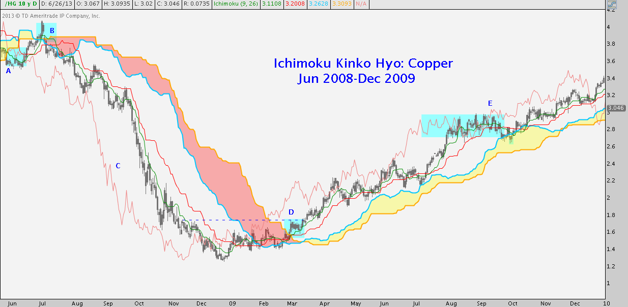
In June 2008 at A, price, Tenkan (green) and Kijun (red) broke below the Cloud, providing opportunities to enter and add to a short position, supported by a bearish Kumo flip at B.
Speaking of B, price shot up in a mini-measured move, snapping the Cloud. Ever the faithful trailing sidekick, Tenkan came along soon after; but Kijun-sen did not. However conservatively or aggressive one’s stop was managed here, some or all of the position entered at A was sold for a loss here. A few days passed and price gapped back below the Kumo – B was quickly looking like a short capitulation. July became August, and Tenkan/Kijun both crossed beneath the Kumo once again. This time, a scaled-in entry worked; and with the exception of a brief blip above Kijun in mid-August to retest the low at A Copper did not look back. The trend strength denoted at C are overwhelming and unmistakable. The volatility was considerable in October, true; but no system-derived stop criteria (that aren’t overly onerous) were tripped during this period.
When all was said and Copper, declined from the entry just after B at 3.7 to as low as 1.2 in 4 months.
Now recall the June-November passage we saw earlier on USD/JPY. Tapering Kumo (remember, the Cloud plots 26 periods ahead), tangled Tenkan/Kijun, and a trendless Chikou – these same conditions prevailed January-March 2009. A trend reversal? No. A trend change away from the strength exhibited at C? Yes. Finally at D, a development that should seem vaguely familiar occurred: price broke above the Kumo at its thinnest point since B and shortly after the SSA and SSB flipped bearish to bullish.
Despite the residual shock from C, not-so-subtle signs were mounting that a change was afoot.
Then, in mid-March, price crossed above D. This level might seems inconsequential at first, but note D represented a break above the Jan-Mar price range, the Chikou was above where price was in late January and resistance posed in Oct-Nov 2008 just below 1.80. Tenkan/Kijun were also above the Kumo; and Copper took off to the upside.
The trend between D and E was not as impressive as Fall 2008 (nothing is), but except for very modest ranging tests of Kumo support in late May and early July, the trend remained well-intact until meeting resistance at around 3 at E in Fall 2009. A long, tight consolidation zone formed here. Like in the Summer, price broke below Tenkan and Kijun and testing lightly into the Cloud – even Tenkan crossed Kijun. In both cases, Chikou Span was modestly bullish but became ambiguous as a function of the persistent sideways movement.
Soon enough, Copper sorted itself out and for those who weren’t over-leveraged and could tolerate these light brushes against the top of the Kumo (hint: anyone who couldn’t was over-leveraged!) was soon printing over 3.4, a nearly 90% gain (at 1:1) in 9 months.
Lastly, let’s take a look at a stock. Much beloved, much maligned and maybe predictably on my part (this is a trend following system, after all), I elected to check out Apple.
Case Study 3: Apple (AAPL) (click the image below to zoom):
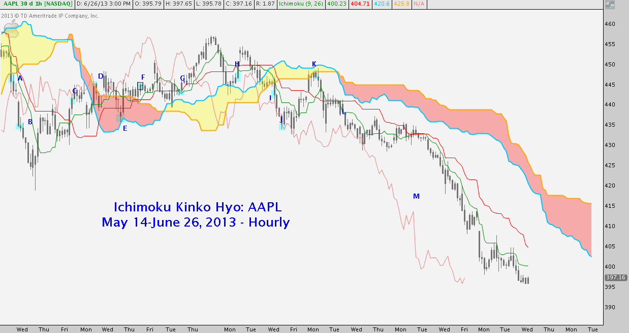
This chart is choppier than the previous two and important include: markets are not all sailing, uninterrupted ramps and cliff dives, and neither is Ichimoku. How does it perform in a sustained choppy market? How does it do with equities in an environment where opening gaps are commonplace? These are “special situations” no Ichimoku practitioner should be unaware of because much capital is forfeited in these environments by the unwary. That said, let’s run through the progression annotated on the chart above.
At A, price breaks below a bullish Kumo: there’s a potential entry here, but as we’ve seen before it would be aggressive because Tenkan-sen and Kijun-Sen remain in the Cloud.
At B, Tenkan and Kijun follow price, in the wake of a big gap down. This is a major drawback of IKH with equities. A “Tenkan/Kijun breakdown” or Kumo cross like this is a fairly solid short entry – but the gap adds a tricky variable, particularly if that gap is filled. One’s post-gap entry may be substantially lower. Here we see a gap down around 445 followed by a decline to 420; but a few days later the gap is filled at C and the trade (depending on how it was entered) is back near break-even. Also at C, Tenkan crosses back above Kijun.
Then D sees price poking above a bearish Kumo. Any short taken near A/B is stopped out or pruned back. Price dips back into the Kumo to find Kumo support at E and reverses back out of the cloud.
Tenkan and Kijun follow at F and we now have a long trade. G and H see more chop with a brief Tenkan blips below Kijun, but there’s little to complain about because price is moving higher.
I and J happen according to the script written for A and B, sans the gap. The long trade taken back at F is stopped out after 5 trading days with a 1% loss at I, and more like 2% at J. Nothing to lament, except the wasted opportunity cost of a sideways trade that ultimately fizzles.
Speaking of 2% losses, the scaled-in short averaged between I and J almost immediately transitions into a loss of that size to K: but, the thin, flag Kumo there swats AAPL back. Tenkan-sen – our short-term trend strength measure – crosses back below Kijun-sen at L near 440. And from there, the wide spread of a indisputable trend down at M has characterized the last 6 trading sessions, bringing it with a decline of nearly 10%.
Some Parting Considerations
Time frame: You can see that Ichimoku is can be applied to any asset class; but is it adaptable to any time frame? That a matter of some debate because Goichi Hosoda tested and optimized the system’s parameters using Daily price data. Using it on wider time frames (weekly, monthly) is usually deemed acceptable, but day or swing trading time frames are generally looked on as unworkable. I disagree with this in principle; but ultimately pragmatic, risk-based constraints must be our guide. Different market environments necessitate different position size constraints, true; but don’t kick IKH to the curb just because you’re a day trader.
Stocks: Equities are challenging to trade with Ichimoku on shorter time frames. Opening gaps often ruin solid entries around the Cloud, leaving you in the position of a) chasing (don’t do it), b) hoping for a gap fill; but c) still being a little unsure of how to handle a sub-par entry if a gap fill comes through. Similarly, because earnings and other impactful events often occur after-hours, timely entries and exits are often blown up, creating a kind of “slippage” on system entries and exits that are almost inevitable. Just a few of these incidents have to occur before a trader becomes fully convinced Ichimoku on something less than a daily stock chart is untenable. The same cannot be said of Futures and Forex with 24/5 trading.
Risk Management: Ichimoku is adaptable to a variety of entry and exit strategies but the system offers no explicit rules or guidelines on how to select position size, where to place stops, or where to take profit. The system is robust insofar as it goes, but it is incomplete structure until outfitted with your risk parameters. How you manage risk is up to you as the individual IKH practitioner and will make all the difference to your success. As with other systems that seek to exploit sustained trends, several small losses will pile up before a real winner plays out. Also as a rule, the wider the time frame = the fewer the signals = the greater the loss/profit potential = the more modest the position sizing. As with any other strategy: the real work is accomplished by formulating entry and exit rules that quantify a risk profile you can tolerate.
It’s worth reiterating, Ichimoku is squarely defined as a trend following discipline. It has magnificent periods; and it has whipsaw foibles that can sorely test one’s patience and resolve. If this is compatible with your psychological makeup as a trader, IKH can be a fantastic asset; but don’t have any illusions about its limitations. In short, don’t want the right side of the AAPL chart above so badly you forget about the long, graceless slogs like the one on the left side. Keeping this in mind, whether you hold investments for months on end or only a few days (or both), if you’re comfortable tackling the modest learning curve and favor a tactical approach, Ichimoku Kinko Hyo will be a highly valuable addition to your analytical toolbox.
Twitter: @andrewunknown and @seeitmarket
Author holds no position in the securities or instruments mentioned at the time of publication.
Any opinions expressed herein are solely those of the author, and do not in any way represent the views or opinions of any other person or entity.


