By Sheldon McIntyre
Over the last couple of weeks I have been rethinking my bullish working thesis and in particular, the importance of September 2012. The convergence of extreme readings for several metrics, as well as, bearish technical divergences suggests that it could have time stamped a long-term inflection point for the equity market.
Notable Data Points
- The NASDAQ Composite Index and NASDAQ 100 Index advance to the 50% retracement level of the 2000-2002 bear market. Both indexes are unable to close September above the key retracement level.
- The Russell 2000 Index advances near the 2011 highs at 868.57 on September 14, but is unable to print a new all-time high. This is the third time that the index has struggled to break above the 2007 highs at 856.48. The other two times were May 2011 and March 2012.
- The S&P Mid-Cap 400 Index advances to an all-time high on September 14, but could not follow-through.
- The number of NYSE stocks printing 52-week highs hits 958 on September 14.
- The ISEE Index prints a 52-week high at 205 on September 14. Retail investors are super bullish on the equity market.
- On September 7, 2012 Tom DeMark forecasts that the S&P 500 Index will top at 1478. The index 1474.51 on September 14, 2012. Tom DeMark has been successful calling this bull market so I consider it an important data point.
I have posted four charts below that offer compelling evidence that the September 2012 price highs were the final hurrah for a bull market that had been slowly deteriorating over the last year. (Click charts to enlarge)
No Conviction
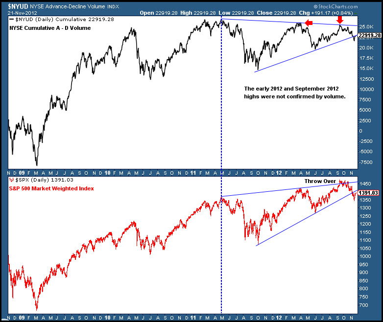
The first bearish divergence that stands out for me is between the NYSE Cumulative Advance – Decline Volume indicator and the equity market during 2012. The early 2012 highs and the September 2012 highs were not confirmed by the indicator. If the uptrend is healthy there would be new highs for volume accumulation.
Not An Encouraging Historical Precedent
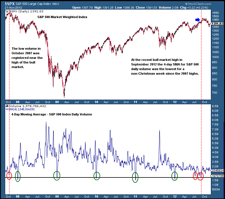
To take an alternative look at market volume I took the 4-day moving average of the S&P 500 Index volume in order to compare it with holiday shortened weeks and the result was interesting. Excluding the Christmas holiday periods, the moving average reading near the September 14 highs for the S&P 500 was the lowest since the bull market highs of October 2007. Not an encouraging historical precedent.
Shorter Legs
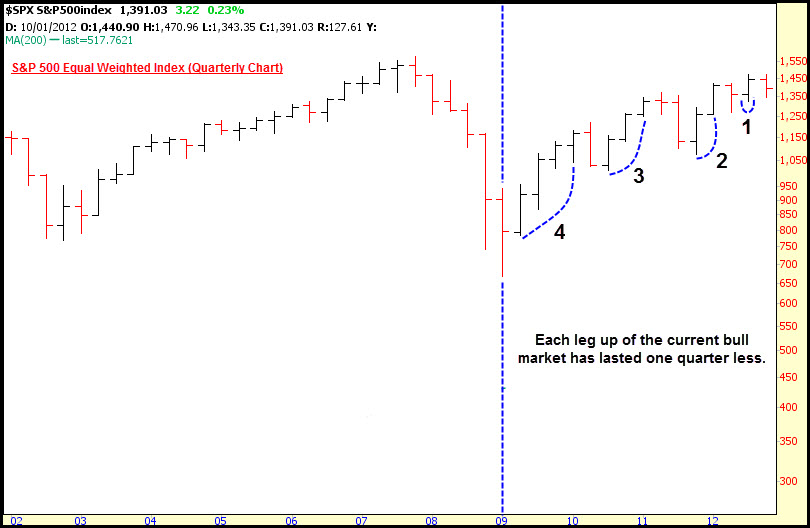
The quarterly chart of the S&P 500 Index highlights the deteriorating market health. Since the beginning of the 2009 bull market each leg up has lasted one quarter less. It must be noted that the current quarter is not over so this could change. Nevertheless, the point is clear; the bull market has lost upward momentum.
Overall Trend Health
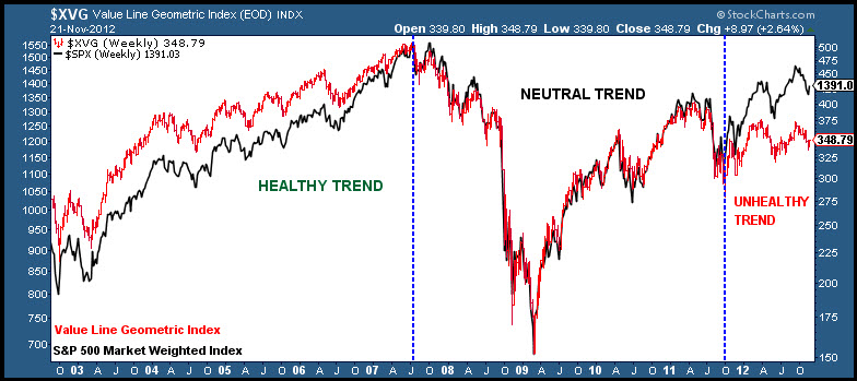
A few years ago I came across a chart from Terry Laundry that evaluated the market health by overlaying the S&P 500 Market Weighted Index on the Value Line Geometric Index. The Value Line Geometric Index is a broader index and a better representation of the U.S. stock market in general. You can clearly note that following the 2011 ‘flash bear market’ the broader market decoupled and did not print new highs like the S&P 500 Weighted Index.
—————————————————————-
Twitter: @hertcapital @seeitmarket Facebook: See It Market
No position in any of the securities mentioned at the time of publication.
Any opinions expressed herein are solely those of the author and do not in any way represent the views or opinions of any other person or entity.

