This post was edited on May 31, 2017 at 7:47 am to add the author’s video commentary.
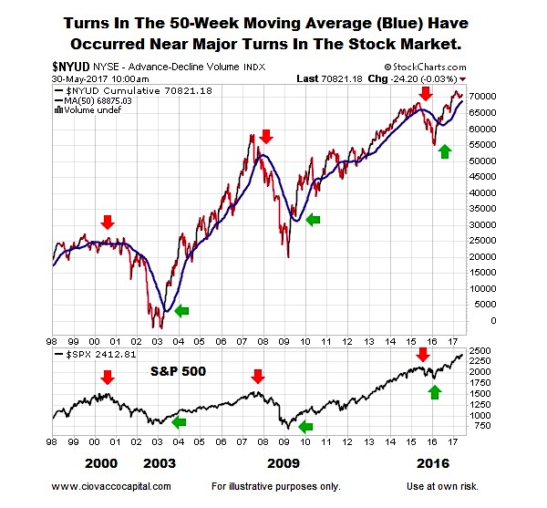
Similarities To Previous Major Market Turns
The chart below shows up/down volume (1998-2017) for the NYSE Composite Stock Index (), along with its 50-week moving average (thick blue line).
Notice how all-things-being equal, the probability of bad things happening increases when the 50-week moving average is flat or negative (see red arrows below). Conversely, the probability of good things happening increases when the 50-week moving average turns back up in a bullish manner (see green arrows below). The S&P 500 () is shown at the bottom of the image below for reference purposes.
Not Much Talk About A Major Bottom
Instead of 2016-17 looking like a major stock market topping process, a strong case can be made 2016-17 looks very similar to a major bottoming process. The charts below compare the breadth-based 50-week moving average in 2003, 2009, and 2016.
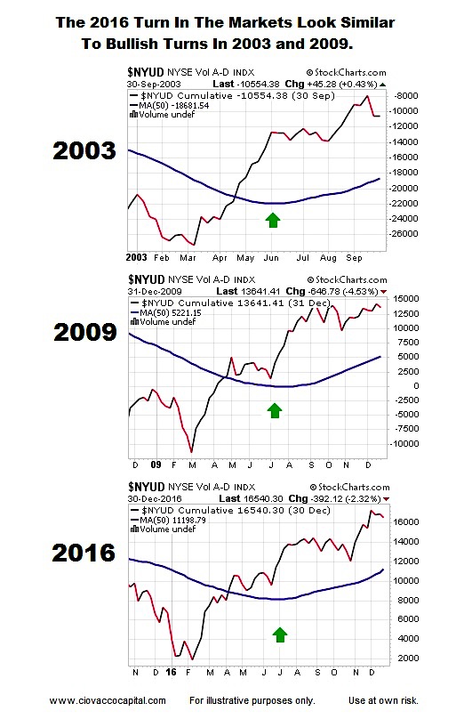
You Can’t Compare 2016 To 2003/2009
It is easy to understand how a major stock market bottom can form after a bear market (2003 and 2009). However, it is more difficult to understand how one could have possibly formed in 2016, given the S&P 500 did not hit the 20% bear-market threshold. While the major indexes held up relatively well in late 2015/early 2016, the story was quite a bit different for the average stock. From a January 11, 2016 USA Today story:
There is mounting evidence that the U.S. stock market is being decimated and undermined by a so-called “stealth” bear market…Indeed, the Standard & Poor’s 1500 index – a broad basket of large, mid and small company stocks – shows that the average stock’s distance from its 52-week high is 26.9%, according to stats compiled by Bespoke Investment Group through Friday’s close. “That’s bear market territory!” says Paul Hickey, co-founder of Bespoke Investment Group, the firm that provided USA TODAY with the gloomy price data.
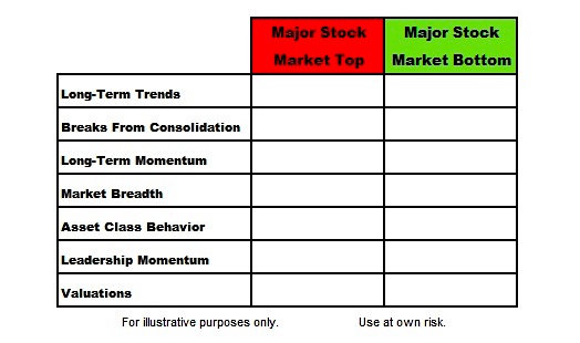
Does 2016-17 Look More Like A Major Top Or A Major Bottom?
This week’s stock market video uses facts to complete check marks in the table below. If you review the evidence with an open mind, the conclusions may be surprising.
This Week’s Video:
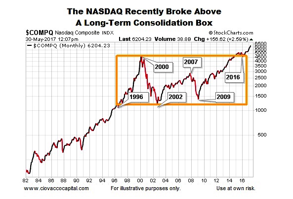
Tech Breaks Long-Term Barrier
The NASDAQ’s long-term chart (1982-2017) also leaves the door open to better than expected outcomes in the coming weeks, months, and years.
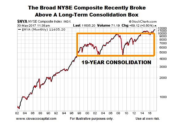
Broad Market Has A Constructive Set-Up
The NYSE’s long-term chart below aligns with the volume-based breadth analysis above. The NYSE Composite was unable to clear the orange box below between 1996 and 2015; a break occurred in 2016.
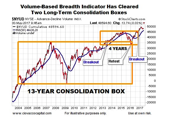
Breadth Aligns With Stocks
The NYSE’s up/down volume indicator has also recently cleared some areas of past resistance. The longer the indicator remains above the orange boxes below, the more meaningful it becomes from a bullish perspective.
Remaining Open To All Outcomes
The facts we have in hand today align with a growth-oriented investment stance. As long as that is the case, our allocations will continue to be heavily tilted toward equity ETFs. If the evidence shifts in a meaningful way, flexibility will allow for prudent adjustments.
Thanks for reading.
Get more investing research from Chris on his CCM website. Thanks for reading.
Twitter: @CiovaccoCapital
The author or his clients may hold positions in mentioned securities at the time of publication. Any opinions expressed herein are solely those of the author, and do not in any way represent the views or opinions of any other person or entity.

: Creating Bullish Divergence?")

: Creating Bullish Divergence?")


