The essence of market breadth is to see how the stocks that comprise a benchmark are performing relative to the benchmark itself.
In today’s “One Chart”, we’ll see how with less than 50% of S&P 500 stocks trading above their 200-day moving average, the conditions are more characteristic of bearish phases than bullish phases.
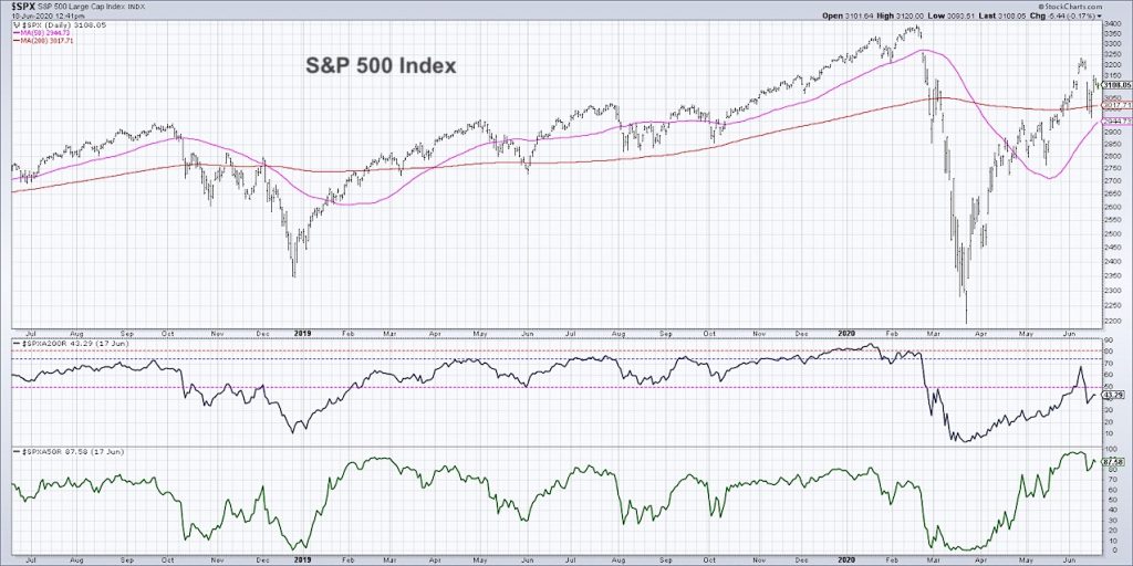
At the bottom of today’s chart, we have two key breadth indicators: the percent of stocks in the S&P 500 above their 200-day moving average, and the percent of stocks in the S&P 500 above their 50-day moving average.
I look at market breadth every day, and I find these metrics quite helpful because they show overall participation.
If the market as a whole behaves in a certain way, these indicators tell you what the masses of stocks are actually doing. They confirm whether stocks are agreeing or disagreeing with the overall market conditions.
The top panel shows the S&P 500 Index INDEXSP: .INX with the 50 and 200-day moving averages. The middle panel is the percent of stocks within the S&P 500 that are above their 200-day moving average. And the bottom panel is a shorter-term measurement showing the percent of these same stocks above their 50-day moving average.
I use this chart in a couple different ways. First off, when you see disagreement or when you see non-confirmation, this is when the price is doing one thing and the indicator starts to slope downward or starts to do something different. In February 2020, this was one of the indicators that suggested to me that we are nearing, or are in the midst, of a topping phase.
When you have higher highs in price and indicators like these were all sloping downward seeing lower peaks, this suggested that as the price was going higher it was due to all the mega cap stocks. These “safety stocks” were really making that final push higher, yet a lot of stocks did not go along with the S&P 500 and make that next final high. Basically about 10-15% of these names had already broken down through some of their key moving averages, and this was a precursor of further downside for the index.
On a short-term basis, you can look at some of these indicators and identify swings and understand participation. At the market low on March 23rd, you can see that literally zero percent of the S&P 500 remained above their 50-day moving average. All 500 stocks had gone below their 50-day.
But 6-8 weeks later, almost 100% of the S&P members had gone back above their 50-day moving average. This huge transition speaks to the strength of the V-bottom, the strength of price movements coming out of those lows, and the breadth of that upside participation.
Where it really gets interesting is when you use the chart as more of a longer-term measurement and think about bull and bear phases. If you look back at the last couple years, you can see that when the percent of stocks above their 200-day moving average remains above 50%, this tends to coincide with bull market phases.
It makes sense that if the S&P 500 is above its 200-day moving average and is making consistent new price highs, then over half of the S&P should be participating in that uptrend. Otherwise we would have a sort of non-confirmation, where the S&P is doing one thing, but these indicators are doing something different.
You can also see in bear market phases that the indicator will remain below this key 50% level. For example, think of the 4th quarter of 2018 as sort of a short-term tactical bear market going from the September high down to the low in December. The indicator went below 50%, and this was right around when the S&P started breaking down through its own 200-day moving average. The majority of stocks remained below their 200-day moving average, and by staying below 50%, this suggested that it was more of a bear market phase. More recently, I think that was one of the key indications in early March of this year when we did not get back above that 50% line.
What’s happened in the last couple of weeks though, is that we’ve perhaps had a bit of a head fake. This indicator went back above 50% the first week in June, suggesting to me this could be an “all clear” signal. The S&P had gone back above its own 200-day moving average as well. A couple weeks later, this indicator confirmed with a breakout above 50% and more than half of S&P names were above their 200-day. That seemed pretty encouraging!
Since then, the indicator has gone back below 50% which is actually very unusual. We have not seen an example of this quick reversal in the last two years at least. It’s rare because usually when it crosses the 50% line, it represents a seismic shift when everything is in a downtrend and then things start to improve.
This fluctuation around the 50% line is sort of what the market feels like right now, where there’s a bit of indecision by investors. We’ve had the huge sell-off from February to March, the huge rally into the June peak, and since then we’ve now stabilized between that peak (around 3240) and the low from last week (around 2960).
I think where we go from here will be very importantly indicated by whether we break above previous resistance or down through previous support. If we break down through support, this would most likely trigger a lower high and then a new lower low. This would confirm a new downtrend, and I would then expect this indicator to remain below 50%.
However, if we breakout to the upside, the upswing would likely continue and produce a higher low. A break above 3240 or maybe 3250 would confirm a higher high, and chances are this indicator would go back above 50% and suggest that the S&P most likely returns to previous all-time highs around 3400.
Price overall is always most important to me but looking at breadth measurements like this can be very helpful in understanding the dynamics “below the hood” of the benchmark. Think of it as popping the hood and seeing what’s happening inside the engine of the markets.
I’m looking very closely at whether or not this indicator goes back above 50%. If you’re bullish and are expecting further upside, I would certainly be looking for that break above 50% and subsequently remainingabove 50% as giving fuel to that bullish argument. If you’re bearish, I would be looking for it to remain below 50%. If we’re unable to eclipse 50% on the short upswing out of last week’s lows, I think that could confirm that the weight of the evidence is more negative than positive.
To watch this in video format, just head over to my YouTube Channel!
Twitter: @DKellerCMT
The author does not have a position in mentioned securities at the time of publication. Any opinions expressed herein are solely those of the author, and do not in any way represent the views or opinions of any other person or entity.


