This past week the stock market found both love and irreconcilable differences when comparing key sectors and indices.
The love came from the big cap tech stocks. Nvidia, Apple, Google, Microsoft all gave investors hearts and flowers.
On the flip side, small caps, energy, industrial metals, and transportation stocks gave investors indigestion, inconveniently ahead of Thanksgiving.
Rare and disconcerting to see the market so divided. Nonetheless, investors do have some reliable barometers to gauge what might be next.
I have posted four charts that depict the market breadth and risk on/off.
I also threw in one chart to see how inflation is faring, or at least what the Federal Reserve might be looking at to support their “transitory” theme.
One chart shows the relationships between the Transportation Sector ETF (IYT) versus the S&P 500 ETF (SPY).
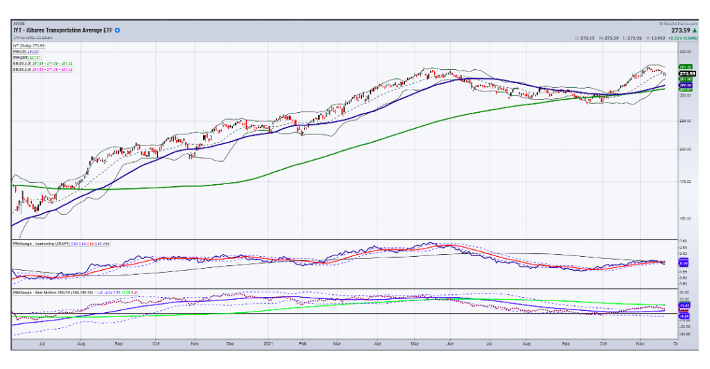
This is the most disconcerting of the four charts. The health of the economy and the ultimate health of the stock market are undeniably interlocked, even with the NASADQ going up making new all-time highs.
Transportation (except for the rails which are doing way better) reflects the supply chain issues, consumer demand, and the appetite for travel. Plus, with the infrastructure package as the growth economy’s holy grail, that it is underperforming SPY. We see that as risk off.
The price chart of IYT remains intact however, so this sends up a caution flag but not necessarily the end of days. Nonetheless, it is something to watch as what we know about the markets is that regardless of tech strength, a crash in the inside sectors of the economy weighs heavily on everything at some point.
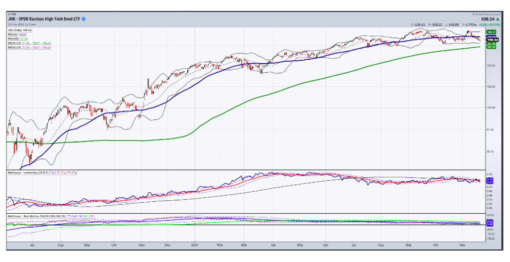
Next chart is the relationship between the high yield junk bonds and the long bonds.
Again, independently, junk bonds (JNK) are holding technical support. But what we like to see is junk bonds outperforming the long bonds. TLTs are often used as a flight to safety while junk bonds are bought during good times.
Right now, junk is underperforming long bonds. That too is a typical risk off scenario. If IYT holds and begins to show muscle over the SD&P 500, then that relationship can change. For now though, the lovefest for both bond traders and “inside” sectors is questionable.
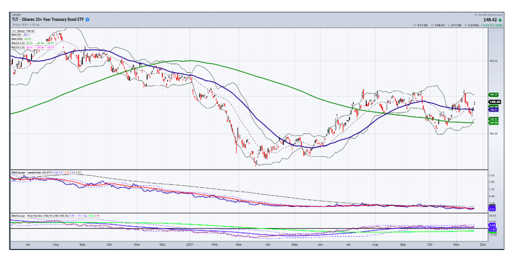
Next, we see the chart of the relationship between the long bonds (TLT) and SPY. Again, we want to see SPY outperform the long bonds as we want to see JNK outperform long bonds.
Friday’s price action put the TLTs ahead of the SPY and also put the TLTs above the 50-DMA. Even with certain members of the FED talking more hawkishly about interest rate raises and a faster tapering pace, bonds are up and yields are down. If one follows price, the bonds are telling us that the economic picture is not quite so roseate as the big tech stocks are showing Besides big tech may be sexy, but they are not good economic barometers. Ideally, we want to see SPY outperform the bonds. So for now, we consider this more risk neutral.
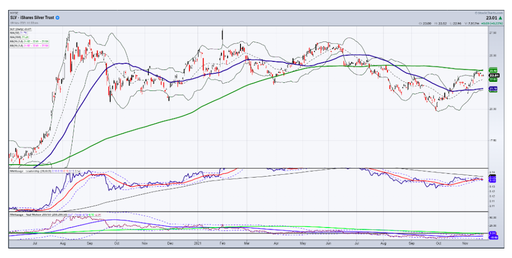
Which leads me to a good inflation indicator chart. Typically, when inflation is going parabolic, silver will outperform gold. This was the case in 1979 and during other inflationary times throughout history.
In this chart we see that silver outperformed gold from the middle of October until this past week. Although not underperforming to any large degree, silver most likely emboldens the Fed to believe that inflation is transitory.
Even with food prices up a lot, until the precious metals take off, even in the face of a firmer US dollar, that is when the Fed will have to pay attention and take some more aggressive action on rate hikes.
For us traders, keeping eyes on this chart, especially if silver takes out the 200-DMA (green) will not only give you a great long trade, but keep you one step ahead of the pack on a potentially parabolic move in commodities, whilst impacting a lot of equities.
Put this all together and these four charts are saying:
- Risk is neutral to slightly off in equities although big tech is in love with itself
- Long bonds are key-not so much in yields or even in yield curve, but in relation to the performance of the SPY
- Transportation is the most important gauge for the future growth or not of the economy
- Inflation, although a hot topic, has done nothing compared to what it can do if silver takes off.
Check out this week’s StockchartsTV installment, “Are Small Caps the Next Big Thing?” I give actionable information on current trades that are unfolding in the Small Cap space. I also highlight how I am positioning our portfolio from now into 2022.
Stock Market ETFs Trading Analysis & Summary:
S&P 500 (SPY) 464 is price support.
Russell 2000 (IWM) 232 is price support.
Dow (DIA) 352 is key price support area.
Nasdaq (QQQ) Breakaway gap which could lead the rest of the market or turn out as a top if the others fail to rise.
KRE (Regional Banks) If 73.50 breaks next is 70.00.
SMH (Semiconductors) Breakaway gap this week- 320 price target.
IYT (Transportation) 270-272 is price support.
IBB (Biotechnology) 153.38 is price support.
XRT (Retail) 98.50 is price support.
Twitter: @marketminute
The author may have a position in mentioned securities at the time of publication. Any opinions expressed herein are solely those of the author and do not represent the views or opinions of any other person or entity.


