U.S. Treasury Secretary Janet Yellen recently stated: “You don’t have a recession when you have the lowest unemployment rate in 53 years.” Let’s HOPE she is correct.
As logical as her statement seems today, it may look equally foolish in short order. As we will explain, HOPE leads us to believe Yellen does not appreciate the time it takes for tighter monetary policy conditions and reduced liquidity to cause economic deterioration.
The Fed is tightening monetary policy at the fastest pace in over 40 years. Furthermore, the economy is more leveraged now than at any time in history and, therefore, more sensitive to interest rate increases. It seems naïve to assume a recession is not probable because a lagging economic indicator, like employment, is robust.
This article explores the HOPE framework, developed by Michael Kantro, Chief Investment Strategist of Piper Sandler. HOPE is an acronym describing the lags and the sequence in which economic activity typically weakens before a recession.
HOPE
Michael’s HOPE model consists of Housing, New Orders (ISM), Corporate Profits, and Employment.
His framework acknowledges that the most interest rate-sensitive sectors are first to feel the brunt of tightening monetary policy. These sectors often serve as leading economic indicators. As interest rates dampen economic activity in interest rate-sensitive sectors, other sectors and facets of the economy begin to feel the impact of higher rates. HOPE illustrates the various lags or the time it takes for rate hikes to affect economic activity fully.
Janet Yellen may not acknowledge monetary policy lags, but Jerome Powell and many Fed members are fretting about their inability to judge how 2022’s interest rate hikes will impact 2023’s economic activity. Did they hike too much? Or might they stop too soon, keeping inflation pressures too high?
At his most recent post-FOMC press conference, Jerome Powell describes the lag effect the economy faces.
We are seeing the effects of our policy actions on demand in the most interest-sensitive sectors of the economy, particularly housing. It will take time, however, for the full effects of monetary restraint to be realized, especially on inflation. – Jerome Powell 2/1/2023
The Fed first hiked rates on March 17, 2022, by .25%. Assuming it takes a year or longer for the full impacts of a rate hike to be experienced, the first, relatively small rate hike is not fully being felt. There were seven more after March 2022, accounting for an additional 4.25% of interest rate increases.
H Housing
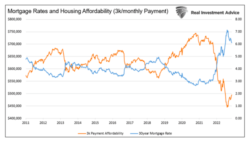
30-year mortgage rates were just under 3% at the end of 2021. They currently stand north of 6%. Like most debt, mortgage rates move in lockstep with other interest rates. Therefore, when the Fed increases rates, the cost of buying a new home often follows.
As Lance Roberts often correctly reminds us, “people buy mortgage payments, not house prices.” The graph below shows how the surge in mortgage rates grossly deflated housing affordability.
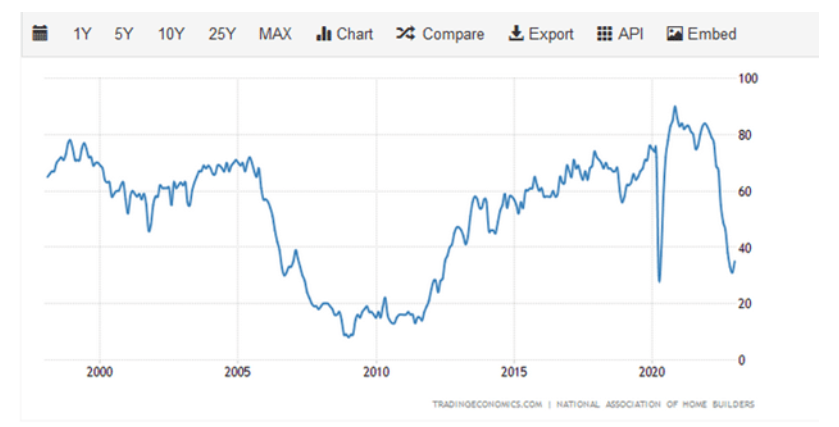
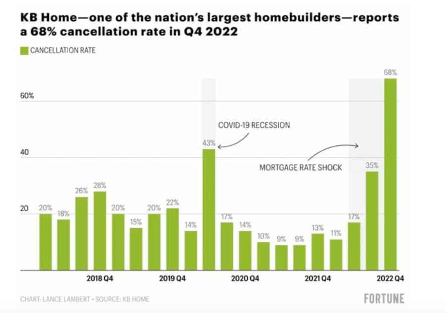
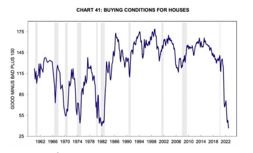
The following graph shows the NAHB homebuilders’ sentiment survey plummeted over the last year. Such is not surprising given that cancellations of new home sales are literally off the chart, as shown in the second graphic. The third graph, the University of Michigan Survey Buying Conditions for Houses, shows how interest rates have negatively impacted homebuying sentiment.
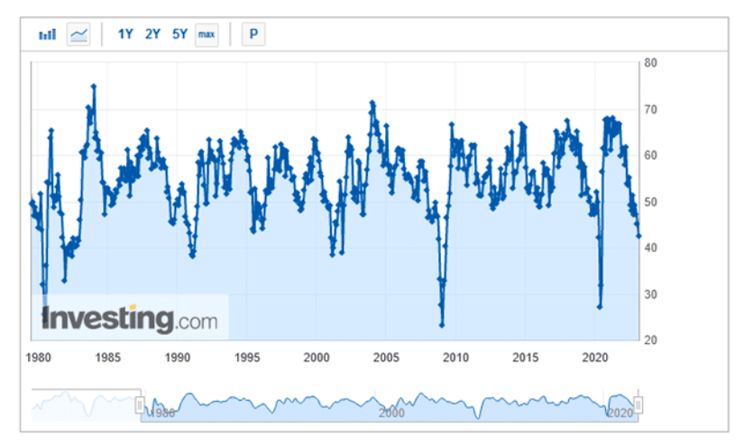
O New Orders
New orders tend to follow interest-rate-sensitive sectors. Often companies seeing accumulating inventories start to reduce new inventory orders. Recent inventory warnings and desperate inventory liquidation actions from Target, Walmart, and other retailers result in reduced demand to restock inventory.
The Investing.com graph below shows the ISM New Orders survey is down to 42.5, a level often associated with recessions.
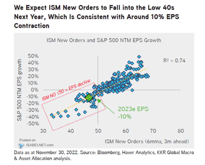
P Profits
As companies order less, corporate revenue and usually profits fall.
The KKR Global Macro scatter plot graph below shows the six-month moving average of ISM New Orders tends to lead corporate profits by about three months. The plot implies profits could drop 30-40%.
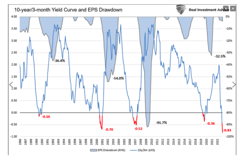
The yield curve, also a leading economic indicator, is another prescient indicator of corporate profits. It also shows a profit slump of 20-50% would be commensurate with such an inverted yield curve.
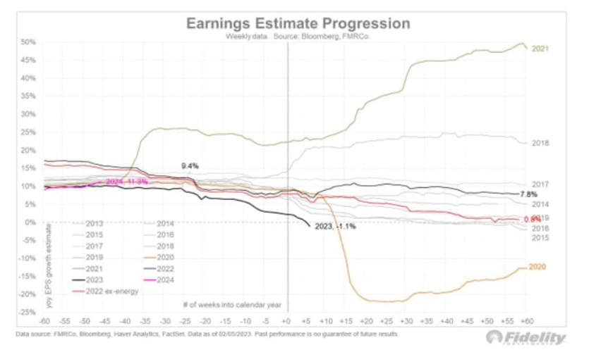
Thus far, with more than two-thirds of companies reporting fourth-quarter 2022 earnings, earnings growth is slightly negative. Estimates for 2023 are falling.
The Fidelity graph below shows the progression of 2023 earnings estimates. 2023 estimates just went negative after starting the year in positive territory. Except for 2021 and 2018, earnings estimates over the last ten years trended lower throughout the year. We suspect 2023 will as well.
The following quote comes from Morgan Stanley’s Mike Wilson:
Forward EPS growth has just gone negative. This has only previously happened 4 times over the past 23 yrs. In each prior instance (2001, ’08, ’15, ’20), equities have faced significant price downside associated w/the shift from positive to negative earnings growth.
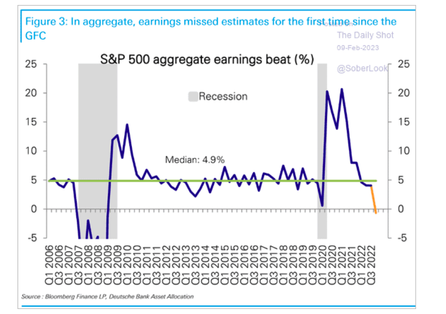
Lastly, the graph below from Deutsche Bank shows that last quarter’s aggregate earnings were below estimates for the first time in nearly 15 years.
E Employment
Employment is often the last economic indicator to falter. Companies will often take other cost-cutting actions before laying employees off. Not only is firing employees expensive, but it can be very disruptive and worrying for the remaining employees. Before companies’ fire employees, we often see them reduce the average work week and wages. Thus far, there are few signs this is occurring.
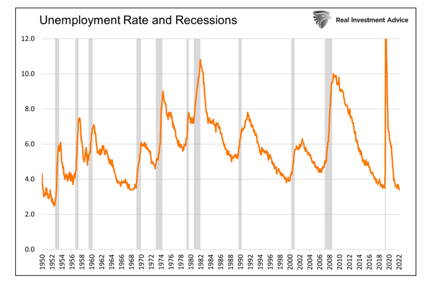
Quite often, unemployment doesn’t increase until a recession has already begun.
The graph below contrasts the unemployment rate with recession periods. Recessions begin within months of the cyclical low in the unemployment rate. Unemployment tends to shoot higher once a downturn begins.
Janet Yellen’s False Comfort
As we began, Janet Yellen told us not to worry about a recession because the unemployment rate is at a 53-year low. 53 years ago, in December 1969, the unemployment rate was 3.5%, marking the low for the nine-year economic expansion starting in 1960. By May 1970, it was 4.8% and rose to 6.1% within a year.
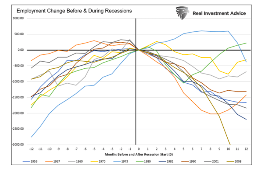
The following two graphs show how employment and unemployment trended before and during the last 11 recessions since 1950. The first shows that on the eve of recessions, the unemployment rate has always been within half a percent of its cycle low. In all cases, unemployment rose by at least 1% and up to more than 3% in a recession’s first twelve months.
The second graph makes a similar point. Employment increases right until the recession starts, and then it drops suddenly. 1973 is the only exception.
Summary
Janet Yellen and most investors are failing to factor in the powerful lag effect of monetary policy. Even more concerning, they seem to be making a critical mistake as the Fed is raising rates and doing QT at a pace most of us haven’t seen in our careers. We HOPE we are wrong and such actions result in a soft landing. Unfortunately, history tells us it’s a matter of when and not if tighter monetary will send the economy into a recession.
Focus on the leading, not the lagging indicators!
A special thank you to Michael Kantro for his simple HOPE acronym that makes the lag effect of tighter monetary policy so easy to understand.
Twitter: @michaellebowitz
The author or his firm may have positions in mentioned securities at the time of publication. Any opinions expressed herein are solely those of the author, and do not in any way represent the views or opinions of any other person or entity.

: Worrisome to Broader Market?")

