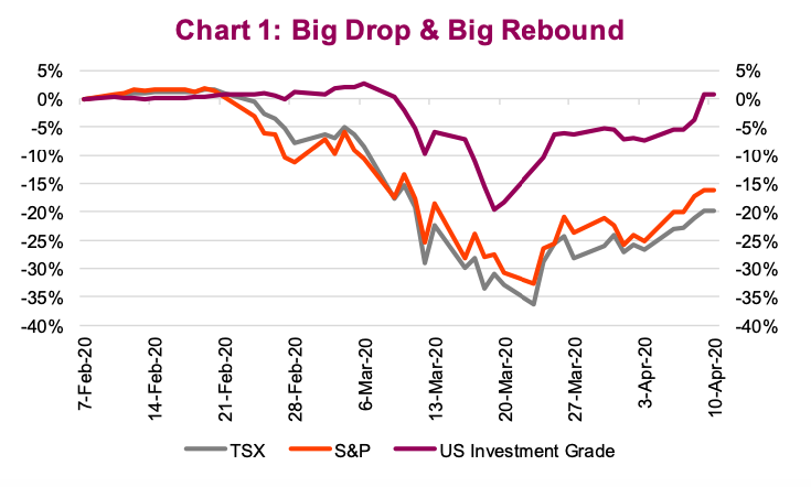
So far in April, the stock markets have recovered a sizeable portion of the March crash damage.
The S&P 500 Index, at its trough on March 24, was down 34% from its February high.
Now the stock market is down 17%, or in other words it has recovered about half.
Last week saw the biggest weekly gain for the S&P 500 in 45 years. The TSX has done well too: at one point it was down 38% and now it’s down 21%.
And credit? The U.S. investment-grade bond ETF is almost back to its pre- bear market level.
There have been two primary drivers for this ‘partial recovery’: The COVID-19 data has improved and the U.S. Federal Reserve’s bazooka.
COVID-19
Relative to a few weeks ago, the pandemic data has materially improved. Keep in mind a few weeks ago the market had little to no visibility on the path forward. Yes, a number of Asian countries seemed to have navigated through the pandemic (China, South Korea, Singapore) but the situation had not yet been repeated in any Western nations. With the news out of New York, there were concerns that Italy would be repeated on a much larger scale in the U.S.
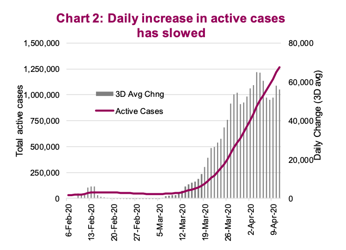
Today, while still deep in the fight against this pandemic, there are signs of improvement even in Italy and New York City. Active cases are still rising but the pace is slowing. Italy’s active cases took seven days to rise from 25K to 50K, another seven days to reach 75K but 12 days to reach 100K. Hospital admission rates have declined in NYC. The fact is, social distancing works and dire forecasts have been reduced to somewhat less dire.
The pace of increase in active cases has slowed. While they’re still rising, the increases are no longer accelerating based on recent data. Now this could be due to the law of large numbers versus testing capacity, but it would appear improvements are rather widespread. Recoveries are starting to rise. Germany has had a number of days with greater recoveries than new cases. The daily data is rather volatile, so we opt to focus on a three-day average in new active cases (chart 2).
This has enabled the market to start looking farther ahead and considering key questions like when social distancing measures may be relaxed and when portions of the economy may be restarted. It’s worth noting that China and South Korea remained vigilant in terms of ongoing quarantines and strong social distancing long after active cases peaked and started to decline. We have yet to see the peak in most other nations.
Still, the news has improved, and the markets reacted.
Bazooka Jerome
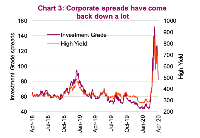
Not to be outdone by other central banks, the Fed announced $2.3 trillion of balance sheet expansion. As details emerged of where this would be allocated and how much, credit markets rallied hard as a sizeable portion would be used for corporate bond buying. This has helped credit spreads fall considerably from March highs (chart 3). Consider the Carnival Cruise bond issue last week – the 3-year bond with a 11.5% coupon was issued at par (100) and is now trading at 105.
This helped lift risk assets, including equities, higher last week. Bankruptcies will still occur but the Fed’s action will reduce this number.
Here come earnings, it won’t be pretty
We believe there are still opportunities out there, but we have near-term concerns that the market may be overreacting. In March, the markets
appeared to overreact to the bad news; in April they may also be doing the same with regards to the good news.
The duration of social distancing remains a big variable in forecasting the economic damage done. Governments are doing everything to soften the blow but regardless, there will be a blow! And it’s worth noting that it’s easier to go bankrupt or lose a job than it is to start a business or find a job.
Even ifyoubelievethepandemicdatawillcontinuetoimprove(wedo),themarket has to get over two more hurdles. The first is earnings. The first-quarter earnings season just started, estimates had been reduced and most social distancing didn’t’ start till very late in the quarter. We believe the results should come in better than revised estimates; the outlook and revisions are key.
Guidance is pretty much non-existent, and many dividends are being put on pause as maintaining liquidity remains paramount. This will trigger a wave of earnings revisions from analysts who have waited for the quarterly results.
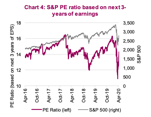
This brings us to the second hurdle – valuations. Remember how cheap the market got in March, from 19x down to the 13x range? Well, that is not the case anymore (back up to 18x). Instead of our regular valuation metric of price-to-earnings (PE) based on the consensus estimates for the next 12-months of earnings, we are going to show the longer term earnings period. Afterall, markets moved higher and the 12- month estimates are taking a beating due to the battle against the pandemic.
Chart 4 is the PE for the S&P 500 based on the earnings estimates for the next three years. This PE got down to 11x in March and is now back over 14x. This is hardly what we would now call ‘juicy valuations’ anymore.
Economic data
So far,the market has been primarily focused on the pandemic and health data – and for good reason. However, this may begin to pivot. We would say the dire economic data now being released is different. This unprecedented poor economic data is the result of a self-induced recession to fight the pandemic. That is very different than other instances of bad economic data and should be understood within this context.
The market has been ignoring the poor data. Chart 5 is the daily change of the CitiGroup Economic Surprise index. If the data was better than expected, the daily change is positive, if the data was poor, the daily change would be negative. Each is plotted against the daily change in the S&P 500. In a ‘normal’ world, if the economic data surprises to the upside, markets would rise. And if the data surprised to the downside, markets would fall.
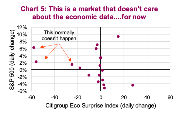
We highlighted a number of days with awful economic data and markets rose. This market is currently ignoring or looking past the bad economic data.
Our concern is that the market’s ambivalent response to poor economic data may change in the weeks and months ahead. We are in for, at best, two or three months of bad data. At some point the market may stop believing we will have that sharp V-shaped recovery and begin discounting a more moderate recovery or a longer period of economic pain.
Portfolio implications
The markets are pricing in a lot of good news on the outcome of both the pandemic and the economic path forward. We believe the March low was an overreaction and the recovery may have gone a bit far in the other direction. While not ringing any alarm bells, it certainly has become harder to find mispriced assets and deploy capital. Keeping some powder dry at this point makes sense, especially if the steady bad earnings and economic news ahead creates another opportunity.
And while ‘Don’t fight the Fed’ is a core mantra of many investors, it may be time to fade the Fed.
Source: All charts are sourced to Bloomberg L.P. and Richardson GMP unless otherwise stated.
Twitter: @ConnectedWealth
Any opinions expressed herein are solely those of the authors, and do not in any way represent the views or opinions of any other person or entity.


: Showing Some Signs of Emerging Strength")
