Say say two thousand zero zero party over, oops, out of time
So tonight I’m gonna party like it’s nineteen ninety-nine” – Prince 1999
Prince wrote the song “1999” in 1982, 18 years before the clock ran out on the 20th century and possibly the greatest stock market run in American history.
In 1999, equity valuations stood at unprecedented peaks, even dwarfing those of 1929. At the time, investors were euphoric as if the rally were eternal. Newbies were killing it, and veterans were cleaning up like never before. Some stocks were rising 10, 20, and even 30% or more in a day. Companies adding dot com to their name or discussing new internet technology saw huge pops in their share prices. Investors bought the narrative with little to no due diligence.
Sound familiar? Not only is today’s speculative environment eerily similar to the late 90s, but valuations, in many cases, are frothier than that period.
Comparing valuations from separate periods is inaccurate as economic and earnings environments can be different. This article contrasts the valuations and environments to consider if it’s time to leave the party or stay and rock on. To help you decide we provide a statistical analysis showing the potential downside risk facing the S&P 500.
First, however, let’s look at a few valuation measures to provide context between today and 1999.
S&P 500 Price to Earnings
Price to earnings (P/E) is the most often used method to value stocks. It’s common for investors to use the trailing 12 months (ttm) of earnings in the P/E denominator, as shown in the first graph.
Some investors, including ourselves, prefer using the CAPE P/E. Robert Shiller’s CAPE method uses the last ten years of earnings to better factor in secular earnings trends and avoids one-off events that distort valuations.
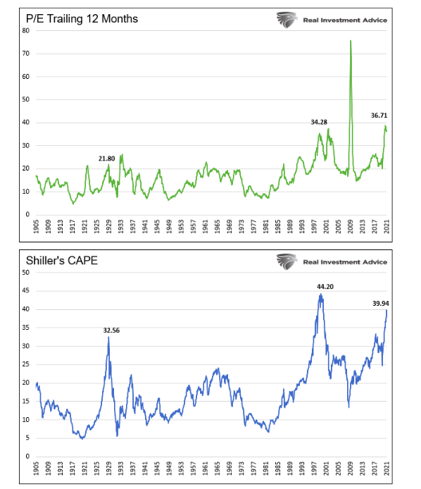
P/E valuations are grossly extended, and in both calculations nearing or surpassing levels in 1999. The graphs also show valuations are well above those of 1929.
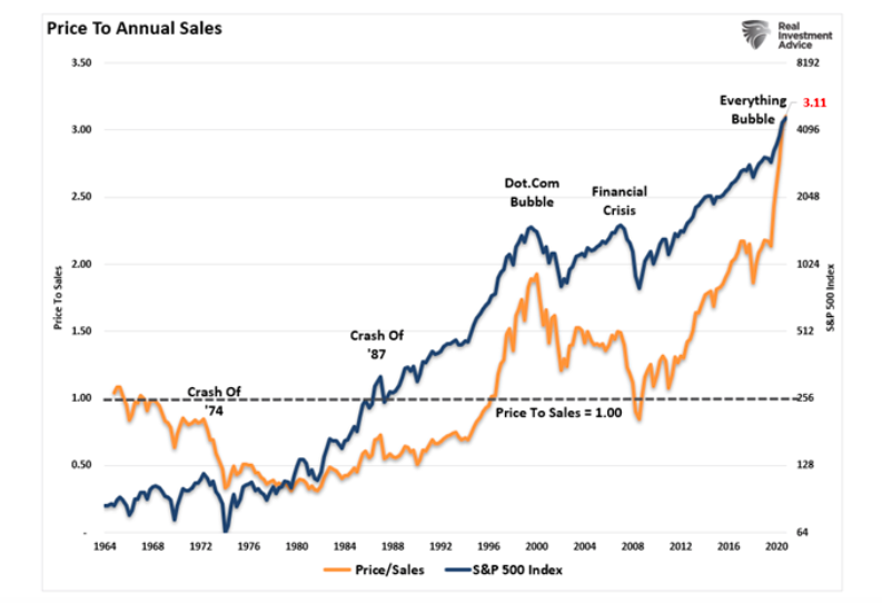
Price To Sales
The benefit of using the ratio price to sales (P/S) versus P/E is that sales, or revenue, are not easy to manipulate by executives.
The graph below shows the price to sales ratio (P/S) is now 50% above where it was in 1999.
The charts below, courtesy of the Leuthold Group, provide further context. The top chart shows 15% of the S&P 500 stocks have a P/S ratio greater than ten. That compares to 8% in 1999. The bottom graph shows the median P/S ratio is nearly double the 1999 level.
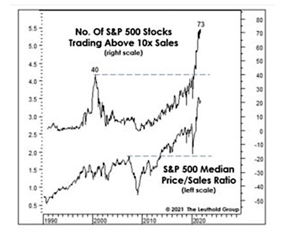
To highlight what a P/S ratio of ten entails, we quote Scott McNeely, the CEO of Sun Microsystems, from 1999.
“At 10 times revenues, to give you a 10-year payback, I have to pay you 100% of revenues for 10 straight years in dividends. That assumes I can get that by my shareholders. It assumes I have zero cost of goods sold, which is very hard for a computer company. That assumes zero expenses, which is really hard with 39,000 employees. That assumes I pay no taxes, which is very hard. And that assumes you pay no taxes on your dividends, which is kind of illegal. And that assumes with zero R&D for the next 10 years, I can maintain the current revenue run rate. Now, having done that, would any of you like to buy my stock at $64? Do you realize how ridiculous those basic assumptions are?”
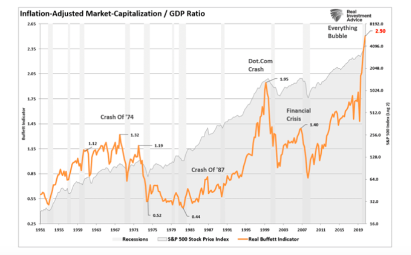
More Valuation Metrics
The following graph is purportedly Warren Buffet’s favorite valuation technique. The measure compares the inflation-adjusted market cap of the S&P 500 as a ratio to the economy. Given that earnings and economic growth correlate well over time, the ratio effectively points out valuation extremes. Currently, the ratio is at 2.50, well above the 1.95 from 1999 and 1.40 leading into the Financial Crisis.
Now, let’s take a look at the Q-ratio.
Continue reading on the next page –>

 Rolling Over At Key Fibonacci Level?")


