NYSE Stocks Greater Than 50-Day Moving Average
The 50-day moving average helps us monitor the health of short to intermediate-term trends. In 2010 69 days after the stock market correction ended, 68% of NYSE stocks were above their 50-day moving average.
In 2011 69 days after the stock market correction ended, 57% of S&P 500 stocks were above their 50-day moving average. In 2015 69 days after the market correction ended, 53% of S&P 500 stocks were above their 50-day moving average, which is not significantly different from 2010 and 2011.
NYSE Stocks Percent Above Their 50 Day Moving Average
69 Days After The Low Was Made

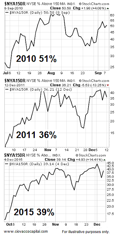
NYSE Stocks Greater Than 150-Day Moving Average
The 150-day moving average helps us monitor the health of intermediate to long-term trends. Let’s check market breadth here: In 2010 69 days after the stock market correction ended, 51% of NYSE stocks were above their 150-day moving average. In 2011 69 days after the market correction ended, 36% of NYSE stocks were above their 150-day moving average. In 2015 69 days after the market correction ended, 39% of NYSE stocks were above their 150-day moving average, which is similar to 2010 and 2011.
NYSE Stocks Percent Above Their 150 Day Moving Average
69 Days After The Low Was Made
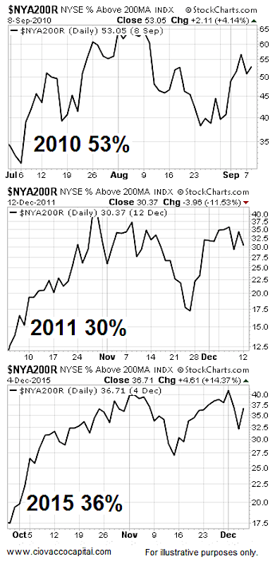
NYSE Stocks Greater Than 200-Day Moving Average
The 200-day moving average helps us monitor the health of long-term trends. In 2010 69 days after the stock market correction ended, 53% of NYSE stocks were above their 200-day moving average. In 2011 69 days after the market correction ended, 30% of NYSE stocks were above their 200-day moving average. In 2015 69 days after the market correction ended, 36% of S&P 500 stocks were above their 200-day moving average, which is similar to 2010 and 2011.
NYSE Stocks Percent Above Their 200 Day Moving Average
69 Days After The Low Was Made
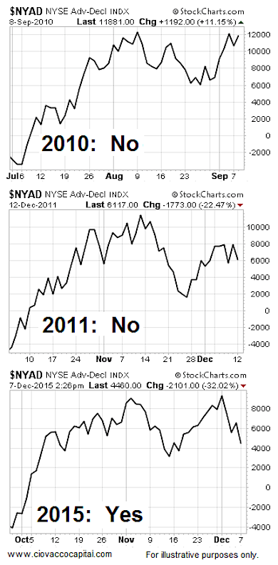
What About The Advance-Decline Line?
The A/D lines shown below track advancing securities minus declining securities and capture market breadth in another way.
All things being equal, it is better when the A/D line can make new highs in relative close proximity to the stock market. If we compare the readings 69 days after the stock market bottomed, the A/D had failed to print a higher high in both 2010 and 2011. In 2015, the A/D line recently made a higher high, meaning you can make an argument that broad market breadth is stronger in 2015 relative to both 2010 and 2011. The question being answered in the charts below is recent new high?
NYSE Advance Decline Line Recent Higher High?
69 Days After The Low Was Made
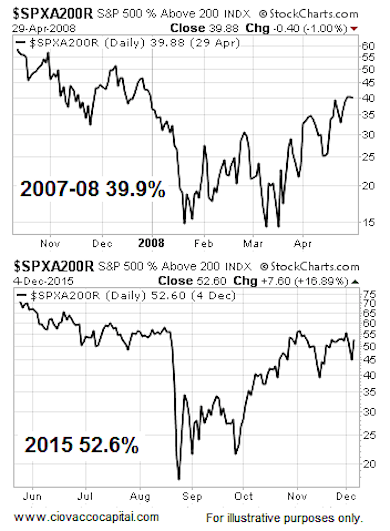
How About Bear Markets?
The S&P 500 hit its 2015 high on May 20 or 201 calendar days ago. Therefore, we can compare 2015 breadth to breadth 201 days after the stock market peaked in 2007. Those who have studied markets know that a low percentage of stocks remain above their 200-day moving average in a bear market. The first chart below shows the percentage of S&P 500 stocks above their 200-day moving average 201 days after the October 11, 2007 peak in the S&P 500. The second chart shows the same market breadth indicator 201 days after stocks peaked in 2015. As you can see, 2015 looks better than 2007-2008.
S&P 500 Stocks Percent Above Their 200 Day Moving Average
201 Days After The High Was Made
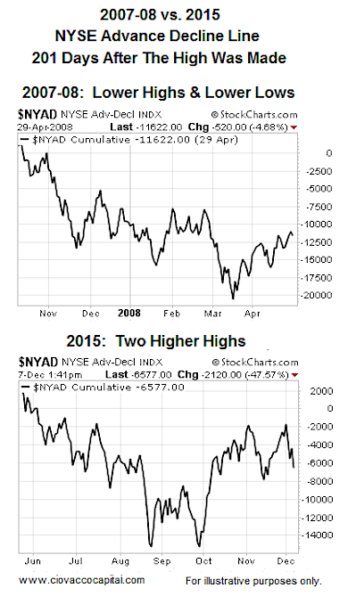
Round Two: 2007-2008 vs. 2015
We noted earlier that all things being equal a market is healthier when the A/D Line can make new highs in close proximity to highs in the stock market. In 2007-2008, 201 days after the bear market started, the A/D Line was making a series of lower highs and lower lows (a bearish trend). If we look at the A/D Line 201 days after the May 20, 2015 high in stocks, we see improvement in the form of higher highs after the stock market bottomed in late September. It is fair to say the 2015 chart looks better than the 2007-2008 chart.
Moral Of The Story – No Firm Conclusions Yet Using Breadth
- Market breadth as of December 7, 2015 does not look significantly different than similar periods after the S&P 500 bottomed in 2010 and 2011.
- In some cases, market breadth in 2015 looks better than at similar points in 2010 and 2011.
- The percentage of S&P 500 stocks above their 200-day moving average looks better in 2015 relative to a similar point after the October 2007 peak.
- The jury is still out in terms of using market breadth in the stock market correction vs. bear market debate. If breadth improves, the stock market correction case will get stronger. If breadth deteriorates significantly, the bear market case will improve.
Thanks for reading.
Twitter: @CiovaccoCapital
Read more from Chris on the CCM blog.
Author or his funds have long positions in related securities. Any opinions expressed herein are solely those of the author, and do not in any way represent the views or opinions of any other person or entity.

 Flirting With Critical Support… Again")


