One of the ways I like to evaluate market breadth is to look at four stocks within a large index. I look at the returns over a period like the last six months, and take the stocks at the 20th, 40th, 60th and 80th percentiles.
This can be a helpful process as it eliminates the effect of the top performers with crazy returns (stocks like ALGN and KORS) and also ignores names that have cratered (such as GE and CMG).
I try not to pay attention to the sector of each stock or the reasons why the names are in that order performance-wise. I’m simply looking at the charts to answer a couple key questions.
How good does the 20th percentile stock look? How bad does the 80th percentile stock look? If our portfolio was an average of these four names, how would we feel? Any key takeaways?
By thinking through these different comparisons, I come to an unscientific conclusion of what the “average” stock at each rank looks like. Then I can compare this to the chart of the overall market to make a more general assessment on broad participation in the overall market trend.
Running the six-month returns this morning, I came up with these four names:
Let’s look at each name and chart individually and see what themes we can identify.
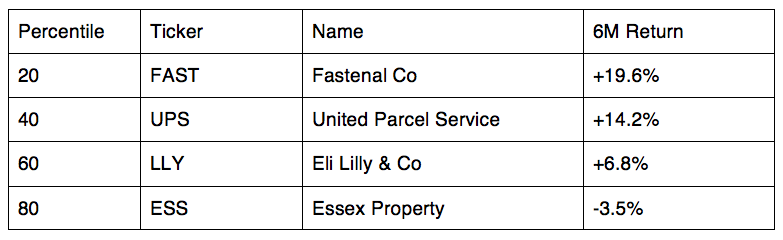
Fastenal (FAST)
At the 20th percentile we have Fastenal Co (NASDAQ:FAST) from the Industrials sector. The stock sold off in the spring and summer, coming down almost 25% before bottoming out around $40 in August. FAST has now recovered all of those losses, gaining almost 33% in three and a half months.
FAST is currently overbought on both the weekly and daily charts. If and when the current rally continues, the stock could be headed for its all-time high of $55.05.
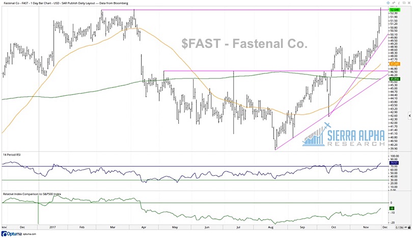
United Parcel Services (UPS)
At the 40% percentile mark we have United Parcel Service Inc. (NYSE:UPS), also from the Industrials sector. Here we have a chart showing the cup-and-handle pattern, with a long-term rounded bottom followed by a shallower correction. The key to this pattern is that the resistance stays constant, in this case just above $120.
A strong finish to this week would give UPS a new 52-week closing high and confirm a bullish breakout of this pattern.
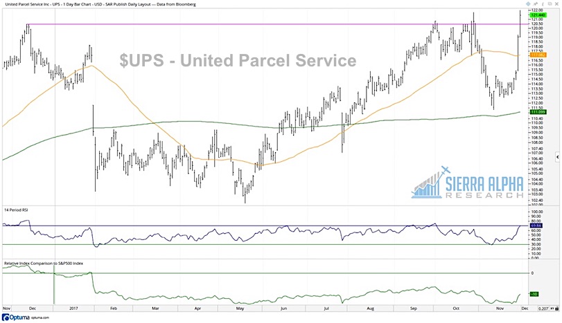
Eli Lilly (LLY)
Next at the 60th percentile we have a Health Care stock, Eli Lilly & Co (NYSE:LLY). After rallying to the upper 80’s in early 2017, the stock has settled into a range between $77 and $88.
Encouraging signs include a series of higher lows and two upward sloping moving averages. A trend line (blue) using the lows from Dec 2016 and Aug 2017 is a good visual representation of the recent uptrend. Overall, not the most exciting chart around, but still in a fairly positive configuration.
Essex Property Trust (ESS)
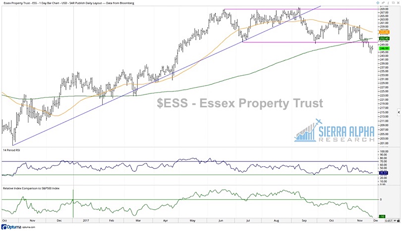
Finally at the 80th percentile we find Essex Property Trust Inc (NYSE:ESS) from the Real Estate sector. Here we have a perfect illustration of the rotation from accumulation to consolidation to distribution. That is, we see a trend of higher highs and lows through mid-2017, tracked by the blue trend line. Then we see a consolidation period for the last six months as the stock traded between $250 and $270 (pink horizontal lines). Now we have a distribution period, with ESS breaking down from that range while closing below its 200-day moving average.
If the stock continues lower, there isn’t much support on the chart until previous lows around $222.
Now let’s go back and answer the original questions posed.
How good does the 20th percentile stock look?
Pretty good! FAST is close to completing a breakout above 2017 highs with plenty of upside.
How bad does the 80th percentile stock look?
Not good. Certainly in a sell configuration, having recently broken to new 13-week lows. However, it could be much worse.
If our portfolio was an average of these four names, how would we feel?
Not bad. An equal weighted portfolio of those four stocks would have provided a return of +9.3% for the last six months, not far from +9.8% for the S&P 500. We basically missed out on the top performers in the index, most of which were in the Technology and Consumer Discretionary sectors.
Any key takeaways?
The biggest takeaway from my perspective is that when I compare the top two stocks (FAST and UPS) to the lower two stocks (LLY and ESS), I feel much better about the top two than I feel worse about the lower two. That is, the top two charts look very strong, and the bottom two charts look mildly bullish to a little bearish.
At some point, the market will take on a more corrective posture. Then we’ll see the 80th percentile stock start to look very bearish. The 60th percentile name will rotate from mildly bullish to mildly bearish. And the 40th percentile stock will show early signs of breaking down.
Based on today’s work, this unscientific look at the 20/40/60/80 Portfolio tells me that the S&P 500 is in a fairly positive configuration.
You can gain deeper insights and more meaningful analysis over at Sierra Alpha Research.
Twitter: @DKellerCMT
The author does not have a position in mentioned securities at the time of publication. Any opinions expressed herein are solely those of the author, and do not in any way represent the views or opinions of any other person or entity.

: Showing Some Signs of Emerging Strength")
