We have been watching Intel’s stock (NASDAQ:INTC) for a while over here on @seeitmarket. And we have been bullish. So it’s nice to see the stock ramping higher.
I can honestly say that if you took the ‘ticker symbol’ of INTC out of the picture I would still look at this chart in the same manner. I do not have a clue about the fundamentals of ‘why’ INTC is on the move right now. But, the patterns and relative strength ratio analysis of technical gave us a clue almost 3 years ago. For a synopsis please see the following posts:
- Intel (INTC) On The Move (update)
- Intel Stock In Focus: Is INTC Setting Up For Another Rally?
- Intel Stock Price Outlook (INTC): Overbought But Bullish
Time for an update.
So where are we now?
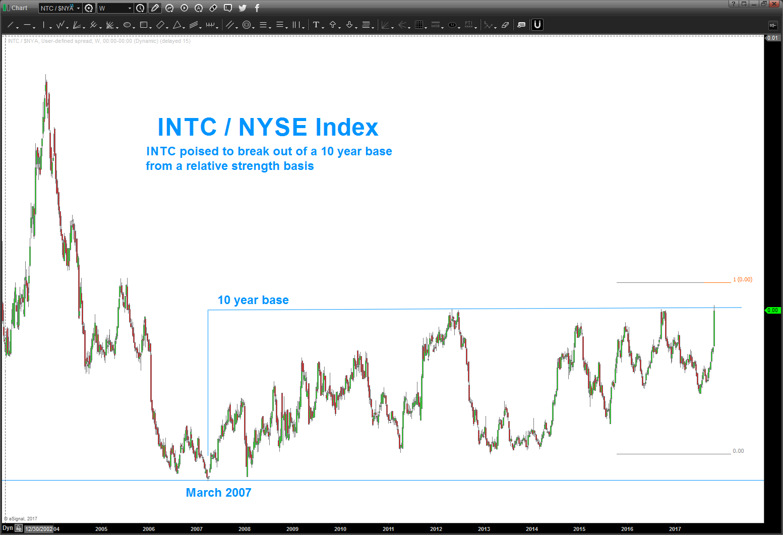
The first chart below is a ratio analysis of Intel (INTC) versus the NYSE Composite Index. It has NOT broken out of the 10 year channel but I do ‘expect’ it to shortly. This will be a very strong confirmation that a new bull market is beginning in INTC.
Intel (INTC) vs NYSE Composite Index “ratio” Chart
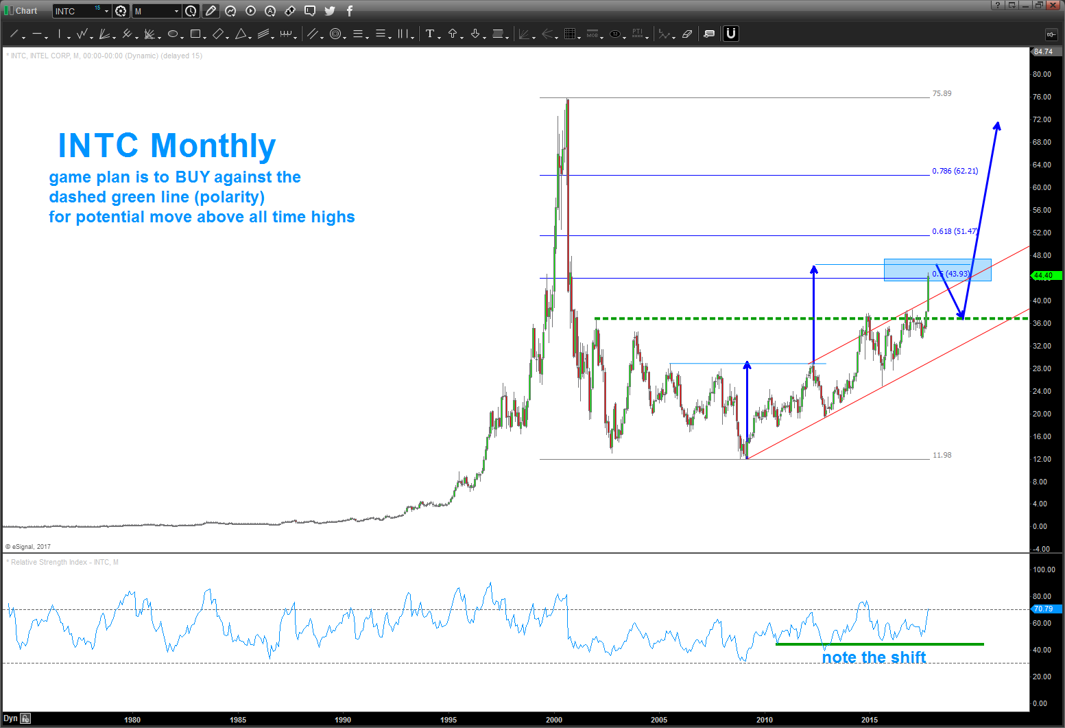
The second chart is a monthly look at Intel’s stock price and showing the resistance zone calculated over 3 years ago. I would ‘like’ INTC to find resistance here (note: it doesn’t have to and doesn’t care what I think – the market never does). This would enable an ‘outside return’ (pullback) LONG opportunity against the 10 year base in/around the mid-30’s.
This would be a classic technical analysis opportunity called polarity where (in this case) resistance becomes support.
Intel (INTC) “Monthly” Chart
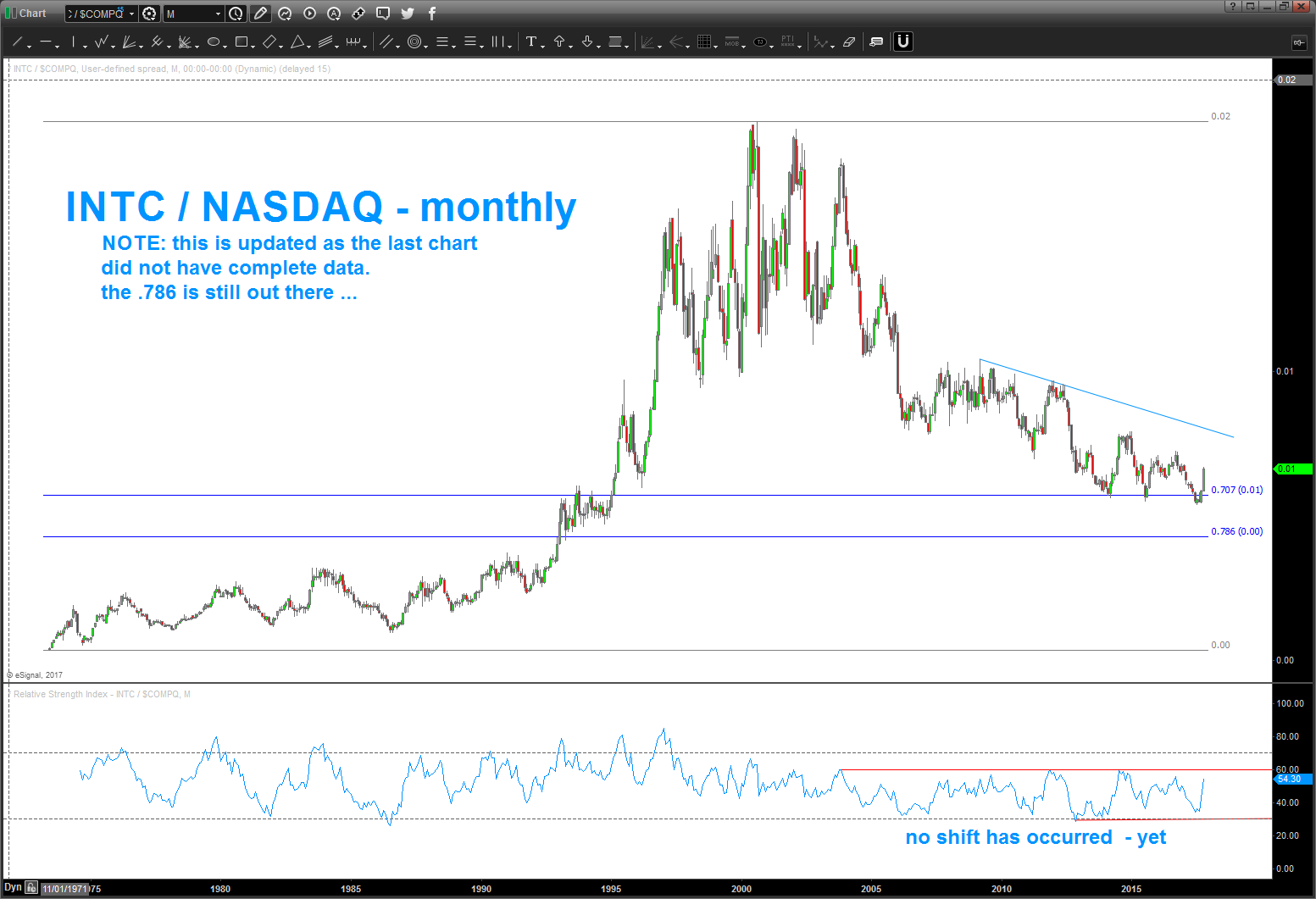
The third chart is ratio chart of Intel to the Nasdaq Composite (INDEXNASDAQ:.IXIC) and highlighting its relative strength. Frankly, I am a long term positional investor and I’m a freak about long term data. As you can see, and importantly, we have not had the relative strength (RSI) shift its zones of resistance and support. Once this does, rotational leadership will continue to bolster the LONG Intel’s stock case.
INTC / Nasdaq Relative Strength Chart
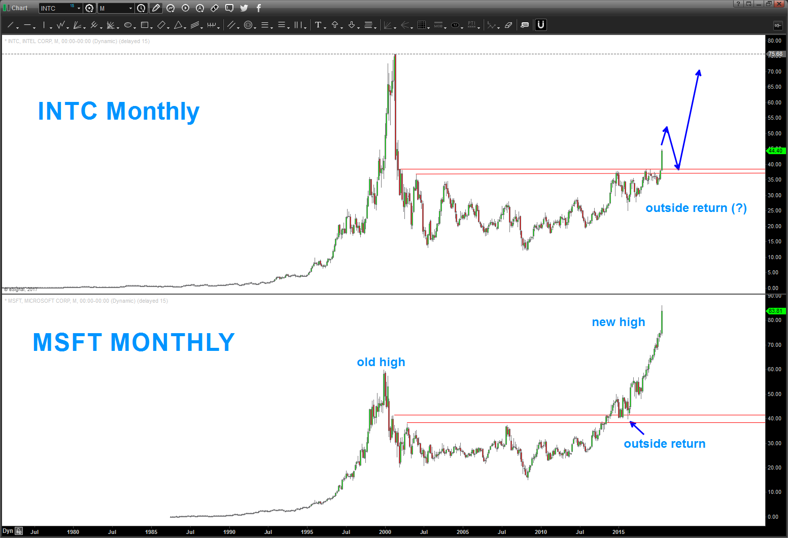
The fourth chart shows a comparison of the PATTERN of Microsoft’s stock price (NASDAQ:MSFT ) and the mirror image of Intel (INTC). Note, MSFT built a rounded bottom and then broke out, returned to the neckline and then blasted off to new highs. Is INTC following this pattern?
Intel vs Microsoft Stock Market Pattern Comparison
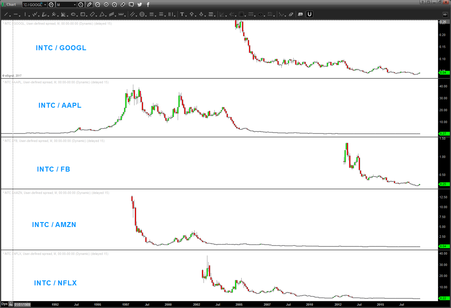
Lastly, let’s take a quick look at INTC versus the FAANG stocks (FB, AMZN, AAPL, NFLX, GOOGL). I wanted to put them all on one chart so we could track them… while not as noticeable in this view, we can actually see GOOGL and FB losing some relative strength against INTC. Perhaps those are the names the institutions are/will be rolling out of and into with regard to INTC taking some leadership. Time will tell. Additionally, AAPL, AMZN, NFLX all appear to be strong against INTC for the time being.
Intel vs the FAANG Stocks
In conclusion, certainly appears the Intel stock breakout is real. That said, I would look to minimize risk in the coming days/weeks and playing for an outside return to the neckline to add back to longs.
Twitter: @BartsCharts
Author does not have a position in mentioned securities at the time of publication. Any opinions expressed herein are solely those of the author, and do not in any way represent the views or opinions of any other person or entity.


