Lagging Equal-Weight In 2011
Over the past few months, the Equal Weight S&P 500 has lagged the standard S&P 500 Index (cap-weighted), which is a legitimate concern for stock market bulls.
Underperformance can precede weakness in the stock market as it did in 2011 (see chart below). After the ratio of Equal Weight/S&P 500 started to break below the three major FIBS shown below, some painful sessions in the S&P 500 followed.
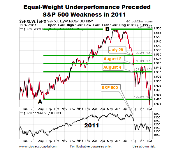
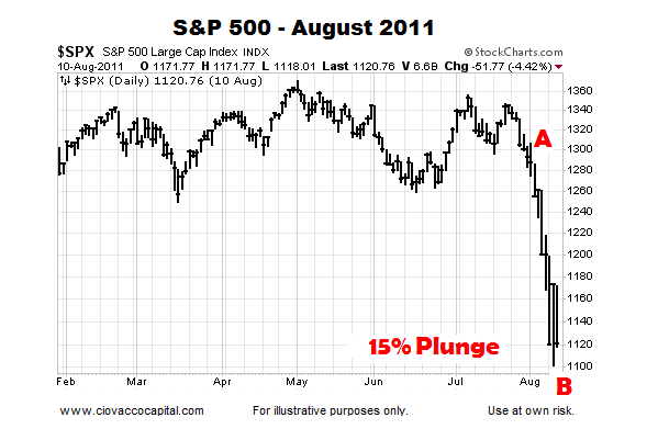
The chart below shows a larger view of the 2011 S&P 500 waterfall decline. The 15% plunge in 2011 occurred between the close on July 28 and the intraday low made on August 9.
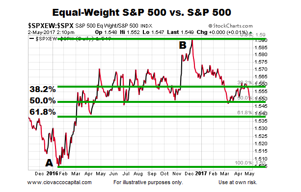
Taking A Look At May 2017
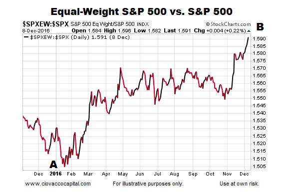
The present day bullish trend in the Equal-Weight/S&P 500 ratio began in early 2016 (point A below). The bullish move got a bit ahead of itself after the November election (point B).
Thus far, the pullback in the Equal-Weight/S&P 500 ratio has stayed within the “normal retracement” zone as shown via the three Fibonacci levels below. If the ratio can hold near the three major Fibs, the odds of a higher high will remain in the favorable range. If the ratio drops below and stays below the three major Fibs, the odds of a trend change or deeper pullback will increase.
How Vulnerable Is 2017 vs. 2011?
The following charts provide some insight into the health of the present day market relative to the market’s health in 2011 before the waterfall plunge. Markets can do anything at any time. Having said that, waterfall plunges typically do not come without some type of observable deterioration already in place. The 15% plunge in 2011 occurred between the close on July 28 and the intraday low made on August 9.
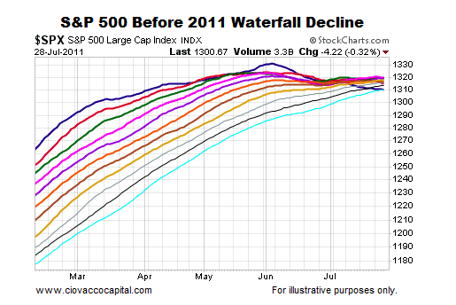
How Much Damage Was In Place Before The 2011 Plunge?
Moving averages help us monitor the never-ending tug of war between bullish conviction and bearish conviction. Remember, the plunge in 2011 occurred between the close on July 28 and the intraday low on August 9. The chart below shows various daily moving averages for the S&P 500 on July 28, 2011; the moving averages range from the 50-day (dark blue) to the 150-day (teal). Notice how the 50-day moving average peaked two months before the waterfall decline. The fastest moving average had also moved from the top of the cluster to the bottom of the cluster, which spoke to the magnitude of the deterioration in bullish conviction relative to bearish conviction. Also notice how tight the cluster of moving averages were on July 28, and how many of the slopes had moved from positive to neutral or negative.
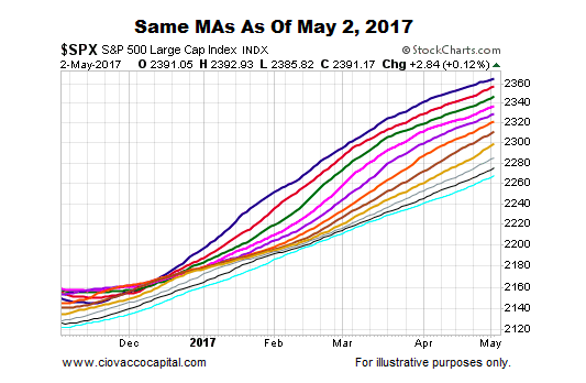
The 2017 chart below allows us to compare and contrast the exact same moving averages as of May 2. Instead of making a new high months earlier, the dark blue 50-day moving average is still making new highs. Unlike the tepid slopes in 2011, the slopes of all the moving averages in 2017 look much healthier from a bullish conviction relative to a bearish conviction perspective. In 2011, the 50-day had migrated to the bottom of the moving average cluster; today, the 50-day remains firmly on the top.
continue reading on the next page…


: Showing Some Signs of Emerging Strength")
