“Never ever lose sight of long term relationships” Paul Krake – View from the Peak
Throughout 2016 we highlighted that various measures of equity valuations are at historically high levels and present an unfavorable risk/reward profile.
Comparing valuation metrics to their respective longer term averages is a good way to gauge richness or cheapness, but it does not necessarily paint a complete valuation picture. For instance, Amazon’s stock trades at an astronomical price to earnings ratio (P/E) of 172 or about seven times that of the S&P 500 (INDEXSP:.INX). Despite the seemingly high ratio, one cannot single-handedly declare that Amazon is expensive. If Amazon’s sales continue to grow at a torrid pace, a ratio of 172 may not be out of line.
The objective of this article is to form a complete valuation picture of the S&P 500. Although the work behind valuations and rich/cheap analysis is never complete, this exercise will help you understand the earnings growth priced into current valuation levels. It also provides a framework to evaluate the upside and downside of various combinations of earnings projections and price multiples. From there, you can make your own judgment about whether current valuations make sense.
Price/Earnings (P/E)
The graph below plots the Cyclically Adjusted Price to Earnings ratio (CAPE) since 1883, its average and plus/minus one standard deviation levels from the average. The current ratio of 28.14 is approximately 1.75 standard deviations higher than average and stands perched above almost every prior observation in the last 130 years except those of the late 1920’s and the late 1990’s.
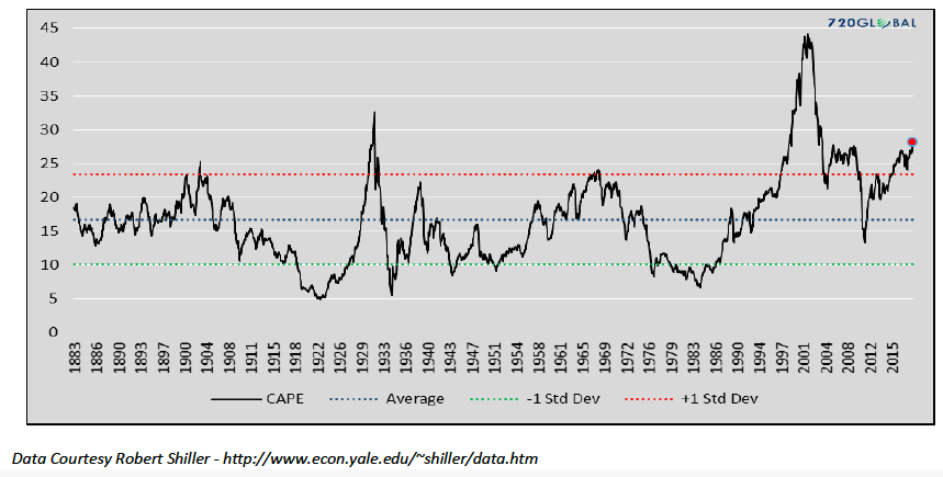
Calculating P/E ratios may be done using CAPE, earnings for the trailing twelve months (TTM) or numerous other methods. While market practitioners tend to favor TTM, CAPE is used here for the same reasons Ben Graham and Robert Shiller preferred it – ten years of earnings data helps eliminate short-term noise that frequently distorts quarterly and annual earnings. CAPE takes an additional step and adjusts for inflation, thus normalizing the ratio for different inflation environments. While some may claim that these two approaches yield wildly different results, we found only a minor variance. TTM P/E for the S&P 500 is currently 1.50 standard deviations above its 130-year average, only slightly below that calculated using CAPE (1.75).
The bar chart below shows the distribution of CAPE values or the percentage of time the ratio was in each respective P/E band on the x-axis.
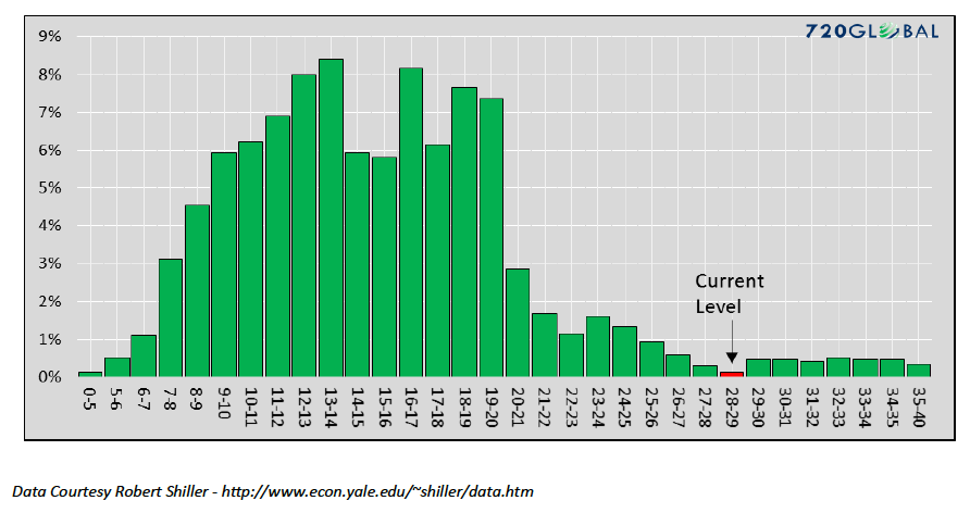
While not a perfect bell curve, the chart above does have a similar shape, albeit with a long right tail. Over 80% of the data lies between a ratio of 8 and 20. The current ratio of 28.14 has only been eclipsed by 3% of the observations. Put more bluntly; the S&P 500 is in no man’s land by this measure.
Corporate Earnings
To gauge the expected earnings growth that is currently priced into the market, we could take the all too popular consensus forecasts published by Wall Street at face value. While that might be a fast approach, history, as discussed in “Earnings Magic Exposed”, has proven misleading.
Instead, we prefer to solve for the expected earnings growth rate using the CAPE ratio.
continue reading on the next page…


