A little too quiet for Gold…
Gold came to my attention for a couple of reasons this week. First was the sentiment signals in the latest sentix survey – I tweeted the chart here. Second I decided to feature it in the latest edition of the Tuesday Macro Technicals report.
I wanted to cover it for 2 reasons, first was the fact gold prices are running up against a short-term downtrend line as well as struggling to break through resistance around 1250.
But the other big reason was this chart showing gold prices vs gold implied volatility:
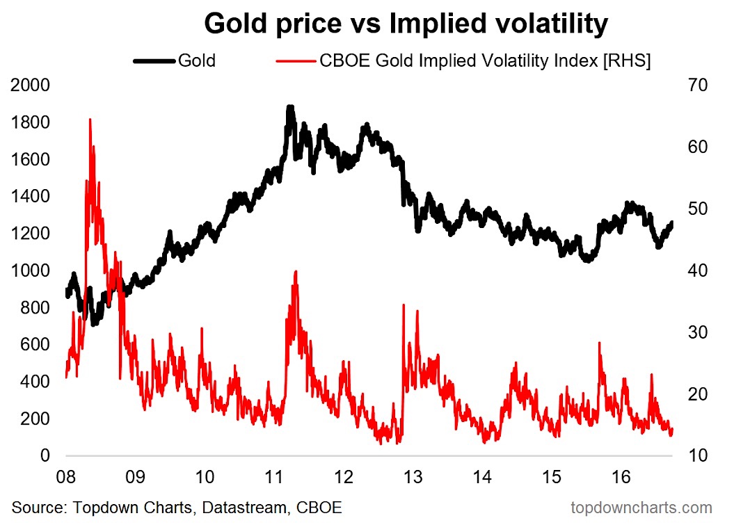
That red line can be considered the “VIX of gold” i.e. it is the gold market’s version of the popular volatility index of stock market fame.
What stands out to me is the slump in implied volatility. It looks like the market is way too complacent.
Indeed eyeballing the history of the chart, whenever you see a crunch down in volatility towards such low and complacent levels it has often preceded a decent sized price move, and often times to the downside.
For example most recently it occurred around the market top in 2016, and slightly more spectacularly in 2013.
While it is only one signal and like most signals it doesn’t see 100% efficacy, but it does line up with the extreme sentiment readings, and the hitting of dual-resistance, to add weight to the short-term bear case.
As with equities – it can pay to be cautious when others are complacent…
Thanks for reading.
Twitter: @Callum_Thomas
Any opinions expressed herein are solely those of the author, and do not in any way represent the views or opinions of any other person or entity.


: Showing Some Signs of Emerging Strength")
