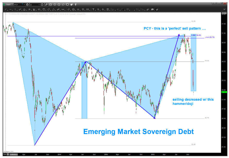
Folks, some followers requested that I take a look at the Emerging Markets Sovereign Debt ETF (NYSEARCA:PCY). Honestly, I hadn’t looked at this particular ETF before. But my initial thoughts are: wow, that was a perfect sell pattern setup.
As I’ve said before, some patterns work, while some don’t – that’s why we (as traders) use a stop. This one worked.
Okay, so let’s look at the chart and pattern setup for the Emerging Markets Sovereign Debt ETF (PCY). The first chart below is a daily chart that shows the gap decline right through support – looks a lot like crude did a while back. The recent candlestick appears to have sloweded the selling pressure (note the doji candlestick). The decline has also hit the Emerging Markets Equity ETF (NYSEARCA:EEM), but that’s for another chart post…
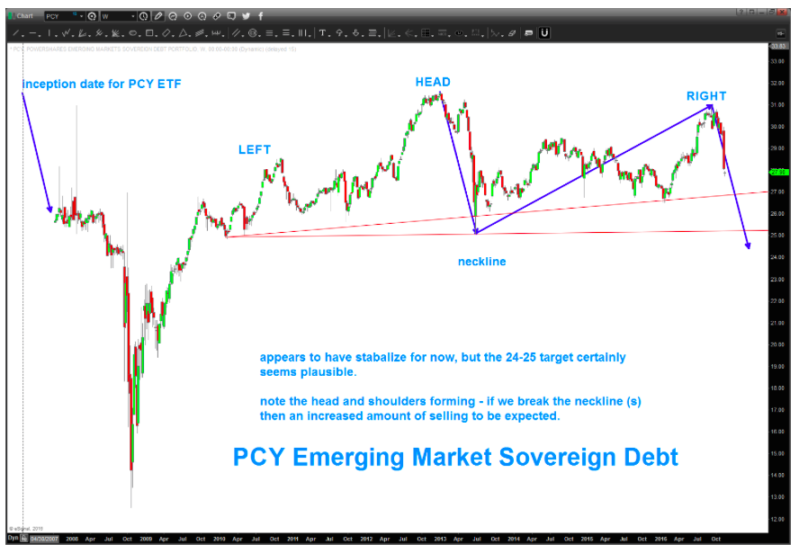
When we zoom out further and look at a weekly chart (see 2nd chart below), it looks like this ETF could decline to the 24-25 area. If/when we get there, things get really interesting.
Depending on your angle, one could put neckline support at 27 or 25. But, either way, I see a big old thump forming…
Thanks for reading.
Twitter: @BartsCharts
Author does not have a position in mentioned securities at the time of publication. Any opinions expressed herein are solely those of the author, and do not in any way represent the views or opinions of any other person or entity.


 Pressuring Lower Price Support")