Ratio analysis is a critical piece in my macro technical approach, as it helps to differentiate different sectors, styles, regions, and themes by gauging their relative performance to one another.
Emerging markets have been on a tear, with the iShares MSCI China ETF (MCHI) making new 52-week highs again this week. The ratio of emerging to developed markets, however, suggests that this may be a bit overextended within the context of a longer-term uptrend.
First, we’ll look at a ratio of the iShares MSCI Emerging Markets ETF (EEM) versus the iShares MSCI EAFE ETF (EFA), which represents global developed markets.
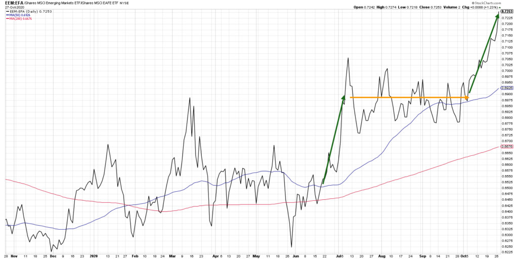
This ratio chart is part of my Mindful Investor Live ChartList, and it caught my eye over the weekend because the ratio has made a sequence of new 52-week highs in recent weeks.
I’m impressed by the relative move, which is clearly driven by strength in China and other EM combined with weakening charts in Europe, as many countries brace for further effects from the Coronavirus.
But I also noted that this ratio has gone very high very quickly, and my contrarian warning bells went off. In early July, a sudden upswing in this ratio quickly dissipated as the ratio went sideways for the next three months.
Should investors expect more of the same?
I decided to look at this ratio over a longer period of time and plotted a lower panel showing how far the price is from the 200-day exponential moving average, plotted in percentage terms.
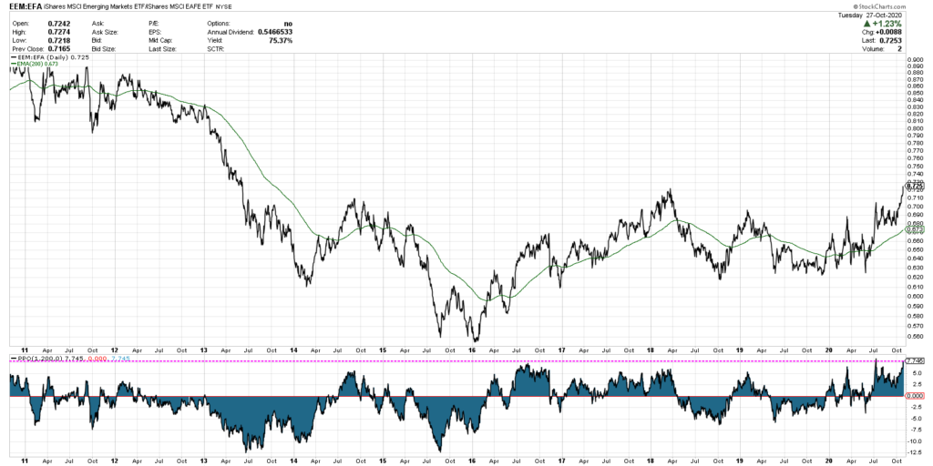
Here we see the price along with the 200-day exponential moving average of the closing prices. Below that, I’ve added the percent above or below the moving average and added a horizontal line approximating the current position.
We can confirm that based on the last ten years of trading, this ratio is indeed at an extreme high level relative to the longer-term trend. The early July upswing took the ratio to a similar extreme. As a matter of fact, whenever the indicator went above +5%, the ratio often took a turn lower soon after this reading.
This tells me that we’re due for a mean reversion, as the price has gone too far above its long-term trend.
But what about longer-term prospects?
Bumping the chart out another eight years shows us more of a long-term uptrend in the ratio.
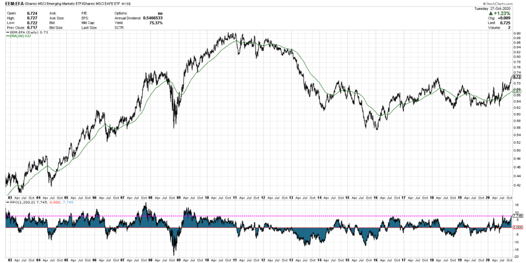
Now we can see that in long-term uptrends, the ratio often goes well above the current levels. Perhaps this ratio has much further to go, and the extreme high reading is simply telling us to expect performance more like 2003-2011 as opposed to 2014-2020?
I could certainly see potential for further upside for this ratio, given the strong performance in Chinese stocks as well as strength in commodities. But the fact that the ratio has moved so far from its moving average suggests a bit of short-term weakness to compensate.
What does this mean for your portfolio?
Most investors have at least some portion of their equity allocation devoted to non-US stocks. The steady increase and potential upside in this ratio tells me to consider emerging markets as I’m reviewing non-US exposure. Sometimes the best opportunities are outside the developed markets.
To see this article in video format, check out my YouTube channel!
Twitter: @DKellerCMT
The author may have a position in mentioned securities at the time of publication. Any opinions expressed herein are solely those of the author, and do not in any way represent the views or opinions of any other person or entity.


: Showing Some Signs of Emerging Strength")
