We asked a few friends what the picture below looks like, and most told us they saw a badly drawn bird with a wide open beak.
They might be on to something.
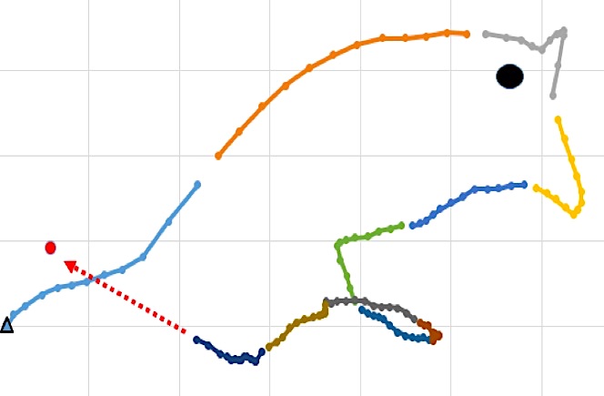
As you might suspect, this article is not about our ability to graph a bird using Excel. The graph represents the current bull market and economic cycle as told by the yield curve and investor sentiment.
As the picture is almost complete, the bird provides a clue to where we are in the current cycle and when the next cycle may begin. For investors, one of the most important pieces of information is understanding where we are in the economic cycle as it offers a critical gauge in risk-taking.
Market Cycles
Economic Cycles- Economic cycles are frequently depicted with a sine wave gyrating above and below a longer-term trend line. Throughout history, economic cycles include periods where economic growth exceeds its potential as well as the inevitable busts when slower than potential growth occurs. Most often cycles track a trend line, oscillating above and below it, but spend little time at the trend other than passing through it.
Boom and bust periods occur because economic activity is governed by human behavior. In other words, our spending habits are erratic because we are subject to bouts of optimism and pessimism about the economy, our financial prospects and a host of other non-financial issues.
The graph below shows the sine wave-like quality of U.S. GDP growth, which has wavered above and below trend growth for decades.
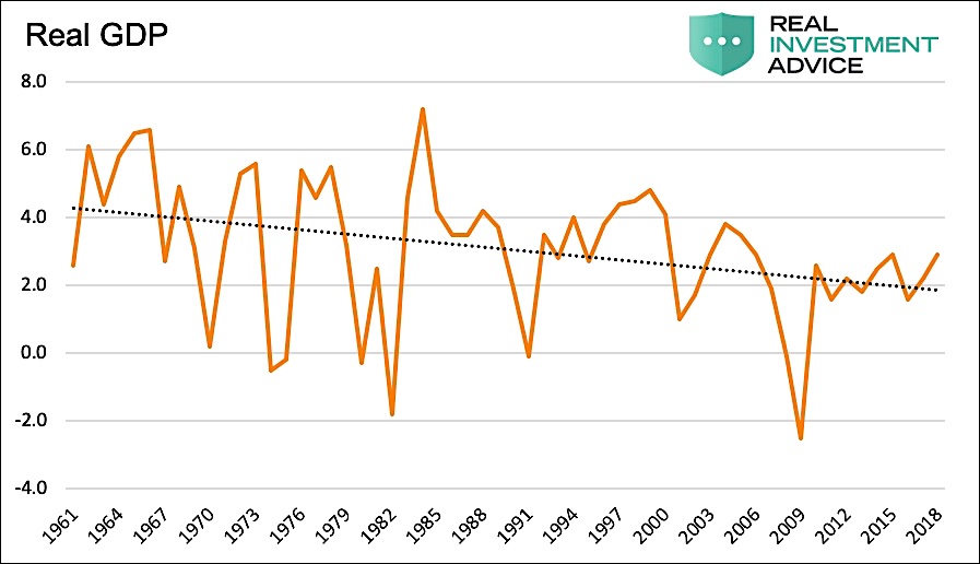
Data Courtesy: St. Louis Federal Reserve (FRED)
Stock Market Cycles- Stock markets also follow a pattern that is well correlated to economic cycles. Strong economic activity results in investor optimism.
During these periods, investors tend to believe that rising economic growth and strong corporate profits are long-lasting. As such they are prone to extrapolate these shorter-term trends over longer periods. Investors temporarily forget that periods of above-average growth will inevitably be met with periods of below-average growth. During bust periods, these mistakes are corrected and often over-corrected.
Implied volatility is a great measure of aggregate investor sentiment. It measures the expected market movement as determined by the supply and demand foroptions. When investors are optimistic about future returns, they tend to neglect to hedge in the options market. The sustained and methodical reduction in options pricing causes implied volatility to decline. In recent years, ETF’s and professional strategies whose objectives were to be short volatility steadily gained in popularity and helped push implied volatility down.
Conversely, when investors grow concerned over higher valuations, they hedge more frequently using options and drive implied volatility higher.
Yield Curve Cycles- The yield curve also takes on a similar path that tends to mirror economic cycles. When the economic cycle portends strong growth, the yield curve steepens. That is to say, the difference between longer and shorter maturity yields rises. This occurs as investors in longer maturity bonds become increasingly concerned with the potential for rising inflation resulting from stronger economic growth.
When strong growth spurs inflation expectations or actual inflation rises, the Fed begins to take action. To combat rising price expectations,they tighten policy with a higher Fed Funds rate. Shorter-term bond yields follow the Fed Funds rate closely, and as the Fed tries to dampen growth, the yield curve flattens. In that instance, longer-term investors are comforted by the Fed actions. This causes longer maturity yields to rise by less than those of shorter maturity yields, or it can help push longer maturity yields lower on an outright basis.
A steeper yield curve increases the incentive to lend and generates more economic growth while a flatter curve reduces the incentive and slows economic growth. The graph below shows how an inverted yield curve, where the yield on a 2-year U.S Treasury note is higher than that of a 10-year U.S. Treasury note, has paved the way for every recession since at least 1980.
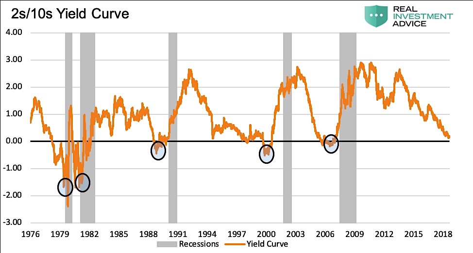
Data Courtesy: St. Louis Federal Reserve (FRED)
The Birdis the Word
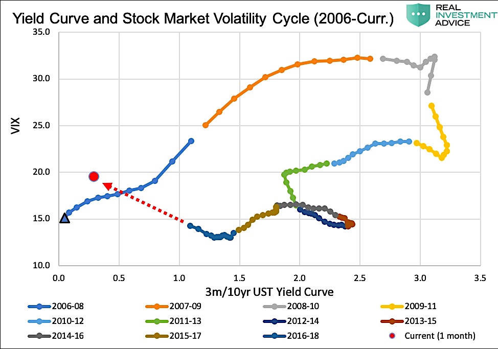
The graph below shows a scatter plot of the relationship between implied volatility as represented by spot VIX and the 3-month to 10-year yield curve spread. With proper context,you can see the bird is a graph depicting the most recent cycle of stock market optimism (VIX) and the economic growth cycle (yield curve). The graph uses monthly periods encompassing two -year averages to smooth the data and make the longer-term trends more apparent.
Data Courtesy: St. Louis Federal Reserve (FRED)
When we started on this project,we expected to see an oval shaped figure, slanting upward and to the right. Despitethe irregularities of the “beak” and “front legs,”that is essentially what we got.
The blue triangle on the bottom-left is the first data point, representing the average VIX and yield curve spread from January 2006 through December of 2007. The years 2006 and 2007 were the economic peak of the prior market cycle. As shown, the two-year average progresses forward month-by-month and moves upward and to the right, meaning that VIX was increasing while the yield curve was steepening. In this period, the yield curve steepened as the Fed began rapidly reducing the fed funds rate in mid-2007. Likewise, VIX started spiking thereafteras the recession and financial crisis began to play out.
The gray and yellow segments on the graph reflect the decline in volatility as the financial crisis abated. Since 2010, the yield curve steadily flattened, and volatility fell to recordlows. The one real break to the cycle trend was the “bird leg,”or the periods including 2013 when the yield curve steepened amidthe taper tantrum. After that period, the oval-cycle pattern resumed. The red circle marks the most recent monthly data points and showsus where the trend is headed.
Interestingly, note that the number of dots forming the belly of the bird is much greater than those forming the back. Thisis typical as the expansionary portion of economic andmarket cycles tend to last five to ten years while market declines and recessionsareusually limited to two or three years.
Summary
Think of the economy and stock market as a long-distance runner. At times they may pick up the pace for an extended period, but in doing so,they will inevitably overexertthemselves and then must spend a period of timerunning at a below average pace.
The stock market has been outrunning economic growth for a long time. Thisis witnessedby valuations that have surged to record highs. The yield curve is quite flat and volatility, despite spiking twice over the last year, currently resides well below the long-term average and not far from record lows. The current trajectory, as shown with the dotted red arrow in the chart above, is on a path towards the peak of the prior cycle.
The Fed has recently made a dovish (no pun intended) policy U-turn and appears to be on the path to lower rates. This likely means that the curve flattening is nearing an end and steepening is in the cards. At the same time,the market is showing signs of topping as witnessed by two large drawdowns and spikes in implied volatility over the last 15 months.
Based onthe analysis above, it appears that the current cycle is close to completion. It is, however, but one piece of information. To borrow from Howard Marks, author of the book Mastering Market Cycles, he states the following:
“While they may not know what lies ahead, investors can enhance their likelihood of success if they base their actions on a sense for where the market stands in its cycle….there is no single reliable gauge that one can look to for an indication of whether market participants’ behavior at a point in time is prudent or imprudent. All we can do is assemble anecdotal evidence and try to draw the correct inferences from it.”
We concur and will use the “bird” as evidence that the cycle is mature.
Twitter: @michaellebowitz
Any opinions expressed herein are solely those of the author, and do not in any way represent the views or opinions of any other person or entity.

: Worrisome to Broader Market?")


