In our previous post here on See It Market, we showed how to use corrective moves to become the radius of circles and how, using the ‘circle polarity principle’ where support becomes resistance OR vice versa.
In this case, however, I was waiting for someone to email me and say “it wasn’t the exact low.”
As you can see in the chart below, it wasn’t… BUT if we expand the circle by 1.05946 which is the ratio of the equal octave scale of music, then we see it tagged the low and the most recent highs in the cash S&P 500 index (INDEXSP:.INX).
2500 looks like the next BIG resistance level. Could this mark an S&P 500 top for traders/active investors?
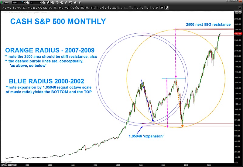
Is this “a top” or “the top” for the S&P 500, I do not know. That said, I have learned to respect this ‘circle polarity principle.’ When using this type of analysis it’s important to take into account all major correct swings – so we did 2007-2009 also. As you can see, multiple ‘techniques’ are coming into the 2500 area so if this current level is breached higher then the next logical price target / S&P 500 top is 2500.
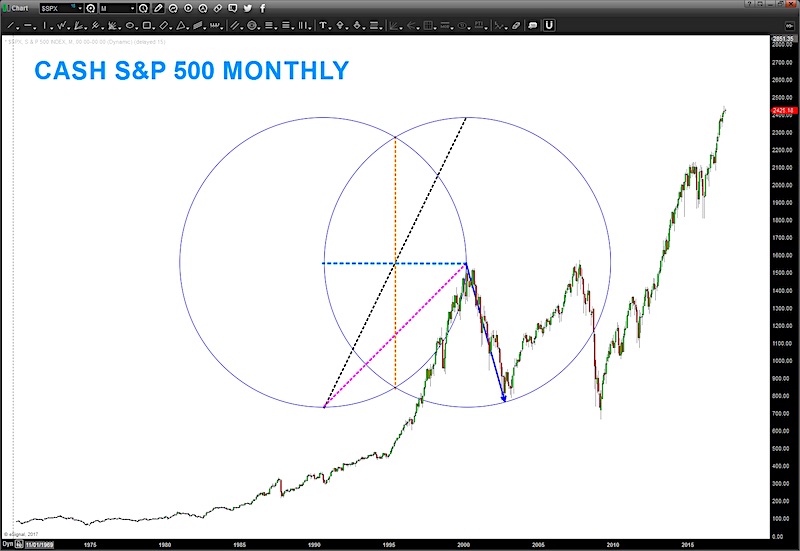
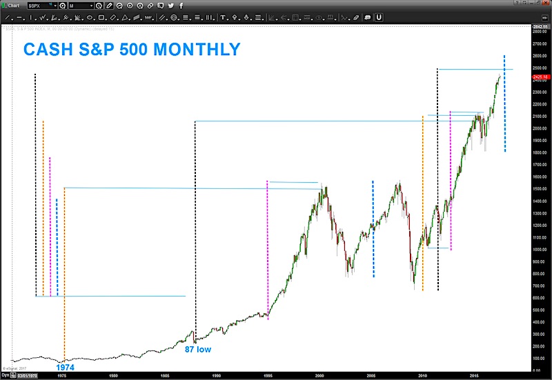
The second and third charts are using the Vesica Pisces to derive PRICE targets based on how the square roots of 1,2,3,4,5 are derived. While it’s ‘out there’ you can see that these measured moves tag highs and lows very well. Do the ‘math’ and test it .. yes, scaling is going to be an issue BUT if your consistent and can, say, lock a 1×1 box into your charting software then scaling shouldn’t throw you off too much. As for me, I honestly use my eye. It’s more art than process and after spending 10,000 hours plus in front of charts you get the ‘look and feel down.
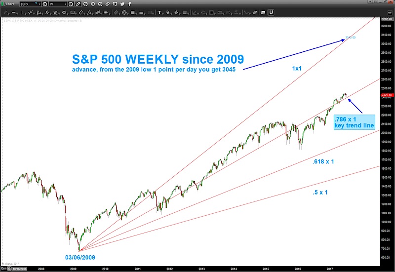
The last chart below is using the trend line technique of advancing 1 point / day. It’s a technique that I learned from Michael Jenkins (stockcyclesforecast.com ) and it’s also based on planetary motion. Essentially, take the low in March of 2009 and add, say 10 points and then move a planet (pick one – close ones are fast and slow ones are far) and find the date that planet XYZ moved 10 degree and plot that in the Y coordinate and then draw a trend line thru the PRICE and TIME. Trust me, it will blow you away.
But for now, let’s keep it simple. We have plotted in this last chart a 1×1, .5 x 1, .618 x 1 and .786 x 1.As you can see the .786 X 1 (dashed purple line) is the ‘most important’ trend line to watch. I would watch for support or a break of this line to give you a general direction of the trend/move in the next couple weeks. Take a moment to study this dashed purple trend line. It’s been like a magnet since 2009. Price bounces above, below and against it all the time.
Anyway, not expecting you to buy into this type of analysis but it’s for educational purposes. Do what works for you … manage risk in the best way that you can. And, if you get a little crazy, take ALL the indicators off your chart and try using some crayons and draw some circles and squares.
Be well, do good.
Twitter: @BartsCharts
Author does not have a position in mentioned securities at the time of publication. Any opinions expressed herein are solely those of the author, and do not in any way represent the views or opinions of any other person or entity.


