While price action is my main focus, understanding how volume plays a role in the market can be key in understanding the environment and health of a market cycle. We often use market internal indicators, such as the Advance-Decline Line to gauge whether stock market bulls or bears are “in control” based on what’s taking place below the surface of the financial markets. Stock market volume can also serve as a good tool in understanding what’s driving stocks higher or lower.
And looking at what’s taking place currently across the U.S. equity market has me concerned.
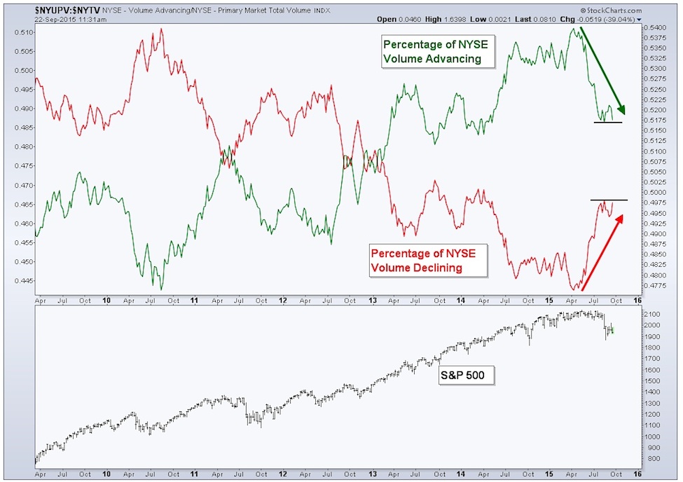
The New York Stock Exchange (NYSE) is not a ‘pure’ equity market, having some bond-type funds and other assets also trading on the exchange. However, it’s still one of the best and largest proxies for the U.S. stock market. By analyzing advancing and declining stock market volume, just like we do with the Advance-Decline Line for price, we can measure the health of a trend. This is what the chart below shows… the percentage of volume that’s either Advancing or Declining. I’ve applied a long-term moving average to each data set to smooth out the whipsawing gyrations and better see the buying and selling pressure taking place.
The chart below shows the time period from late 2009 to current on a weekly basis. We can see that the red line, which represents the moving average of the percentage of NYSE volume that is declining is making a series of lower highs while the percentage of NYSE volume that is advancing, as represented by the green line, is making higher highs. This is a good sign of a healthy bull market. These two trends tell us that there’s a positive environment of a steady increase in the share of volume trading that’s being picked up by equity bulls.
However, since the start of this year the trends have begun to shift. We’ve seen a fairly quick move in both sets of data as they change direction. The percentage of NYSE volume that is declining has been rising, and is close to putting in a higher high, with the advancing volume doing the opposite – nearing a lower low. Both data sets have already broken past their prior lows (green line) and highs (red line) set at the start of the year. This type of shift in stock market volume trends often precedes dominate changes in equity trends, which is why this chart has increased in importance in my view.
It’s been said that volume leads price. And if that’s currently the case, then it’s possible we will see an even deeper dive in U.S. equities (i.e. the S&P 500).
To put the above chart in better context, let me show an example from the 2007-2009 bear market. I don’t show the financial crisis time period as an analogue for what I think the current market will end up doing, but rather as an recent example of a shift in volume that’s taken place.
The next chart is a weekly chart from 2004 through 2010.
continue reading on the next page…


