It’s a known saying around Wall Street that “as the banks goes, so does the market.” The banks/financials lead the market up when it is bottoming and, conversely, they lead the market down near/around topping cycles. So let’s take a look at the Financials Select Sector (XLF) and Banking Index (BKX) to gauge where the financials and bank stocks are at in this cycle.
A lot of charts follow. If you don’t want to STUDY them and want the cliff notes, here they are:
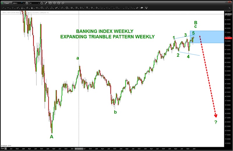
- The Banking Index has surged up into very strong resistance. IF this level holds THEN the banks/financials should start down and, ultimately, put pressure on the equity world. IF this level fails THEN the banks / financials will continue to exert upward pressure on the entire US equity complex.
- Watch this level and, perhaps, a little higher. I typically make decisions on this aspect of a portfolio based on weekly or monthly closes above or below levels shown in order to take the bear or bull stance.
- We are at the levels to watch as of the close December 31,2014.
- Enjoy they charts below and, as always, shoot me an email with any questions.
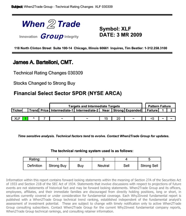
In March of 2009, as the world appeared to be on the verge of collapse (maybe a little dramatic…) I put out this analysis to the institutions to BUY the FINANCIALS. If you look closely, you’ll see the date was March 3, 2009. This went out across the wires …people probably thought I was crazy.
Now here’s the chart that identified the pattern:
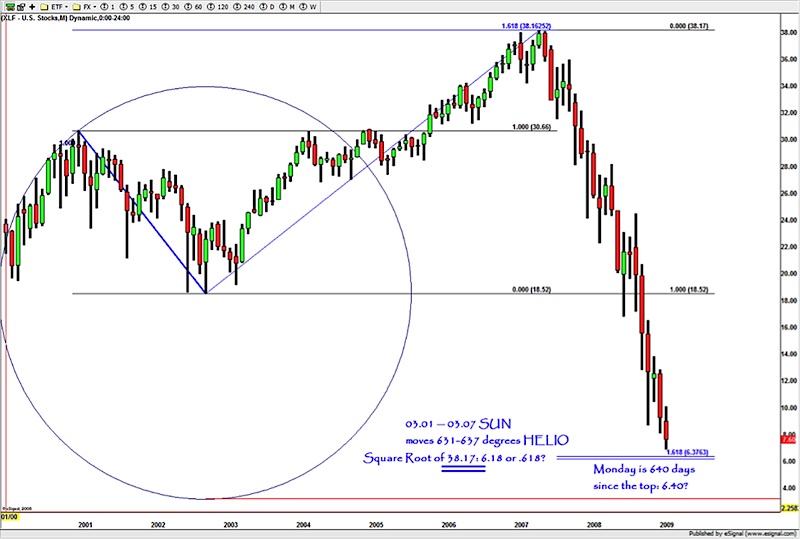
If you take a closer look, the TOP on the XLF was a 1.618 expansion target… and the bottom, ultimately, was a 1.618 extension pattern. Of note, the “beginning” of the PATTERN in 2003 saw the Sun move 630’ish degrees and we were coming into a price of 6.30. The CLOSING PRICE after the level was hit? $6.18. (for those who follow this blog, you’ll realize the decimal points don’t matter …..in my world 6.18 is .618 but I digress…)
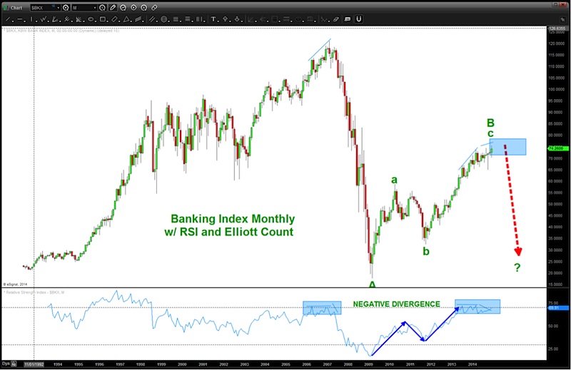
Where are we now? There are MULTIPLE SELL PATTERNS on the Banking Index. I’ll work thru them one by one. Working Monthly down to an hourly we’ll explore the fractal nature that the patterns present.
Again, realize these PATTERNS could fail (they are only an “edge”) and this would be very bullish for the overall nature of the market going into 2015. Let’s watch, closely…
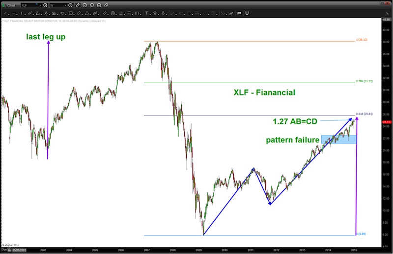
Here’s where the XLF and the bank stocks stand as of the close 12/31/2014. Note the blue shaded rectangle. It busted thru that pattern and now is at another likely resistance zone. This area, coupled w/ the levels and PATTERNS shown below on the Banking Index foreshadow strong resistance. A break thru these levels by both the XLF and the Banking Index will be very bullish for the equity market and select bank stocks.
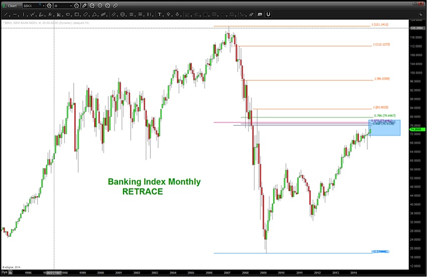
BANKING INDEX MONTHLY:
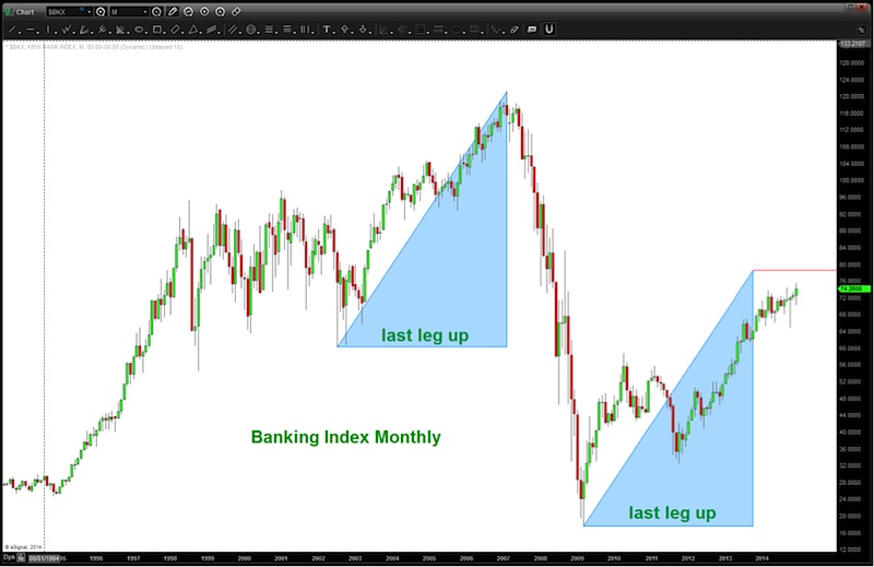
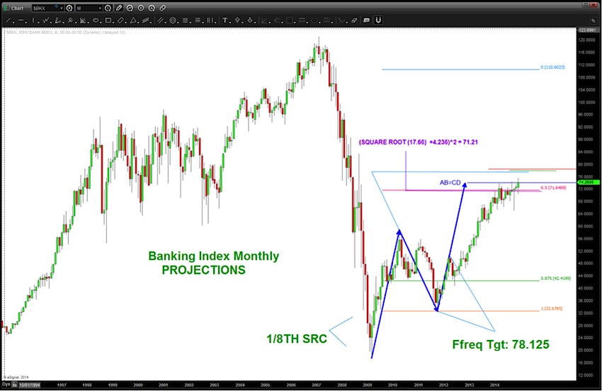
As you can see, we have many different projection techniques showing this area as significant resistance. In the next charts, this “zone” of projections will be signified by a blue shaded rectangle.
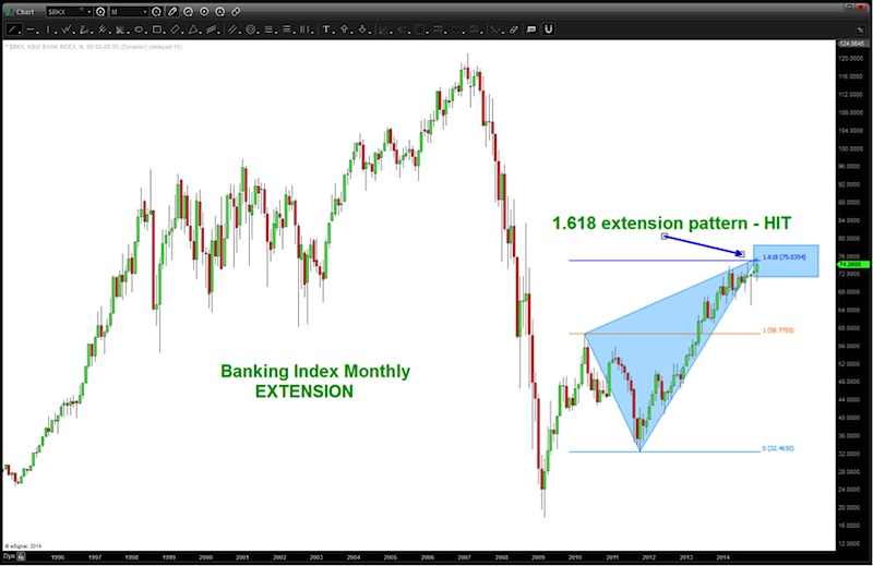
The 1.618 extension pattern was hit yesterday.
BANKING INDEX WEEKLY:
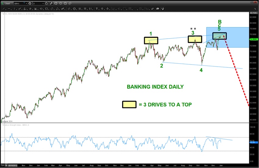
BANKING INDEX DAILY:
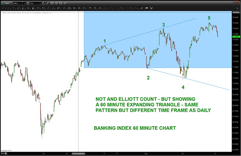
BANKING INDEX 60 MINUTE CHART:
BANKING INDEX “TIMING”:
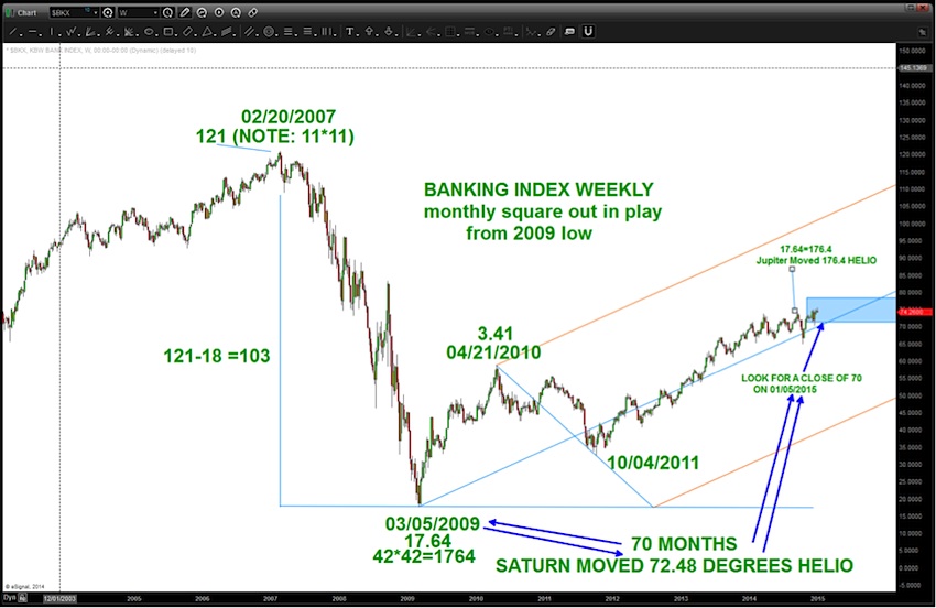
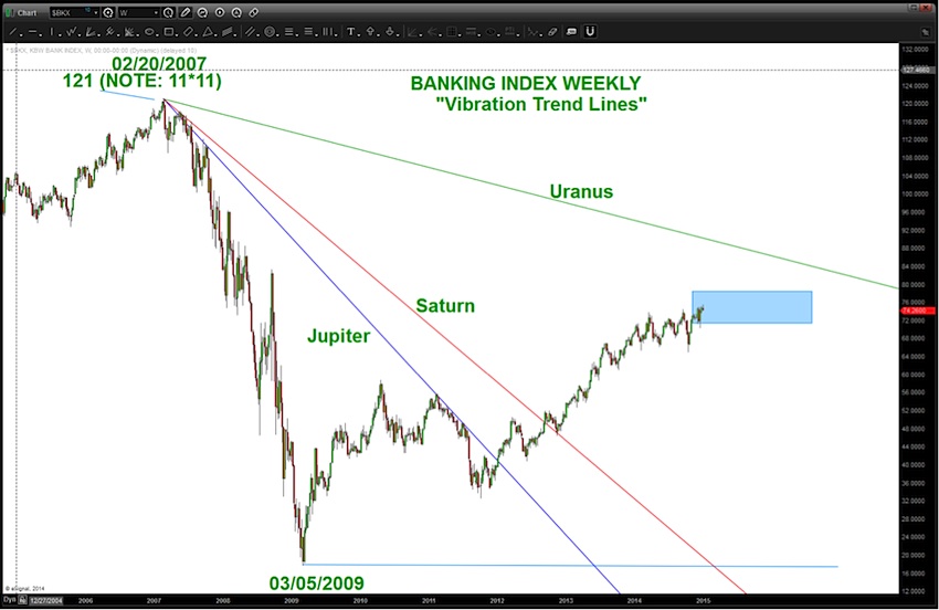
BANKING INDEX “VIBRATION” TREND LINES
In order to look at the “real” trend lines working within different securities it’s a worthwhile endeavor to use “constants” that are mathematically precise. The planets NEVER move off of their mathematical orbits and since they are “getting in the way” of the Sun’s rays they play a role in different cycles. Just reference the Moon and the tides…
So, it’s really quite easy to follow. I use HELIO (Sun Centered) so there are no conjunctions to mess with and simply pick a date of the major high or low and then subtract 10 points (or a multiple of that) and move a planet that many degrees and a trend line is born. We will produce trend lines from the all-time high and the all-time low.
Here’s from the high:
Here’s from the low:
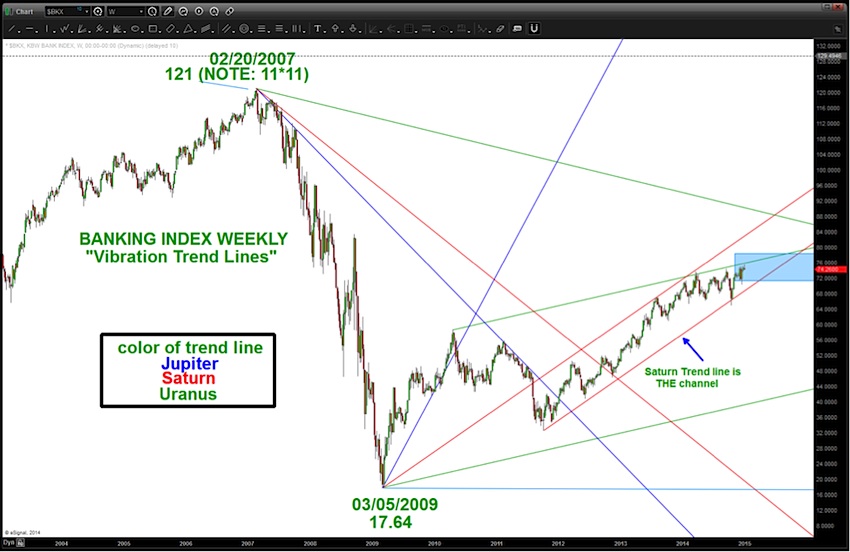
So, we can see the channel that has been developed and how, just maybe, the Saturn Trend line is “helping” to define the upper and lower bounds. Keep an eye on those bank stocks as the year progresses.
Thanks for reading, and have a great 2015.
Follow Bart on Twitter: @BartsCharts
No position in any of the mentioned securities at the time of publication. Any opinions expressed herein are solely those of the author, and do not in any way represent the views or opinions of any other person or entity.


: Showing Some Signs of Emerging Strength")
