If developments so far are any indication, Chart 6 is well on its way. In fact, of the last five charts on this post, this one has gone the farthest in the way of unwinding excesses. The red line is essentially corporate operating margins, calculated by dividing national income into corporate profits.
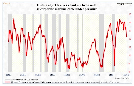
In 4Q15, corporate profits before tax adjusted for inventory and capital consumption were $1.9 trillion and national income $15.7 trillion. The latter was at an all-time high, while profits peaked at $2.16 trillion in 3Q14. As a result, the red line in Chart 6 is under pressure.
Further, the current trend in earnings does not suggest things will change for the better anytime soon.
Operating earnings of S&P 500 companies for 2015 were $100.43. For some reference, 2014 was $113.02, and at the end of 2Q14, 2015 was expected to earn $137.50! That was also the amount 2016 was expected to bring in at the end of 2014. Fast forward to estimates as of March 17th, and 2016 has now been revised lower to $118.57 – probably still too high. Next year is the same way. Early estimates are very optimistic – currently $136.40, which are already down from $141.11 when they were introduced in the middle of this January (Chart 7).
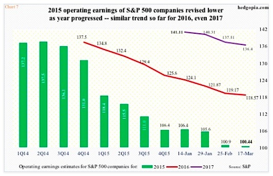
Earnings deceleration is probably the biggest risk facing these stock market valuation metrics. Risk of continued unwinding grows should earnings fail to behave.
Thanks for reading.
Twitter: @hedgopia
Read more from Paban on his blog.
Any opinions expressed herein are solely those of the author, and do not in any way represent the views or opinions of any other person or entity.

: Showing Some Signs of Emerging Strength")
