Yes, we’ve heard and seen this before. No doubt, there are many Apple-Microsoft comparisons out there. But most have to do with a singular issue: the rise to power, fervor of the investor base, saturation of marketplace, or perhaps a lack of innovation.
As much as these themes hold some weight individually, I believe all of them show up collectively in price. And therefore, I thought it would interesting to look at the Apple-Microsoft bull market runs (and subsequent aftermaths) in charts. Will Apple’s (AAPL) stock price go the same way as Microsoft (MSFT)?
Similarites:
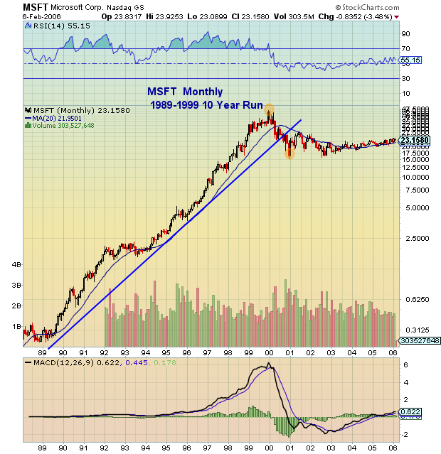
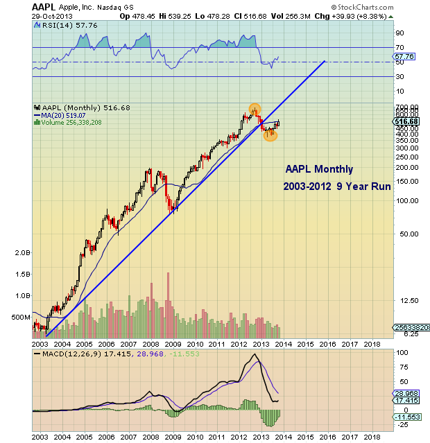
Both stocks embarked upon massive vertical runs higher with similar collective gains.
Both runs lasted for roughly 10 years (Microsoft 10 years, Apple 9 years).
Differences:
Eras — The tech bubble and ensuing crash skewed the upside and downside for many strong brands, including names like Intel (INTC) and Cisco (CSCO).
Microsoft had Although both were household names with similar investor bases, they were/are in slightly different consumer verticals, as Apple plays more in the consumer discretionary brand field.
Microsoft (MSFT) Bull Run
 Apple (AAPL) Bull Run
Also read: AAPL vs Gold: Parallel Bull Market Structures.
Twitter: @andrewnyquist
No position in any of the mentioned securities at the time of publication. Any opinions expressed herein are solely those of the author, and do not in any way represent the views or opinions of any other person or entity.
: Worrisome to Broader Market?")

: Important Breakout Retest")
