The S&P 500 (SPX) is in a consistent pattern of higher highs and higher lows. Charles Dow would tell you that this is the definition of the uptrend.
Look under the hood, however, and you’ll see that things are not as positive as they seem on the surface.
Here are three charts I’m watching that make me skeptical of meaningful further upside for US stocks.
1. Cap Tiers
First, let’s consider how other cap tiers have performed relative to the S&P 500 in recent months.
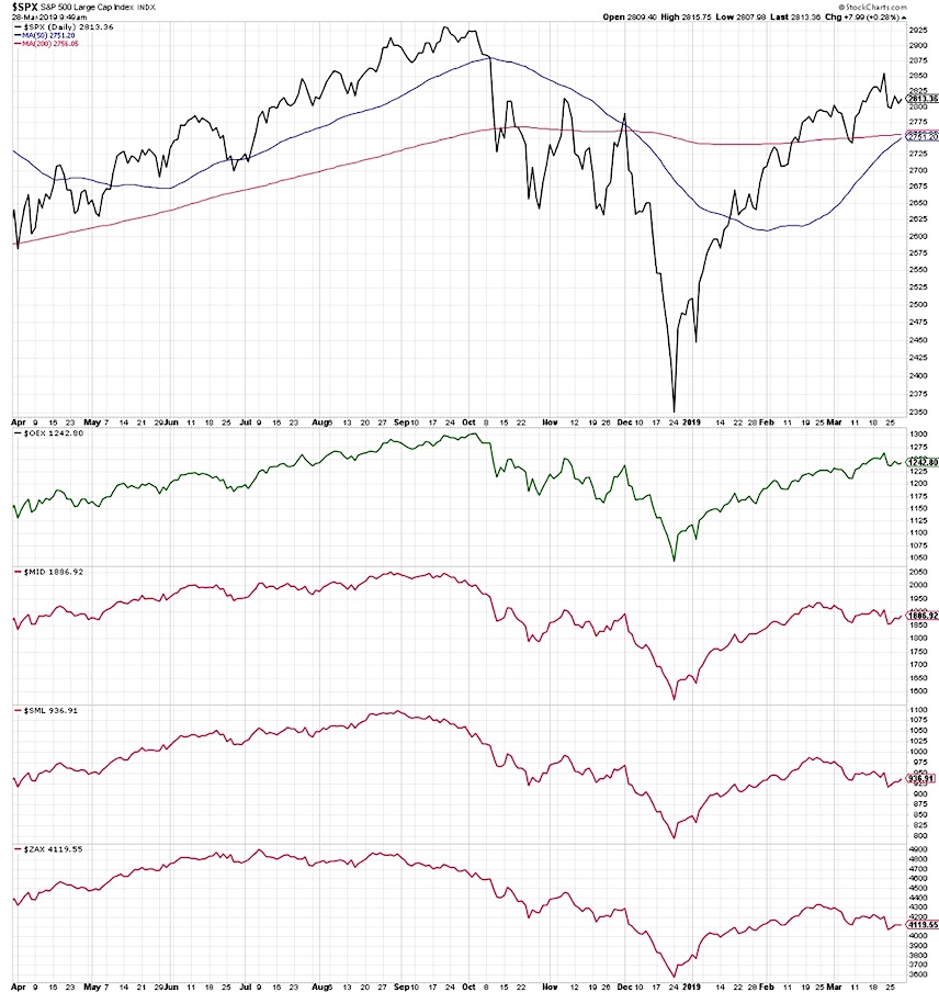
Here we have the S&P 500 index, followed by the S&P 100 (mega caps), S&P Mid Cap 400, the S&P Small Cap 600 and the Zack’s Micro Cap index.
Note how the mega cap index mirrors the SPX chart, with a clear pattern of higher highs and higher lows since the December market low.
Now observe how all other cap tiers have transitioned from a bullish phase to bearish phase. As the largest stocks have been moving higher, everything else appears to have already begun the corrective process.
2.Market Breadth
Now let’s consider the breadth behind the recent market movements. How much are stocks in different groups supporting what we’re seeing with the S&P 500?
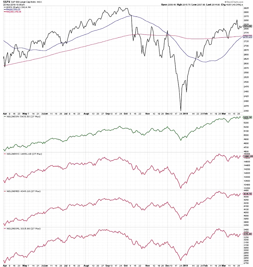
Here we show the S&P 500 along with the cumulative advance-decline line for the SPX, NYSE common stocks only, mid cap and small cap indices.
The advance-decline for the SPX has risen in line with the index. As the market has moved higher, the average stock has participated in that uptrend.
The rest of the breadth indicators tell a different story. As the S&P has moved to higher highs, all other breadth readings have failed to achieve higher highs. Notably, none have made a new swing low.
So the lack of confirmation from other breadth readings is less of a bearish reading and more of a neutral reading. If and when these breadth lines make new swing lows, that would confirm a bearish read across the board.
3. Technical Indicators
Finally, let’s review some key technical indicators to see whether they are validating what we’re seeing with price.
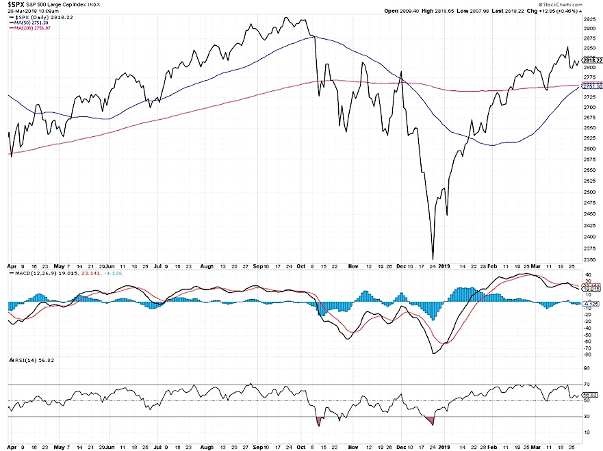
The two technical indicators I use the most (besides moving averages) are MACD and RSI. MACD is a classic trend-following device based on exponential moving averages, and RSI is a traditional momentum indicator that relates the current price move to average price moves for that same security.
Here we see a bearish divergence with price and MACD, where the MACD has established a pattern of lower lows and lower highs while the S&P 500 has moved higher since late February.
The RSI is not necessarily bearish as it has not sloped downwards, but it certainly has not confirmed the most recent price high.
So where does that leave us?
For me, technical analysis is about the weight of the evidence. The downtrend in other cap tiers, the weakening breadth profile, and the bearish divergence with MACD all suggest limited upside for US stocks.
RR#6,
Dave
Learn more about my research over at Sierra Alpha.
Twitter: @DKellerCMT
Any opinions expressed herein are solely those of the author, and do not in any way represent the views or opinions of any other person or entity.
: Creating Bullish Divergence?")


: Creating Bullish Divergence?")