By Andrew Kassen In a piece just out on See It Market, I spent some time in skeptical celebration of the Dow Jones Industrial Average’s successive new all-time highs. At the conclusion of that article, I left a personal coda explaining how, with standing misgivings noted, the “most hated rally in history” deserves our respect until it proves otherwise (as all trends do). But let just expose the elephant in the room with one simple question: Is the Dow Jones topping out?
Well, time frames and context are always important, so “topping” is relative. But I’ll try to add some technical color around that elephant where I can.
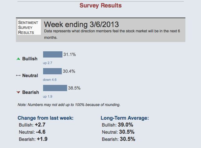
Despite the apparent triumph of the bulls (Bulls on Parade?) and the tireless late-night talk show victory lap the Rally Monkey has been taking, according to at least one measure, bears remain unswayed from their pessimism over how the next 6 months will pan out, even while bulls are slightly emboldened. Click charts to enlarge.
While this perennial back-and-forth is never without partisan acrimony (“bull” and “bear” are more ideology than opinion, after all), the ubiquitous coverage of the best-known stock benchmark in the world effortlessly slicing through a level from which it was cut in half has only served to push the perma-shrill to higher levels.
Not surprisingly, nuance gets lost in this environment.
One obvious distinction that might defuse a lot of debate but is noticeably under-served in discussion: what is meant when we speak of a “top”? Just because the Dow has surmounted its former all-time high doesn’t mean the next dow jones topping will be comparably momentous. Stocks making a material correction isn’t coextensive with “pricing in Armageddon” as they did in ‘08-’09 or the end of modern civilization. What about a 3.5% correction? Or 7.5%? Or 17%?
Each of those downside moves (and many others) has occurred since the Dow bottomed in March 2009. We’ll take a look at each of them in a moment. For now, keep this in mind: the rally has produced significant corrections, even while it closed last Friday at its zenith. The Dow snapping its 4.5 year ceiling like a twig last week doesn’t change that. The Fed’s Permanent Open Market Operations don’t change that. Any post-mortem of the last 4.5 years extolling trend following bullishness concedes some significant drawdowns.
In other words, “a top” doesn’t mean “the top.” A new all-time high means that to-date, it has never meant that; even in late 2007 (though it certainly seemed that way for a time). Local tops and bottoms occur every minute markets are open at some level; pullbacks/throwbacks and secondary rallies and corrections with steady regularity. Any analyst, pundit, observer, investor or trader who doesn’t make allowance for this distinction is a victim of their favored market ideology and is on the short path to discredit and/or insolvency.
So what have these “tops” looked like?
This past week is a timely embarkment point for this question. While there’s a top nowhere in sight, the Dow did accomplish something that has only occurred 5 other times in the last 10 years: 4 consecutive daily closes above its Upper 2 Standard Deviation Bollinger Band.
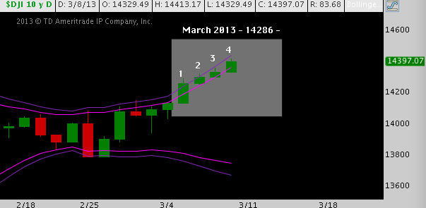
Notice how the bands begin to open up after the Italian election whipsaw at the end of February and have now touched or crossed this Upper BB for 8 consecutive days. That’s not a particularly remarkable statistic, but the successive closes above the band is.
What has that looked like in the past?
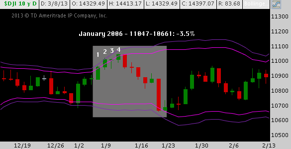
January 2006:
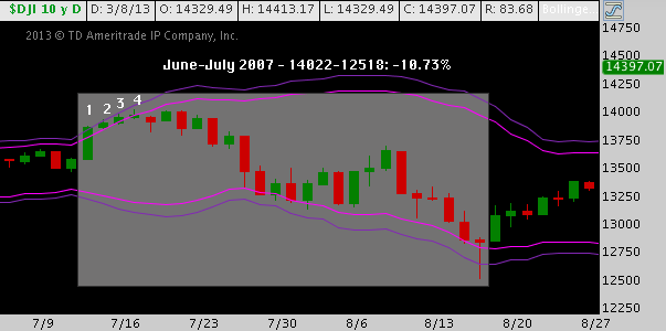
June-July 2007:
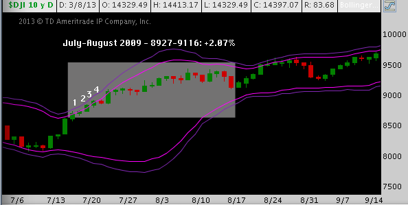
July-August 2009:
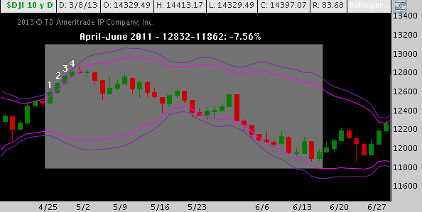
April-June 2011:
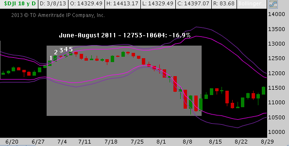
June-August 2011:
As noted, this happens infrequently (consider all the 4-day combinations of the last 10 years, or approximate 2500 market days): it’s indicative of exceptionally bullish momentum that has taken on speed very quickly. What do we know about when it does?
First, 80% of the time (4-of-5) a pullback ensues almost immediately. Second, those pullbacks average a peak-to-trough loss of 9.68%. Third, of the 20% (1-of-5) occurrences where a pullback did not result, the gain was 2.07%. The average subsequent performance over the full data series (defined as performance from the occurrence’s high to the subsequent terminal price trough set prior to a close above the occurence’s high; and as the next major swing low in the positive case) is -7.32%.
With one exception, these were each local tops that occurred in powerful uptrends. Whether they were worth concerning yourself with – either in terms of risk or opportunity – largely depended on your time horizon, persuasion as an investor/trader and your preferred method(s) of approach.
I don’t want to gloss over that exception, though. In the 2009 example, I measured a 2.07% gain from where the 4-closes-over-the-Upper-BB criterion was satisfied to a 38.2% pullback. That’s fair; but under the criteria applied to the other 4 occurrences, this “pullback signal” never panned out; indeed, the market never crossed beneath 8927 again and is now over 60% above that close.
Is there an edge to this study of tops? The stats above speak for themselves and there any number of tactical applications for the shorter-term investor or trader. More to the point here: it demonstrates 1) pullbacks do occur (this might have been forgotten); and 2) that Friday’s close satisfied criteria suggesting another is right around the corner – what? Dow Jones topping!?! No way!
Weren’t there some other major tops over the last 10 years? You’ll notice a number of major corrections are absent from the above study: most notably Fall-2007-Spring 2009 (-54.4%); and during the rally, late Spring 2010 (-14.6%), Spring 2012 (-9.8%) and Fall 2012 (-8.7%).
Here’s a similar study, this time on a monthly (Monthly? Yes!) chart of the Dow Jones Industrial Average (DJIA). However, this time we look back over the last 15 years. Click the chart to enlarge.
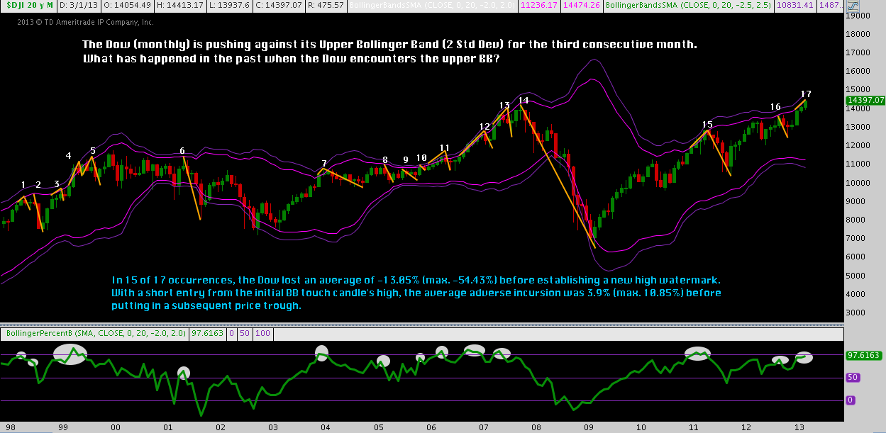
Again, we take the Dow’s current interaction with the Upper 2-Standard Deviation Bollinger Band as our launch point, asking: “What has happened in the past when the DJIA has touched/crossed its upper Bollinger Band?”
17 occurrences have resulted since 1998 where the index has touched/breached this band and then produced a pullback, all over a multi-month duration. These criteria are satisfied more often and take in each of the corrections the last study omitted.
Here are the results:
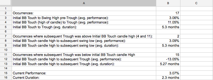
16 corrections across 2 cyclical bulls, and 2 cyclical bears: some of them legitimate bear markets (i.e. -20% peak-to-trough), others comparatively shallow, 3 of them (12, 13, and the unlucky #14) in 2007’s then-“Dow makes all-time-high” territory. In this case, 86% of occurrences (15-of-17) produced an average -13.05% correction.
Between these two studies, there are a lot of negative numbers to choose from; and if this measure (a quite common technical indicator) means anything sooner rather than later (whatever that means, precisely), we’ll have another negative value to chip into the rolling average.
It’s worthwhile to reiterate: this bull market is 4.5 years old. At 1466 days, it is the 8th longest and 6th best performing since the late 1920s. The Dow eclipsing October 2007’s high point does little to answer the market’s standing questions: Now in a very mature trend, are stocks susceptible to a major top? Will that mark the next leg down in a secular bear, or the inception of a secular bull? Or simply put, is the Dow Jones “topping” here?
All of this will be argued incessantly, but answered in retrospect only. Sit it aside and contrast that with what we do know: tops occur relatively often, creating great opportunities to short on pullbacks and buy into dips. According to the Bollinger Band studies we’ve just reviewed, stocks could plausibly begin a -7.68% pullback, or a -13.05% correction as soon as the next few days. In any case: continue to carefully manage risk and press your edges with a clear view: the trend is up, corrections can and will occur. Press hard to concentrate on the signal and shove out all the noise.
Twitter: @andrewunknown and @seeitmarket
No position in any of the mentioned securities at the time of publication.
Any opinions expressed herein are solely those of the author, and do not in any way represent the views or opinions of any other person or entity.


