There’s been plenty of movement of late for traders to digest. No doubt, it’s been a fast pace. But if we just focus on Charts 1 and 2 below and consider how they have behaved in the past, equity bulls may have reason to be optimistic. Because of the stock market rout leading up to the August 24th low, both charts reached extreme readings. Historically, once a process of unwinding begins in earnest, stocks receive a tailwind.
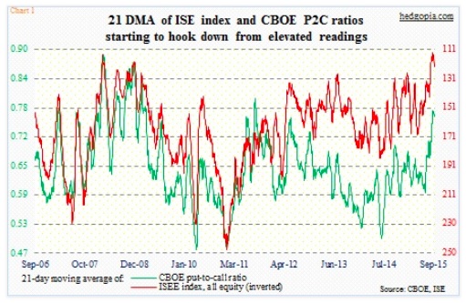
In Chart 1 above, a 21-day moving average has been calculated for the CBOE equity put-to-call ratio and for the ISE index (all equity) call-to-put ratio. The ISE data only goes back to 2006; on August 27, the red line made an all-time low of 112.6 (inverted in the chart). A day later, at .771 the green line recorded its highest since September 2, 2011 (was .773 back then). Both have since come under pressure – 122.9 and .762, respectively, as of yesterday. If the trend sustains, stocks can do well as market participants unwind their previous bearish positions.
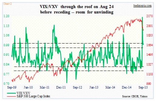
This is also the case with Chart 2 below, which simply takes a ratio of the Volatility Index (VIX), which measures one-month volatility for the S&P 500 Index, to VXV, which does the same but goes out three months. When fears are rampant near-term, VIX tends to trade at a premium to VXV. This was the case leading up to the 53.29 spike on August 24. As fears subside, VIX premium drops. Backwardation is replaced by contango. Traders begin to take on risk. Once again, if the trend sustains, equities do well.
In normal times, this would mean there is a lot of unwinding left to be done. The question is, is this one of those times, or is it different this time?
VIX has been cut in half in two weeks. Nonetheless, with two more sessions to go, it is all set to stay north of 20 for the fourth consecutive week. Fear has subsided, but it is lingering. The sell-off in stocks was so quick and violent that major U.S. indices have all suffered technical damage – to varying degrees. If this is not one of those plain-vanilla sell-offs, followed by V-bottoms, the repair work is destined to be a tedious process, which the current bounce/rally likely is a part of.
Given this, support/resistance levels have taken on increasing importance. Will sellers/shorts show up near resistance, or will they get steamrolled by an avalanche of buy orders?
We got some answers on Wednesday.
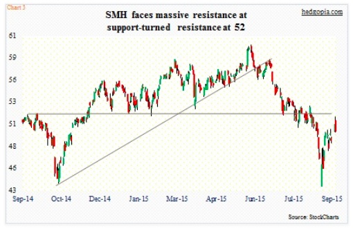
Back on August 24, in the midst of heavy sell-off the Market Vectors Semiconductors ETF (SMH) was one of the sectors/sub-sectors generating early buying interest. Off that low through the intra-day high Wednesday, the ETF of Semiconductors stocks tacked on nearly 19 percent. And that was in just 12 sessions! Chips hold an important place in the economy (along the lines of copper maybe?), and can be an important gauge of market sentiment. And as shown in the chart above, …


