First of all, I want to say that the purpose of this post is not to make predictions about the future, so if you’re expecting a 12-month price target for the S&P 500, you’ll want to look elsewhere.
Throughout this exercise I used the weight of evidence present in markets around the globe in order to identify some market themes that I think will occur throughout 2016. Lastly, I want to say that none of these market themes are set in stone. As a market participant, I’m not here to be right/wrong, if/when the weight of evidence changes I’ll adjust.
Without further adieu, here are the nine market themes for 2016.
1. Developed > Emerging Markets
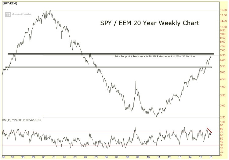
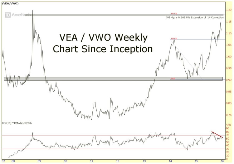
Since the SPY / EEM and VEA / VWO ratios bottomed in 2011, they’ve been on a complete tear, representing the broad outperformance of stocks in developed markets over emerging markets. These ratios developed multi-year bases and the breakouts from them were quite explosive. Despite their aggressive rallies, there is little evidence that suggests they’re ending anytime soon. There is evidence however, that their progress may be due for a bit of a pause in 2016.
The SPY / EEM ratio is approaching the 38.2% retracement of the 2000-2010 decline, which also corresponds with prior support near 6.7. In addition, momentum has negatively diverged at the recent highs, which has preceded pullbacks or consolidation periods in the past. Structurally this uptrend looks great, but we may see some consolidation this year before it breaks out to new highs.
Similar action is occuring in VEA / VWO as it approaches the highs it made in 2008. Despite the strong structural uptrend, momentum recently diverged as the ratio made new highs, suggesting a pause may be needed. Our structural target remains the 2008 highs, which also corresponds with the 161.8% extension of the 2014 correction. Despite this continued outperformance, I’d expect to see some consolidation in this ratio before it makes new highs.
2. Large-Caps To Outperform
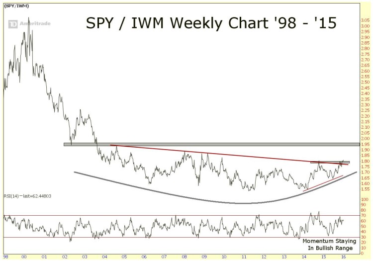
Over the past decade or so, the ratio of large caps stocks to small caps stocks (SPY / IWM), has been forming a major base and is starting to break out of it. If the ratio can clear 1.80, then 1.95 is the next big level of resistance. If this ratio can eventually get above 1.95 there is room for a lot of potential upside. I’m going to continue to watch this chart throughout the year as I think this may be the start of a much larger / longer-term trend. And this could be one of the major market themes for this year and perhaps years to come.
3. Commodities As a Group Will Continue To Slump
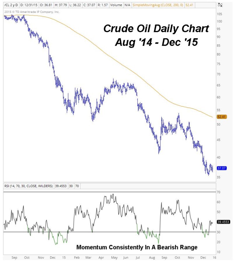
This doesn’t necessarily mean another big down year for the group, it could very well mean a flat year. Many of these markets in strong structural downtrends or trendless markets, meaning that time will be needed for them to reverse / sustainable uptrends to develop. That doesn’t mean that there won’t be counter-trend / mean reversion opportunities to take advantage of over the year, but it does mean that we shouldn’t be expecting strong multi-year downtrends to reverse themselves in a relatively short period. Time heals all wounds, even in markets, but we have to be patient to allow sustainable trend reversals to take place.
A good example of this is Crude Oil. Many commodity charts have been more or less crashing below downward sloping 200 day moving averages for years. Sure, some counter-trend opportunities presented themselves in 2015, but the structural trend is still in place and will take weeks / months / years for these trends to change.
4. US Markets Will Continue To Frustrate On An Absolute Basis
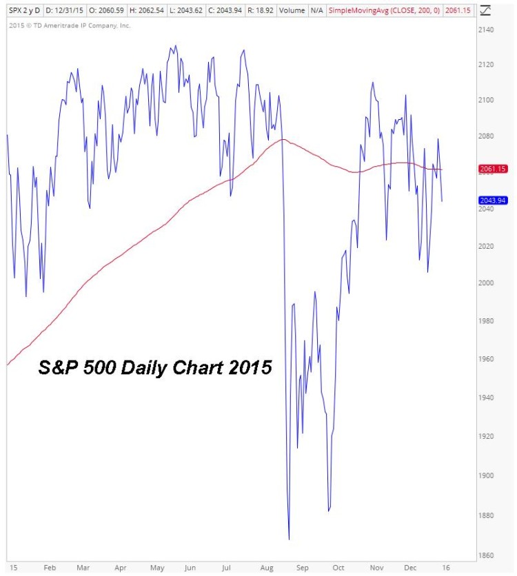
One of the emerging market themes of 2015 and likely 2016? A change in year doesn’t do anything to change the fact that many of the Major U.S. Stock Market Indices and Sectors are riddled with flat 200 day moving averages. Until we see some consolidation in one direction or another to allow the slope of these moving averages to become decisively positive or negative, prices will likely stay stuck in a choppy range.
Micro-Caps, Small-Caps, and Mid-Caps, as well as the Transports and other important measures of risk appetite are trading below downward sloping 200 day moving averages, so that may indicate that the other indexes will follow their deteriorating breadth and resolve to the downside. We could also see sector rotation drive market breadth and the indices to new highs; nobody knows. Regardless of how these ranges resolve, the underlying catalyst is going to be time. Time is needed for the long term moving average to begin sloping in one direction or another to support a sustainable trend.
5. The Long End of The Curve May Finally Begin To Rise
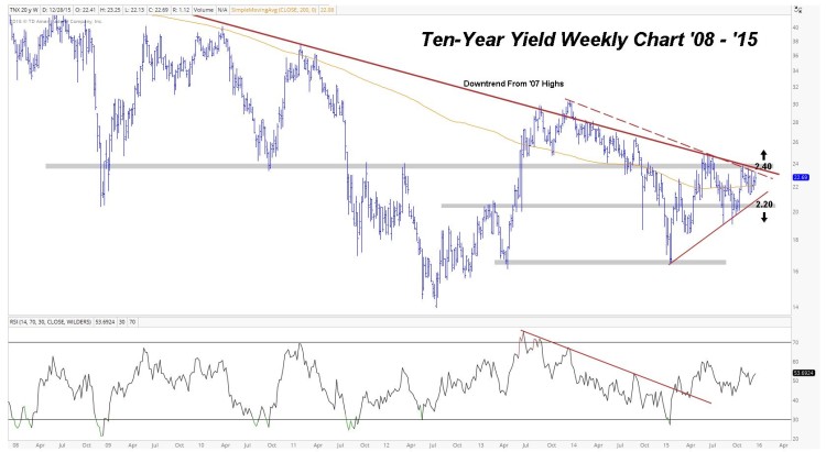
Now I know that everyone on the street has been expecting this to be one of the major market themes just about every year since the turn of the decade.. but I think market conditions are finally at a point that would support higher interest rates. Throughout 2015 we saw yields on the short end of the curve hit multi-year highs, but the long end of the curve was pretty much rangebound.
This action may have seemed lackluster on the surface, but the consolidation toward the top of its recent range allowed for both the 200 week and day moving averages to flatten out and begin rising, which could support higher prices. The other positive is that we’re retesting the downtrend line from the ’07 highs more and more frequently, and the more a level is tested, the higher likelihood it is to break. With momentum improving and the longer term moving averages sloping higher, prices may be able to stage a sustainable breakout, rather than a failed attempt like we’ve seen over the past few years. The prospect of this market theme playing out is worthy of keeping on your radar.
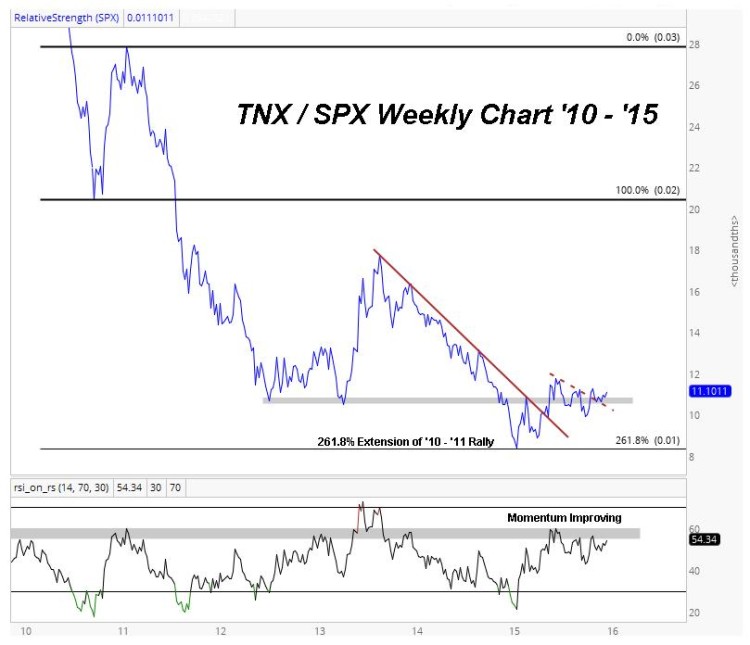
On a relative basis the Ten-Year Yield / S&P 500 ratio reached a structural downside target at the 261.8% extension of the ’10 – ’11 rally earlier in the year, and has since broken above the downtrend line from the 2013 highs, as well as the 2012 and 2013 lows.
The Ten-Year Yield remains rangebound between 2.20 and 2.40 and the resolution of that range should determine where it heads next, but I think the weight of evidence on an absolute and relative basis suggests that the likelihood of a breakout is higher than it has ever been in recent years.
continue reading on the next page…

