Everybody wants to know if the stock market has bottomed.
Unfortunately, there isn’t one chart or indicator that can provide any guarantee either way. But there are several charts and indicators that, taken together, provide a picture of probabilities.
Today I share 9 charts to watch.
If we’re looking for a major long term bottom in times of crisis, we like to see Warren Buffett step up. He’s been very quiet.
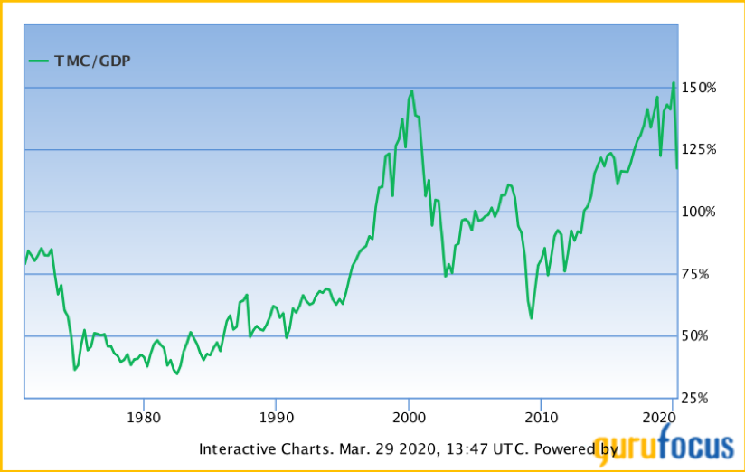
We see here that his proclaimed favorite indicator (Total Market Cap / GDP) suggests the stock market is still pricey based on last year’s GDP data. Chart source: gurufocus
We know GDP is declining notably this year, but other than that there is no visibility. Even using some 2021 data guesstimates, this is likely near the most expensive levels we’ve seen. The longer your timeframe, the more this matters.
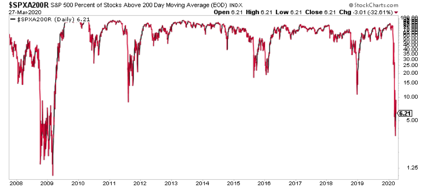
Currently only 6% of S&P 500 Index stocks trade above the 200 day moving average remains. Trading above the 200 day moving average is viewed as a sign of institutional support and health. Right now it’s clear most of the market is unhealthy and risk is elevated.
To sum it up, we know risk is still very high. We can rip through data points all day suggesting bullishness or bearishness. It doesn’t matter. The only thing we can truly know and trust is the asymmetric payoff structure of our positions.
Market tells
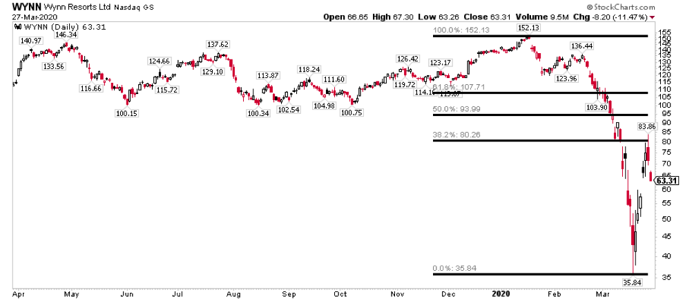
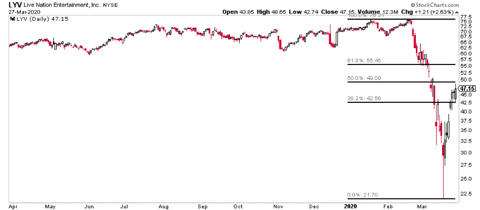
Regardless of which way the market heads, things like Wynn Resorts and Live Nation are worth watching as decent short term market tells as they started rallying 3-4 days before the market did.
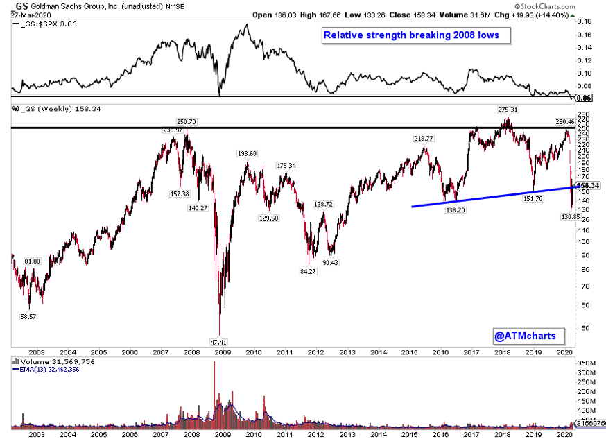
Goldman Sachs remains the U.S. financial to watch as it retests the long-term neckline area from below.
Other charts of note
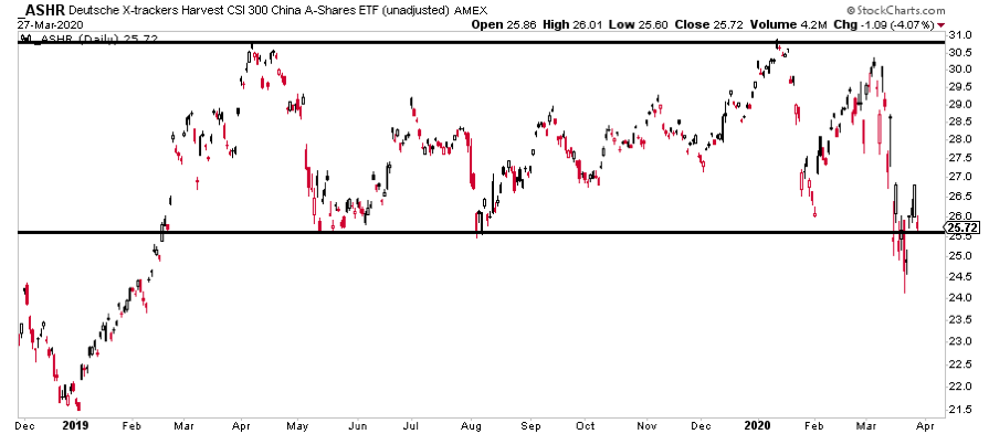
China A-Shares ETF ASHR has been largely range bound for the last year. Will this recent move lower prove to be a false move? We’ll find out soon with price retesting the bottom of the range.
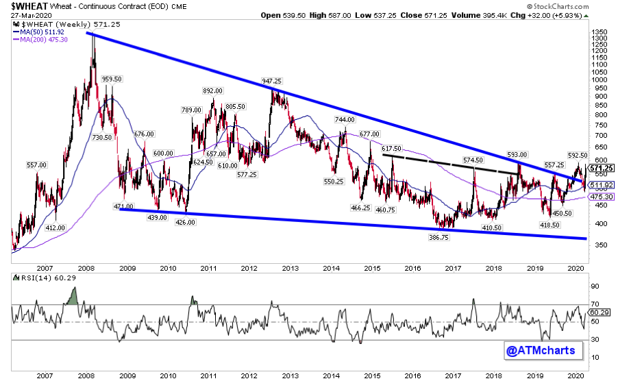
Wheat recently broke a 12 year downtrend. Like almost every other asset in the world it dropped as Coronavirus spread. Now it’s testing the prior high area. A hold over ~600 would be a great first step of a new uptrend.
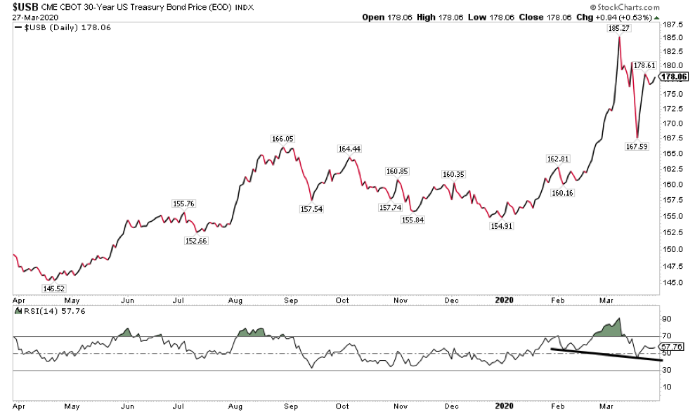
The 30 year US Treasury bond MAY be putting in an RSI head and shoulders top after the sharp reversal earlier this month. We haven’t seen too many of these over the years, but we have recently in indices like the NASDAQ Composite before the major breakdown. Regardless of what happens, this is a market to follow this week.
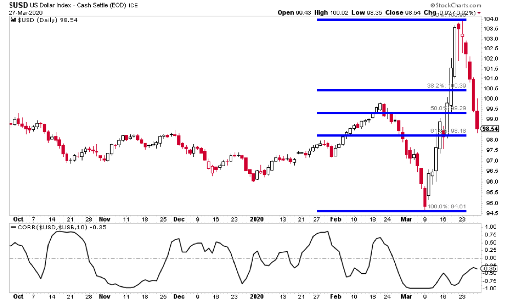
The US Dollar is testing the .618 retrace of the recent rally. Is this a blowoff top in the making? One thing worth noting is the Dollar’s rolling 2-week correlation with the long end US Treasury bond has been consistently negative. Will that relationship continue to hold?
Thanks for reading. Trade ‘em well.
Twitter: @ATMcharts
Any opinions expressed herein are solely those of the author and do not in any way represent the views or opinions of any other person or entity.


 Flirting With Critical Support… Again")


