 With everyone offering up lists of 14 for 2014, I decided to follow a less ambitious but still mathematically justified route (2+0+1+4) with a selection of 7 charts for 2014 that are top-of-mind as we enter the trading year.
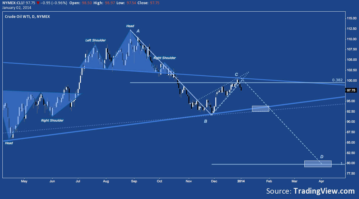
WTI Crude Oil (CL) Continues It’s Broad Consolidation of 2008’s crash to as low as 33.20 (01/14/2009) and 2009-2011’s immense measured move to as high as 114.83 (05/02/2011). The symmetrical triangle that began following completion of the latter move saw a breakout higher in Q3 2013, only to form a Head & Shoulders Top that took the contract as low as $91.77 on 11/27/13. Crude staged a December rebound to $100 and triangle resistance in the form of a rising wedge that has broken down over the last few sessions. $100 (and then $112) remain the levels to breach overhead; while the wedge breakdown suggests a test of $92-$94 may be back in the cards, with the potential for a measured move below to as low as $80.
Charts for 2014 – Crude Oil (CL) (click image to zoom)
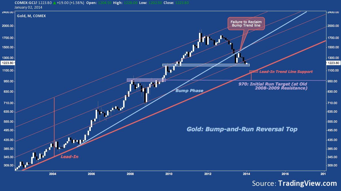
Gold’s Worst Year Since 1981 May be Set to Continue with little to hold it up ahead of rising long-term trend line support near $1080. The Bump-And-Run Reversal Top pattern underway in Gold suggests a target matching up with 2009’s horizontal breakout (highlighted below) between $950-$1000. There is one major opportunity to arrest this decline which may now be underway at November/December 2009 resistance and June 2013 support in the $1180-$1226 range. 12/31/13 fell as low as $1181.40 (just above 06/27/13’s 2013 low at $1179.40) but rebounded nicely with today’s session following through as high as $1228. Gold either 1) double-bottoms here, shooting higher into Q1; or 2) fails to hold at 1180, opening $1080 next and $950-$1000 later.
Charts for 2014 – Gold (GC) (click image to zoom)
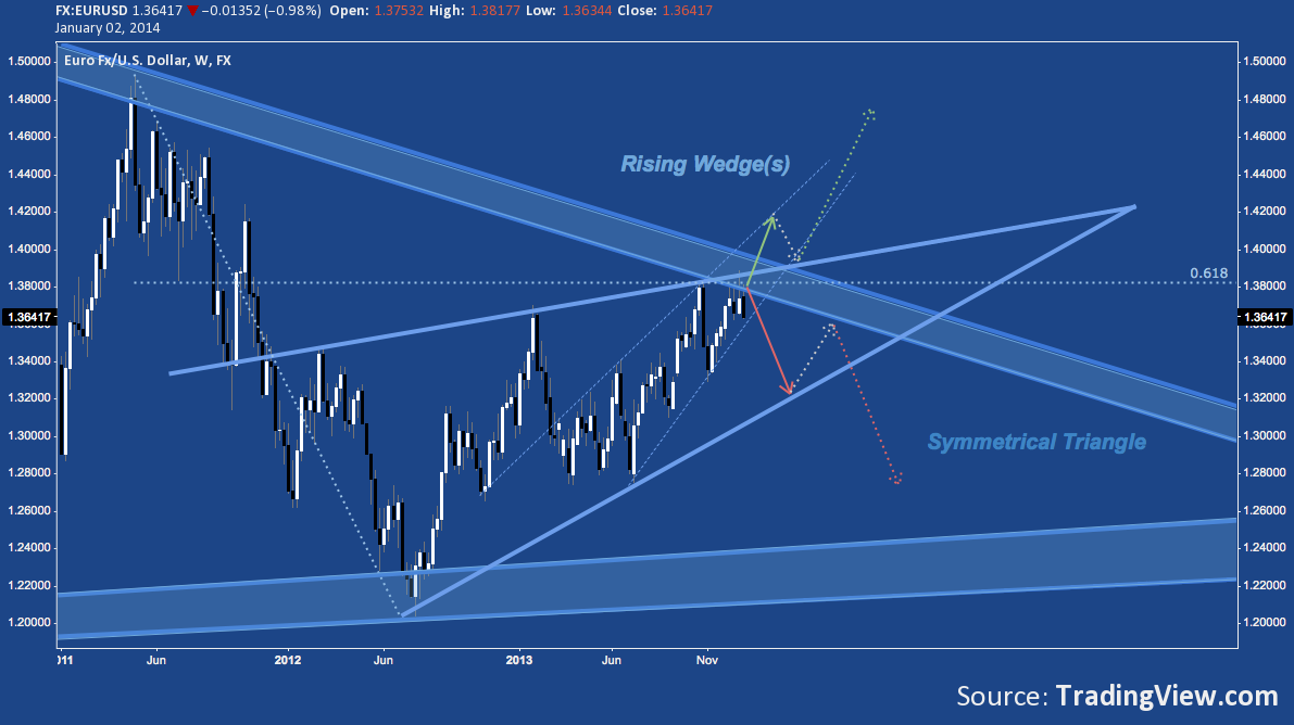
The Euro’s Good Fortune v. the US Dollar Is About to Be Sealed or Scuttled as EUR/USD presses hard inside it’s rising wedges (one underway since mid-2012, the other inside it since mid-2013) against falling long-term trend line resistance near 1.38-1.40. Highs in March and June 2008 and again in April 2011 established the trend line, setting the stage for its first legitimate test with a brief touch in late October 2013 and a then a succession of non-stop salvos against it in December. A snap higher looks wide open to Summer 2011’s resistance zone near 1.45, while a decline to wedge support takes the pair to 1.32; and a break down through wedge support to long-term trend line support near 1.24-1.25.
Charts for 2014 – Euro/US Dollar (EUR/USD) (click image to zoom)
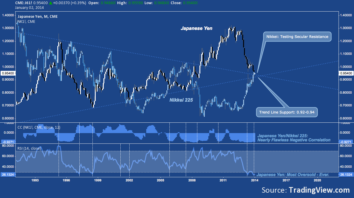
The Japanese Yen and the Nikkei were the dark and light sides of Abenomics’ apparent (I stress apparent) success story in 2013. Many are calling for the massive debasement of the JPY to continue and the Nikkei’s concurrent break of secular trend line resistance in 2014. While this may be the case, the deep negative correlation between JPY and Nikkei paired with the Yen’s most chronically oversold condition ever and near-record long hedging among commercial speculators suggests one of its not-unusual-but-usually-violent short-covering rallies is just around the corner. Given their present and deep inverse relationship (with the cheap and ever-cheaper JPY supporting the long Nikkei trade), the Nikkei’s long-awaited breakout may have to wait.
Charts for 2014 – Japanese Yen (J6) and Nikkei 225 (NKD) (click image to zoom)
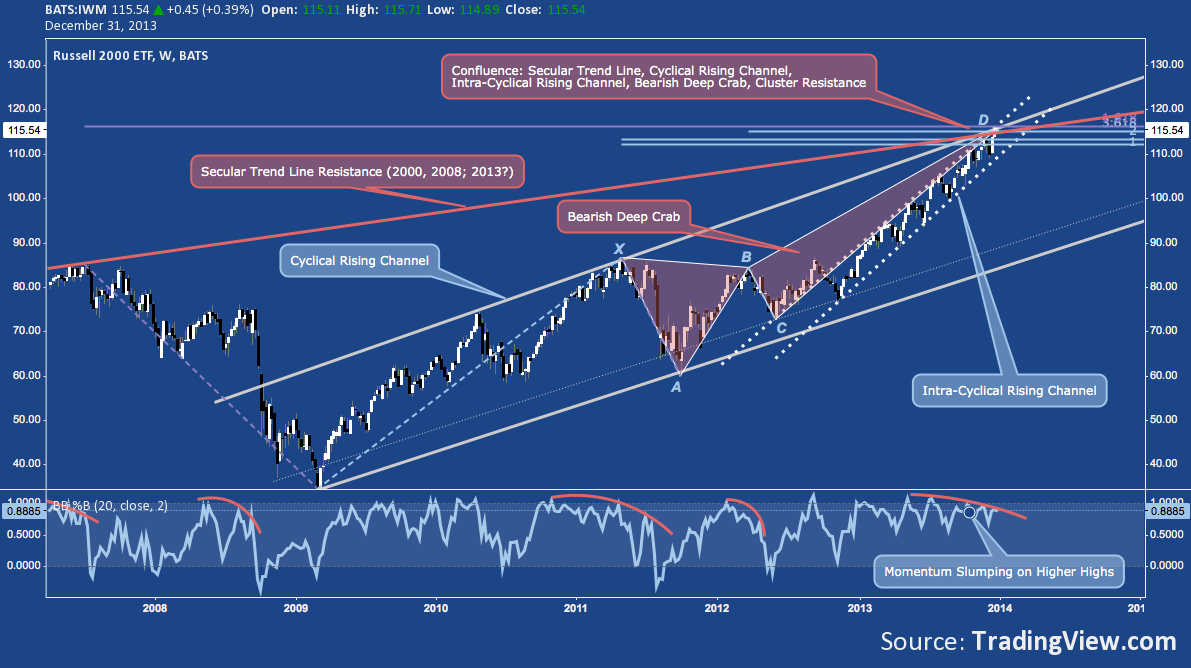
Small Cap US Stocks Bested All But A Few Broad Indices and Sectors in 2013, with only the Dow Jones Transportation Average (+39.5%) and S&P 500’s Consumer Discretionary (+38%) sector besting the Russell 2000’s 37% return last year. That performance belies the precarious spot the small cap benchmark ended up at: Cyclical Rising Channel Resistance, Intra-Cyclical Rising Channel Resistance, Fibonacci Cluster Resistance (including the 1.618% extension off the 2007 high), Bearish Deep Crab resistance and secular trend line resistance off the 2000 and 2007 highs. Look no further than 2013’s bullish persistence for evidence R2k could breach this array of resistance and continue; but the risk environment heavily tilted against the long trade until this happens.
Charts for 2014 – Russell 2000 (IWM) (click image to zoom)
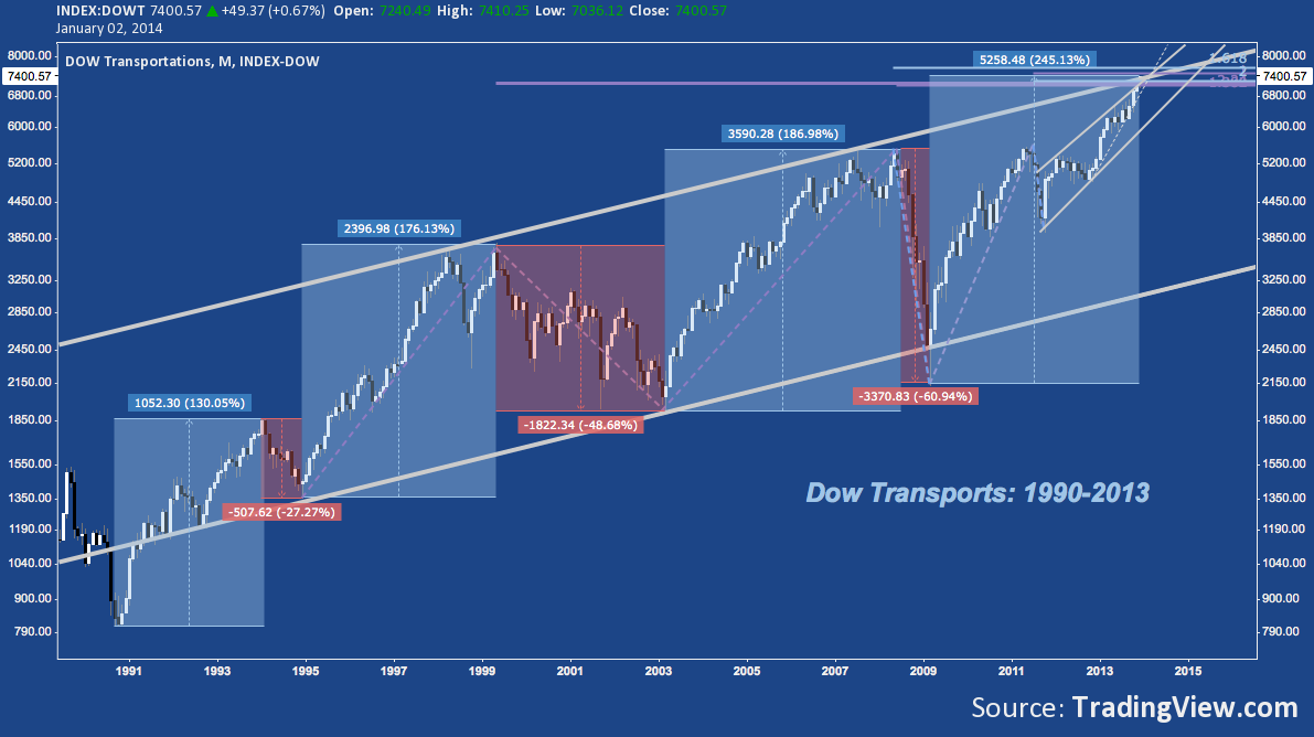
Dow Transports Are Coming Off An Incredible Run, up a staggering 245% off the 2009 low in a cyclical move that dwarfs it’s late 1990s-era leg higher. Like the Russell 2000, DJT is running into secular trend line resistance and major fibonacci cluster resistance.
Charts for 2014 – Dow Jones Transportation Average (DJT) (click image to zoom)
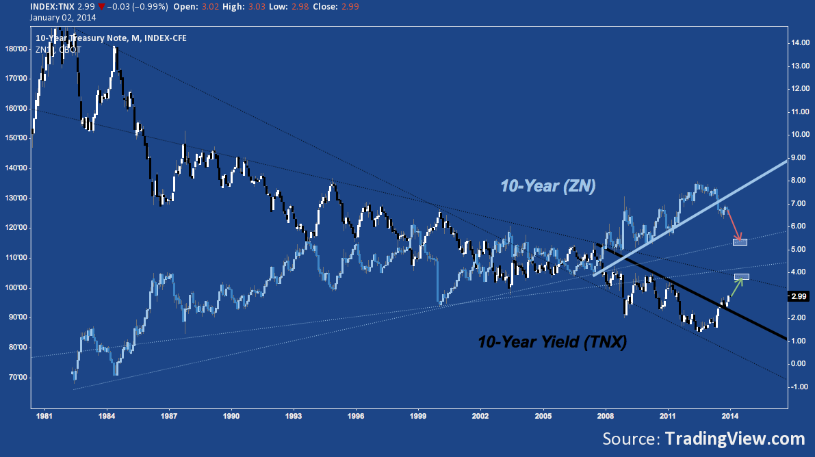
The US Treasury 10-Year Note Ended 2013 on an Ominous Note, just breaching 3% on its final day of trade. After breaching a major medium-term descending trend line amidst Summer 2013’s Taper concerns, the 10-Year yield (TNX) successfully tested it as support in October and is now retesting 2013’s high at 3%. Little appears to be in the way for the 10-Year Note (Futures: ZN) to reach 115-116 with a concurrent move up for TNX to ~3.8%.
Charts for 2014 – 10 Year US Treasury Note (ZN) and 10-Year US Treasury Note Yield (TNX) (click image to zoom)
Keep in mind these charts represent a frozen moment in time at the beginning of the year: they carry significant implications that may be confirmed or negated in the coming months. If nothing else, they suggest 2014 will a very different but comparably eventful year to the one just passed.
Twitter: @andrewunknown and @seeitmarket
Author holds net short exposure to Russell 2000 at the time of publication. Commentary provided is for educational purposes only and in no way constitutes trading or investment advice.
Any opinions expressed herein are solely those of the author, and do not in any way represent the views or opinions of any other person or entity.
: Creating Bullish Divergence?")


 and Semiconductors (SMH): Concerning Price Pattern?")


