One of my favorite parts about the financial industry is the spirit of lifelong learning.
There are so many investors that have come before you; many have found success, and most have learned painful lessons from personal struggles.
I’ve always enjoyed asking mentors of mine which charts they find most helpful to get a read on the overall market environment. Of course, most would answer some chart of the S&P 500 (NYSEARCA: SPY) or another broad market index.
Here are five stock market ratio charts that have been recommended to me over the years, all comparing one group of stocks to another.
I follow them regularly and pointed out back in May that some of them were giving more of a bearish outlook.
You’ll notice that they are now leaning mostly bullish with one notable exception.
1. Consumer Discretionary (NYSEARCA: XLY) vs. Consumer Staples (NYSEARCA: XLP)
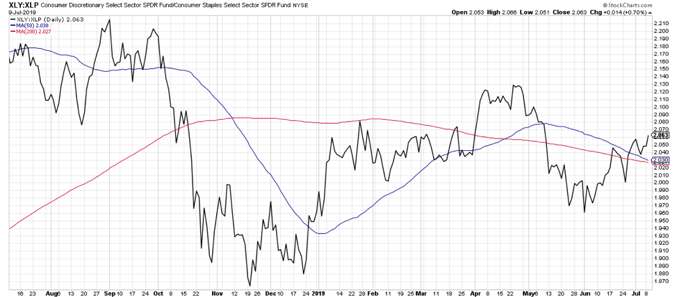
Here we have the traditional look at offense vs. defense within the consumer space. When things are bad, investors can flock to staples like food, beverages, and household products. When life is good, investors tend to be more comfortable speculating on retail and leisure stocks in the Consumer Discretionary sector.
This ratio bottomed out in November 2018 then led the market higher through year end. The underperformance of Consumer Discretionary in May of this year suggested a more cautious tone from investors. In the last month, the ratio has turned back higher and indicates a more constructive sentiment between these two key sectors.
2. Semiconductors (NYSEARCA: SMH) vs. S&P 500
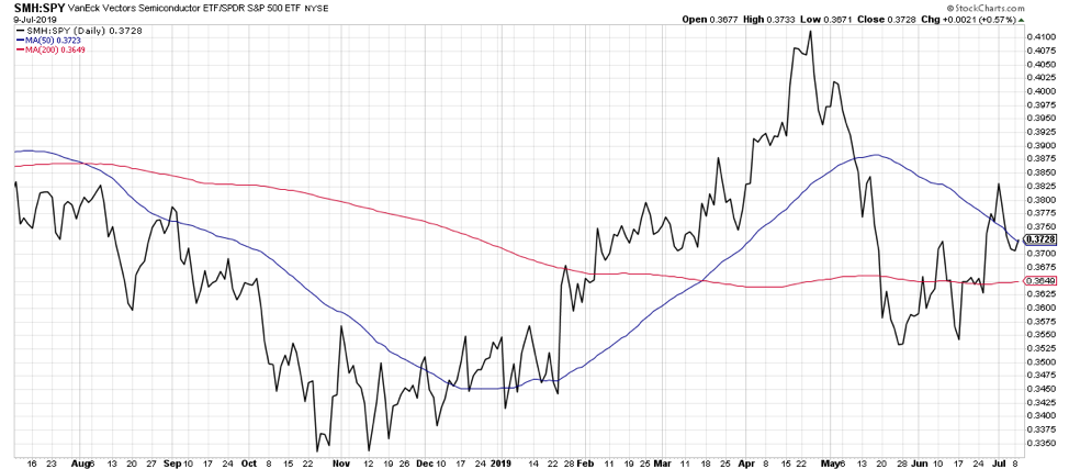
When semiconductor stocks are doing well, the market tends to be doing well. To put another way, it’s rare for the market to do very well when semiconductors are struggling.
Here’s another ratio that started to improve before the market bottomed out in December 2018. After rallying well through late April, semiconductors started to struggle in May.
In the last six weeks, this ratio has turned back to the upside and indicates that the backbone of the internet is in fairly strong shape here.
3. Pure Growth vs. Pure Value
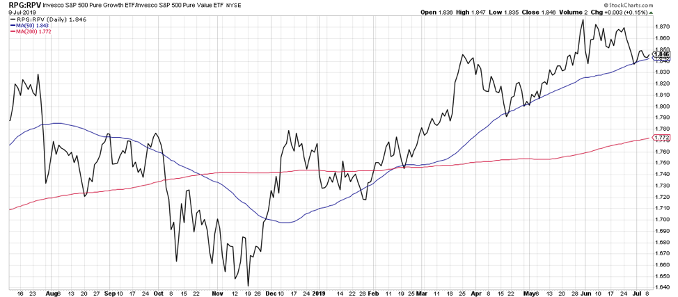
Are investors favoring more growth-oriented speculative names, or more traditional blue-chip value stocks? That’s the general essence of following the growth vs. value ratio.
On top of following the traditional growth vs. value ratio, I like to look at the pure growth and pure value indices. The regular growth and value indexes have lots of double counting, where a stock like Microsoft is actually considered to be both a growth and a value name. The pure growth and value indices just track those names that are in only one of the two indices, and I feel it’s a better read on the growth vs. value play.
This ratio has been steadily improving since November 2018, with a consistent pattern of higher highs and higher lows. As long as this ratio remains above the 50-day moving average, investors are clearly favoring more growth-oriented stocks.
4. US vs. World
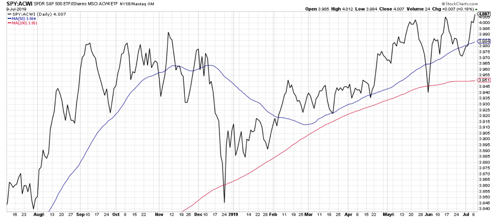
Home bias the behavioral phenomenon where investors tend to invest in companies that are geographically closer to them. For US-based investors, this has not necessarily been a bad thing in recent years.
Especially since the market bottom in December 2018, US stocks have been steadily outperforming their global counterparts, and the ratio is once again testing new highs. For American investors, it still pays to stay local.
5. Small Caps vs. Large Caps
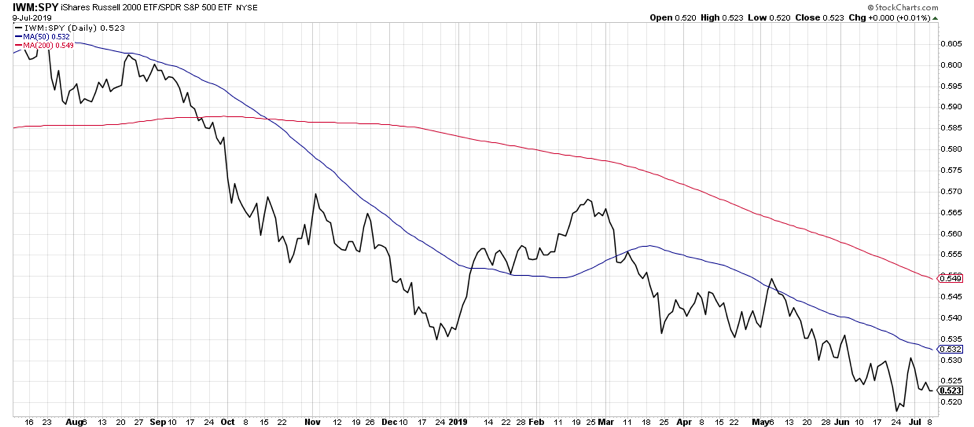
Now we come to the one ratio chart with a less-than-rosy outlook. Small cap stocks tend to do better in bull markets and worse in bear markets. Small cap names tend to be more speculative names and their outperformance can indicate a more risk-on stature for investors.
This ratio has been in a steady downtrend for last year. While the market has experienced numerous short-term bull and bear phases, small cap stocks have pretty consistently underperformed.
So the fact that the market can do just fine without small caps is undeniable. But I would feel much better about the strength of the overall market environment if these smaller and more speculative names were getting more attention from investors. For now, this remains one notable bearish indication among many bullish ones.
These are five key ratio charts that I include in my regular chart review process. If and when these ratios start to turn lower, then I would begin to question the bullish run for stocks.
Follow my thinking at Market Misbehavior.
Twitter: @DKellerCMT
Any opinions expressed herein are solely those of the author, and do not in any way represent the views or opinions of any other person or entity.

: Showing Some Signs of Emerging Strength")
