As much as investors love to complicate things, I am always looking for simple guideposts to validate what I’m seeing on the chart of the S&P 500.
Until the following three key stock market charts start to improve, I’d consider the broader equity markets to be in a bearish phase.
We are far from bear market validation, but these indicators are ones to watch to differentiate between bullish and bearish market phases.
Let’s start with a chart of the S&P 500 index.
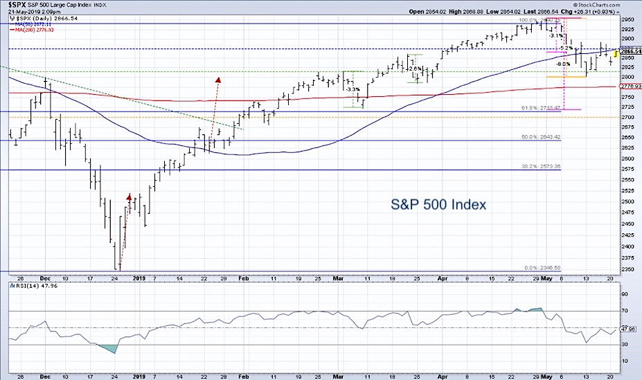
A downtrend is a series of lower lows and lower highs. The S&P has now established a lower high just below 2900, having tested that level twice in the last two weeks. The question now is whether we break below key support at 2800.
This is where the market bottomed out last week, but it’s also a confluence of support and resistance levels over the last eight months.
Bottom line: if the SPX has a confirmed break below 2800, the market is in a Dow Theory downtrend.
So what ratios can we watch to validate what we’re seeing on the broad market chart?
1) Consumer Discretionary vs. Consumer Staples
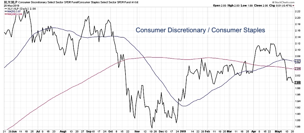
This key ratio of offense vs. defense in the consumer space actually bottomed out last November before the SPX reached its low in December. As investors rotate to a more defensive posture, this ratio will most likely continue lower.
2) Semiconductor Relative Strength
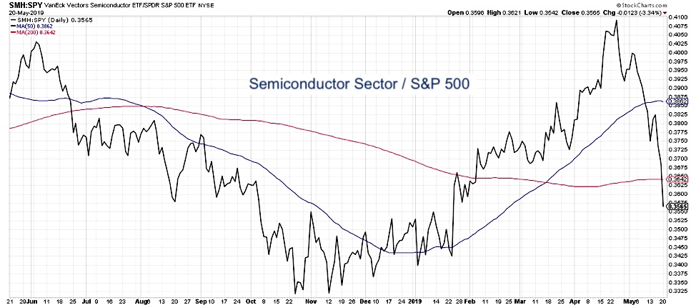
Put simply, semiconductors tend to do well in bull markets and tend to do poorly in bear markets. To rephrase, it’s unlikely the market would go meaningfully higher with this ratio heading consistently lower.
3) Small Cap vs. Large Cap
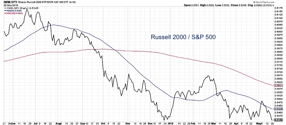
Small cap stocks have been underperforming as the recent bull phase was led by the largest technology and consumer names. To believe that the bull market would resume, I would want to see a rotation to outperformance of small caps. This would represent more of a risk-on positioning within the equity space.
Could the market go higher without these three ratios improving? Certainly. But technical analysis isn’t about certainties, it’s about probabilities. If these ratios continue lower, then the probability of meaningfully higher equity prices would be remote.
The stock market is not just about the broad equity indexes, it’s about all the stocks that make up those indexes. Look one level lower using these three ratio charts, and you should have a good read on where equities are most likely headed.
RR#6,
Dave
Learn more about my research over at Sierra Alpha.
Twitter: @DKellerCMT
Any opinions expressed herein are solely those of the author, and do not in any way represent the views or opinions of any other person or entity.

: Showing Some Signs of Emerging Strength")
