It’s been a wild ride to end the summer months. In my June market update, I noted that the stock market was showing signs that a new cycle was forming as the Cyclicals sector was making its way back onto our radars. Cyclicals tend to lead in “late bear markets” and “early bull markets”. Sector leadership of Cyclicals demonstrates a positive sign that US consumers are on the mend.
However, at that time, there were a few caveats that a new cycle may be put on hold. The 20+ Year Treasury Bond ETF (TLT) was back at an important price support that demonstrated that at least in the near term, “this would likely be bearish for financials, even if just seasonal”. Moreover, crude oil had formed a flag. Flags, a favorite chart pattern for trend traders, demonstrated (at the time) that oil could move very quickly either way; a break out or break down (the latter has occurred – more on crude later).
Following the June update, China’s Shanghai Composite Index (SSEC) collapsed, and the June caveats played themselves out. Financials and Oil felt the pressure immediately, and just a couple of weeks ago, oil found a crack in the spring 2009 base that it had been testing since earlier this year. In response, the stock market ended its side-ways trend to no-where with the current market correction.
That makes this a good time to review the charts and gain some perspective on this market correction and what to expect in the months ahead.
Chart 1 – S&P 500 Index. Stocks continue to trade neatly within the Primary Channel established since the 2010 lows. Although, if you are a base trader, the channel offers a glimpse of the wide berth that the market may need to establish a new base. This means that the market may need some time to form a bottom before any sustainable thrust higher. And so the market correction may take a bit more time.
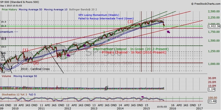
Chart 2 – TLT (bond ETF). The TLT did turn up in late June, but the weekly “dark cloud” in the bubble signals that long-term interest rates may have found their low. Rising interest rates is bullish for financials in the long-term.
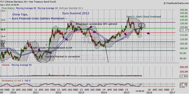
Chart 3 – Crude Oil. Oil is back above the spring 2009 supports. We might expect more scuffling by the bulls and the bears in this area with “fear and uncertainty” over China. If oil prices move back below this base, note the bottom in early 2009 as the next likely target.


: Showing Some Signs of Emerging Strength")
