Will a trade war to bring recession and a bear market?
Charts help us monitor the stock market’s net aggregate opinion regarding all subjects on all timeframes.
When the net aggregate opinion is bullish, stocks tend to rise.
When the net aggregate opinion is evenly distributed between bulls and bears, markets tend to go sideways.
When the net aggregate opinion flips over to the bearish camp, stocks tend to fall.
Thus, charts help us monitor the wisdom of the crowd. Below we look at charts of the S&P 500 during 2007 and this year 2018.
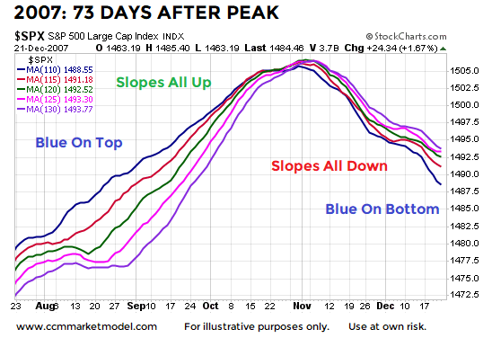
2007: 73 Days After The Market Peaked
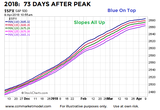
In 2007 after the market peaked, investors had to deal with a recession and a bear market; stocks dropped over 50%. In 2018, the S&P 500 peaked on January 26, or 73 calendar days ago. The chart below shows the S&P 500’s 110, 115, 120, 125, and 130-day moving averages. On the left side of the chart the fastest moving average (blue) is on top and all the moving averages have positive slopes. The right side looks significantly different with blue on the bottom and all the slopes are down, indicating market participants were concerned about the longer-term prospects for a recession and bear market.
2018: 73 Days After The Market Peaked
The present day “wisdom of the crowd” does not have the same “we are concerned about long-term problems” look that was present on the 2007 chart above, telling us to keep an open mind about better than expected outcomes in the weeks and months ahead.
Market Is Concerned About A Trade War
The trading range we have been covering for weeks is indicative of a market that remains concerned a protracted trade war could eventually lead to a recession and/or bear market. However, the fact that stocks (a) have not exceeded the February low and (b) remain inside the range, tells us the market also remains open to a resolution that will allow for a resumption of the primary trend. In short, the market has not made up its mind as to the severity and potential impact of the trade dispute between the United States and China.
The Primary Trend Remains Positive – For Now
Has the market flipped into a downtrend, even on the most basic level? This week’s video answers that question in a logical and unemotional manner. The video also covers a fundamental checklist for bear markets, historical returns after the S&P 500 drops below its 200-day moving average, and two key market areas investors and traders tend to greatly underestimate.
“Groups are remarkably intelligent and are often smarter than the smartest people in them. Groups do not need to be dominated by exceptionally intelligent people in order to be smart. Even if most of the people within a group are not especially well-informed or rational, it can still reach a collectively wise decision.”
— James Surowiecki – The Wisdom of Crowds
Twitter: @CiovaccoCapital
The author or his clients may hold positions in mentioned securities at the time of publication. Any opinions expressed herein are solely those of the author, and do not in any way represent the views or opinions of any other person or entity.


