Wage growth (as measured by the Federal Reserve Bank of Atlanta) seems to suggest the opposite. Wage growth is accelerating for all workers, especially for those who are switching jobs. This seems consistent with an economy that is finding its footing and continuing to show improvement. It may also help put upward pressure on inflation.
Valuations are bearish. The median P/E ratio for stocks in the S&P 500 is at its highest level in over a decade. Historically, valuations do tend to trend higher over the course of a secular bull market. But at this point it appears that prices have gotten ahead of fundamentals.
Valuations are poor timing indicators – a stock (or market) that is expensive can get more expensive, and one that is cheap can get cheaper still. Over the longer term, however, valuations are a good indicator of risk. When stocks are cheap (by historical standards) forward returns tend to be robust. When stocks are more expensive forward returns tend to be depressed. As seen in the chart to the left, based on average 10-year earnings, the S&P 500 is currently in the most expensive quintile and forward returns under such conditions have tended to be weak.
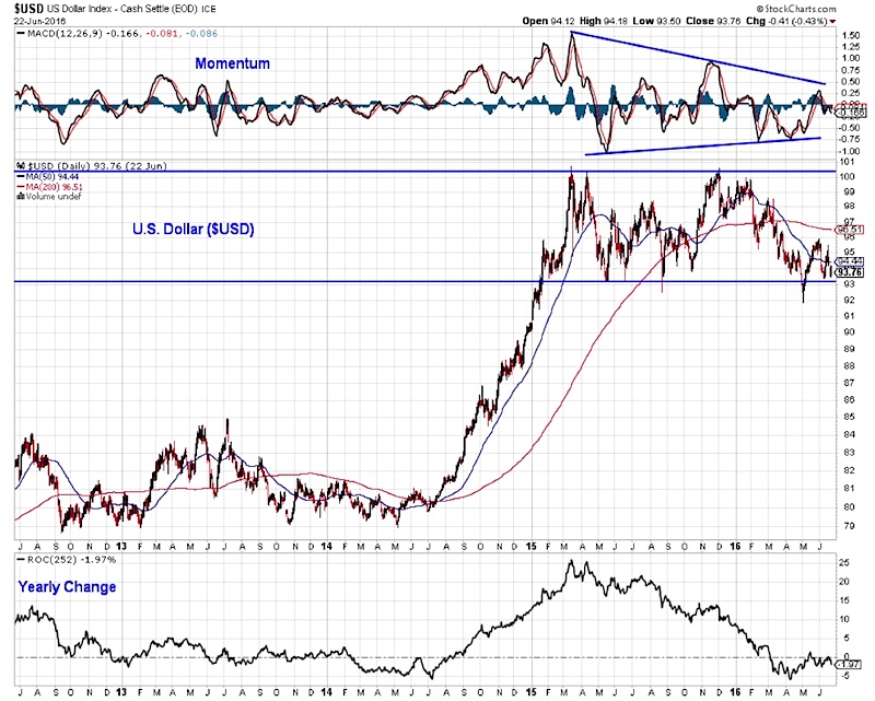
The good news from a valuation perspective is that some of the fundamental headwinds may be diminishing and earnings growth could soon rebound. Forecasts for earnings are as notoriously unreliable as forecasts for growth, but there is still some reason for optimism. Earnings revisions are starting to get tweaked higher, and the U.S. Dollar is now declining on a year-over-year basis, which has historically been a strong tailwind for earnings growth. The valuation excesses described on the previous page could as easily be resolved through improving fundamentals as through price weakness.
Investor sentiment is neutral. The weakness early in 2016 led to an explosion of pessimism that has not been fully unwound. Even as stocks have rallied, optimism has been slow to build and funds have continued flow away from equities (and toward bonds). The pace of outflows has been intense, rivaling on a 4-week basis the outflows seen in 2008 and 2000. This has historically been bullish for stocks.
The skeptic might argue that mutual funds are in secular decline, and investors increasingly favor ETFs. This is true to a degree, but the pace inflows to ETFs has not matched the pace of outflows from mutual funds. There have been only three weeks over the course of the first half of 2016 in which the combined ETF + Mutual Fund flows were positive by more than just a marginal amount for U.S. equities. The tone was set early in the year as stocks swooned and investors have not yet found reason to shift funds back toward equities. If that happens in the second half, it could be a tailwind for stocks.
Despite the weekly data showing persistent outflows from equities, aggregate exposure to stocks across all ETFs and mutual funds remains elevated by historical standards. Exposure to equities is just below its recent peak and cash levels have scarcely risen off of their lows. For all the near-term fear and uncertainty that has been expressed in 2016, there is little evidence of a meaningful build in cash on the sidelines. On possible explanation may be that while the fund flow data (even when aggregated to include mutual funds and ETFs) is measured in hundreds of millions and billions, total assets are measured in trillions. While the flows get the headlines, they are simply not making much of a dent in overall exposure. In the same way the elevated valuations have a depressing effect on future stock market returns, so too has elevated exposure to equities. The chart to the right shows a strong inverse correlation between the percent of household financial assets in equities and forward returns for the S&P 500 (shown on the right axis, and inverted to facilitate the comparison). While the latest update to this data shows that exposure to equities has been reduced slightly in recent quarters, it remains elevated by historical standards.
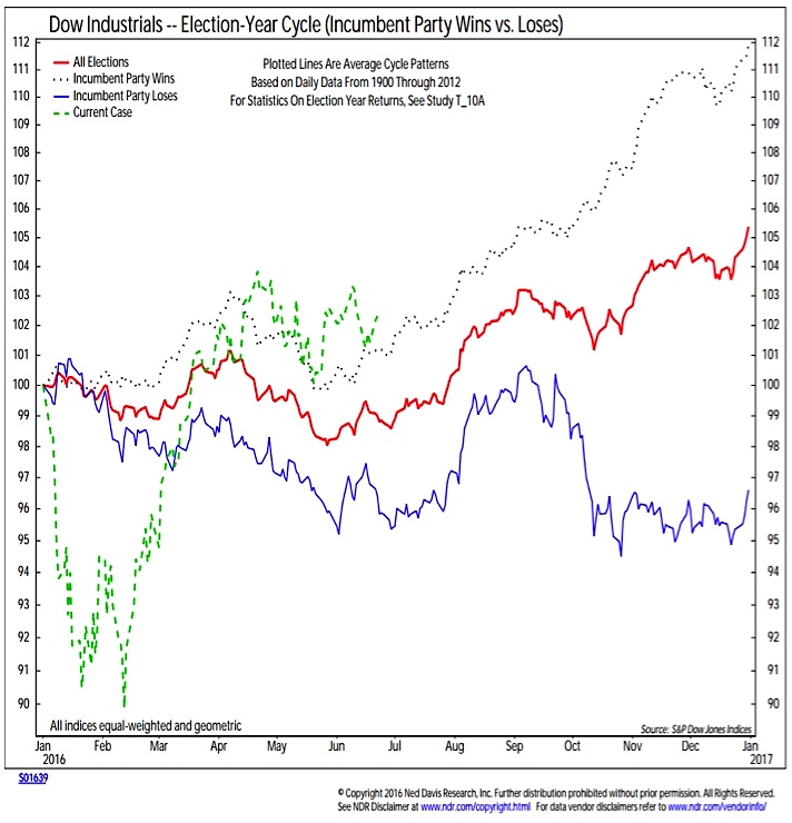
Seasonal patterns are neutral. The intense focus that seasonal patterns have received in recent years has reduced some off their effectiveness. But we believe there is still information in them and history remains the only guide we have. While the first quarter was a clear aberration in terms of the degree of the move, it was not totally out of character with historical election year patterns. Nor for that matter has the second quarter’s range-bound drift. Looking ahead, seasonal patterns suggest stocks could drift higher until the presidential election really heats up this fall and the pattern after that could depend on which candidate appears to have the upper hand.
Breadth has turned bullish with the average stock leading the popular averages. This is in marked contrast to 2015. Last year, the S&P 500 was up on the year because of the so-called FANG stocks. In 2016, it is the opposite. The S&P 500 is positive on a year-to-date basis despite weakness in the FANGs. Those four stocks are down an average of 3% in 2016, while the remaining stocks in the S&P 500 are up an average of more than 5% this year A market that is narrowly supported is vulnerable if the few leaders stumble, while a market that is broadly supported can usually find another sector or stock to pick up the leadership baton.
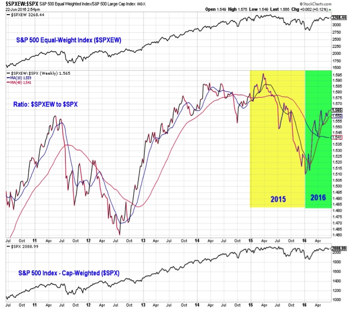
Another way to view this change in leadership is by comparing the performance of the S&P 500 (which is cap-weighted) to an equal-weight version of the index. That is represented in this chart. The ratio in the middle clip rises when the equal-weight index is leading and falls when the cap-weighted index is leading. The contrast between 2015 and 2016 is significant and suggests the S&P 500 enters the second half of 2016 with strong underlying support. This could be a tailwind despite some of the fundamental uncertainties that have yet to be resolved. Or especially if those fundamental uncertainties move toward resolution.
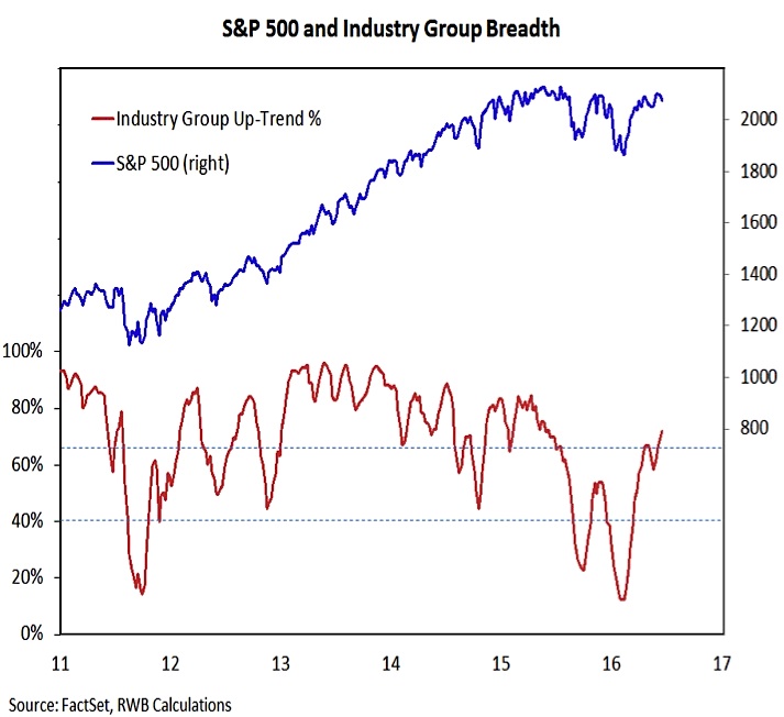
Industry group trends quickly turned higher early this year and have continued to improve even as the S&P 500 has consolidated its gains. While back to the level seen in early 2015 (and not yet matching the broad strength seen in 2013 and the first half of 2014), the direction now versus a year ago is completely different. Then, rallies were joined by fewer and fewer groups still in up-trends, while now, more and more stay robust even if the overall S&P 500 is not going anywhere.
One final difference between 2015 and 2016 to point out here is the number of stocks making new 52-week highs and lows. Similar to the industry group trend indicator above, the number of stocks making new highs is not yet back to the levels seen in 2013, but it is expanding and has broken the dominant trend from 2015. Perhaps more importantly, the number of issues making new lows has remained muted. In the second half of 2015 and opening weeks of 2016, weakness in the S&P 500 was quickly joined by an expansion in the new low list. That is not happening now, and is bullish for stocks.
What to Do (or Where to Go):
– While the weight of the evidence has turned more bullish, risks (as represented by high valuations and fully exposed investors) remain elevated. As such maintaining higher-than-normal levels of cash may not be unwarranted.
– With inflation creeping higher, bond yields could follow suit. Optimism in bonds is elevated and investors have flocked to bond funds in the first half of 2016. Tactical investors may want to tilt away from bonds (perhaps use these funds to build cash positions).
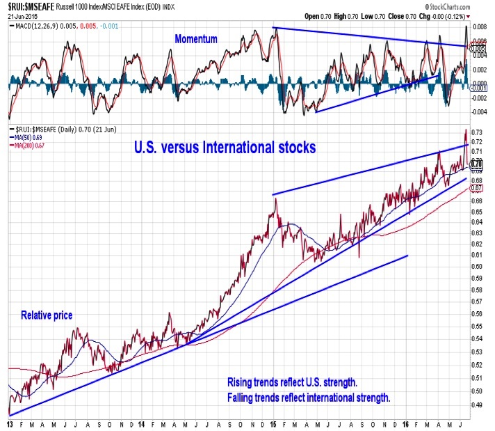
– In terms of equity exposure, we have continued to see U.S. leadership relative to the rest of the world. While global macro uncertainties are adding to volatility, the trend favoring the U.S. remains intact.
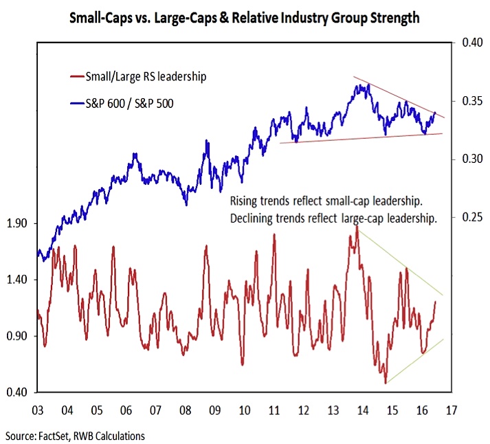
– Domestically, small-caps have gained strength relative to large-caps, both at the index-level and within our industry group rankings. Given the convergence of longer-term trend-lines and other mixed signals between large-caps and small-caps, we would tilt domestic equity exposure toward mid-caps.
– From a sector perspective, global uncertainties and a thirst for yield has helped keep defensive areas like Consumer Staples and Utilities in the leadership group. More recently we have seen more cyclical areas of the market, like Energy, Materials and Industrials move into the leadership group, where we expect them to stay in the second half of 2016.
Thanks for reading.
Twitter: @WillieDelwiche
Any opinions expressed herein are solely those of the author, and do not in any way represent the views or opinions of any other person or entity.
: Creating Bullish Divergence?")


 and Semiconductors (SMH): Concerning Price Pattern?")


